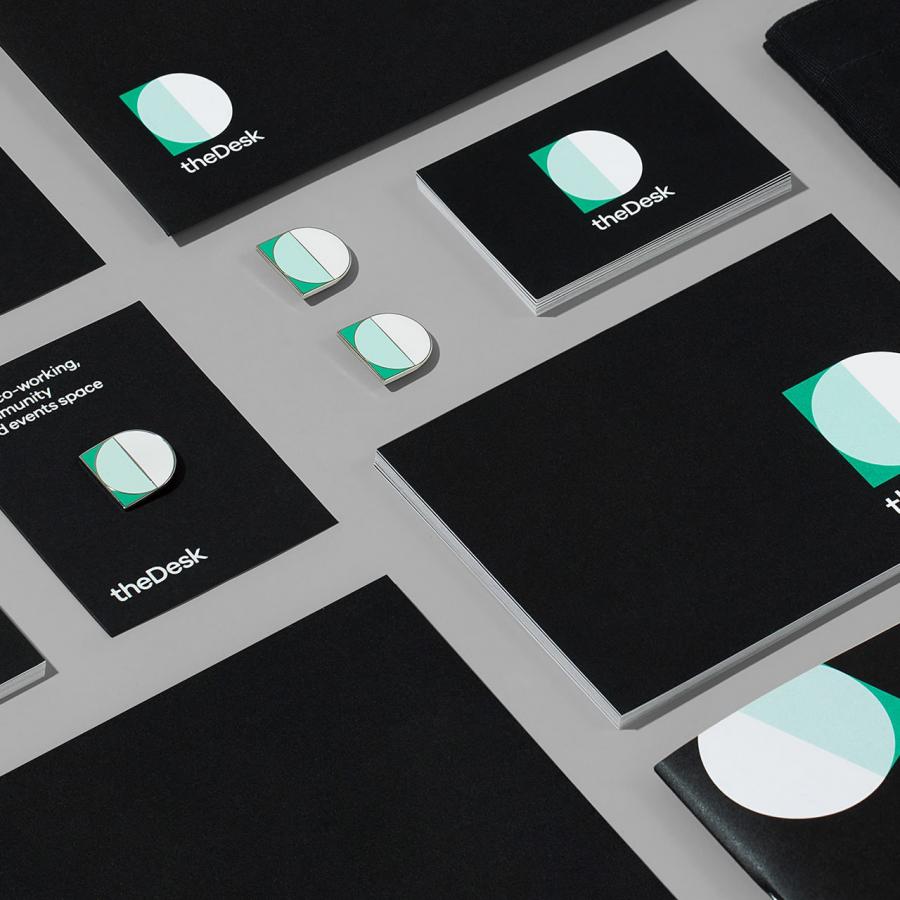
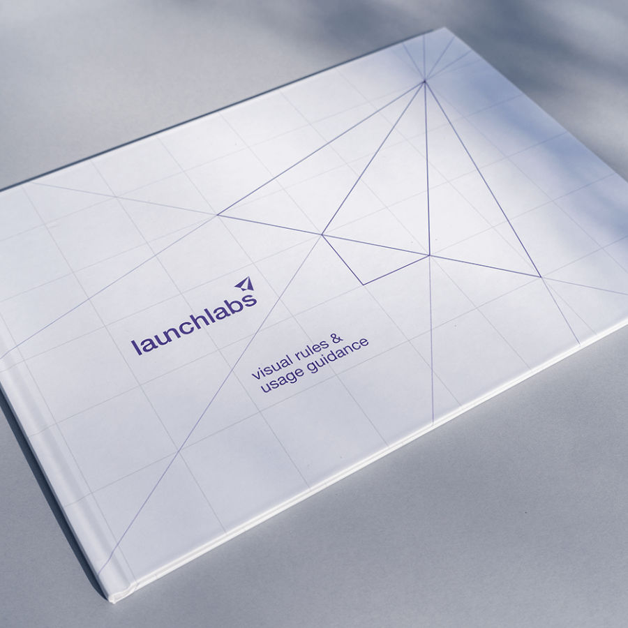
Uniko Studio has unveiled a striking new branding for Controlled Credit Corporation (CCC). Reflecting CCC's steadfast commitment to medical debt recovery, the design is a blend of modern geometry and simplicity, perfectly encapsulating the company's essence.
At the very heart of CCC, there's an unwavering dedication to medical debt recovery, and this fiery commitment is mirrored in the company's freshly minted logo. The emblematic symbol is a nod to modernity, with a pristine circle intersected by three delightful segments of what may remind one of a gourmet donut. Oh, how our design cravings are satiated just by a glance! Arranged neatly within a grid, the motif whispers minimalist brilliance.
But what's design without a touch of typography? The chosen typeface here is a geometric sans serif, as uncomplicated as it is stylish. It's like the little black dress of fonts — timeless, versatile, and fits every occasion.
Now, let’s talk color. The palette is a symphony of dark and light greys, with an elegant white. But the true maestros here are the two shades of green: a vivacious cyan-esque tone playing alongside its mellow dark green counterpart. These aren't merely colors; they're the very mood and tone of CCC, spread graciously over collaterals ranging from crisp business cards to digital wonders.
In conclusion, the CCC branding, as brought to life by Uniko Studio, is a testimony that true design elegance lies in simplicity. And while the humor here might be subtle, the message is clear: in the world of design, less truly is more.
Branding and visual identity artifacts
For more information make sure to check out www.unikostudio.co or follow them on Dribbble or Instagram.
