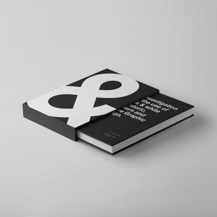
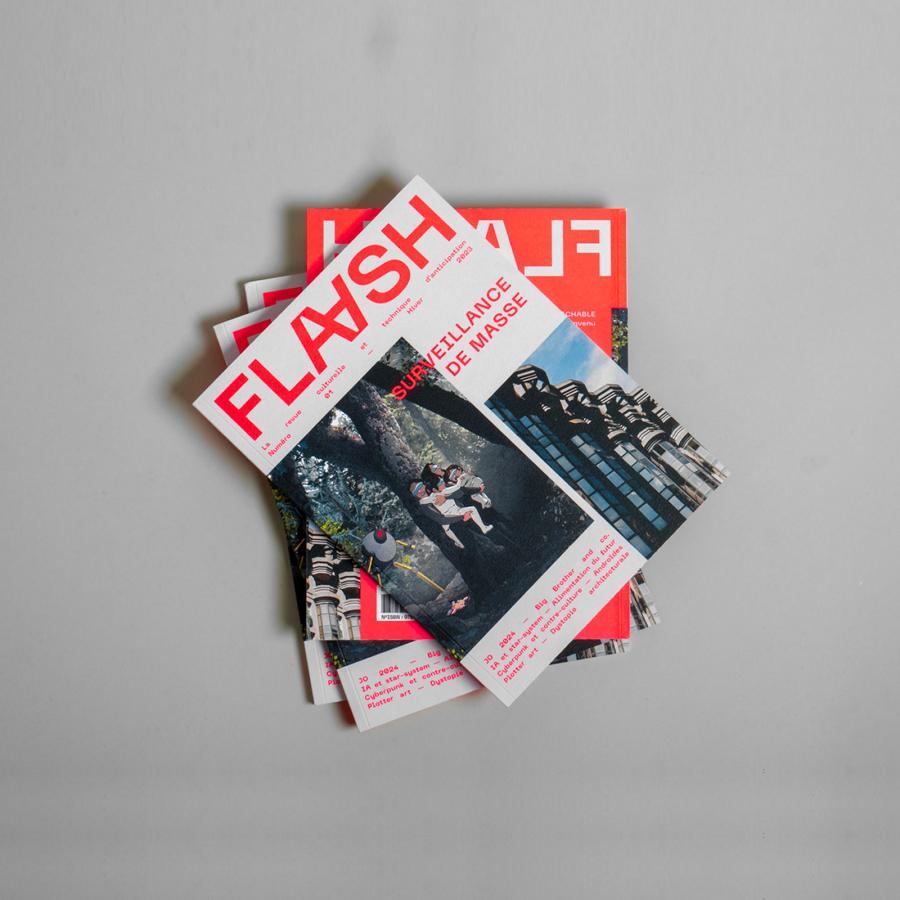
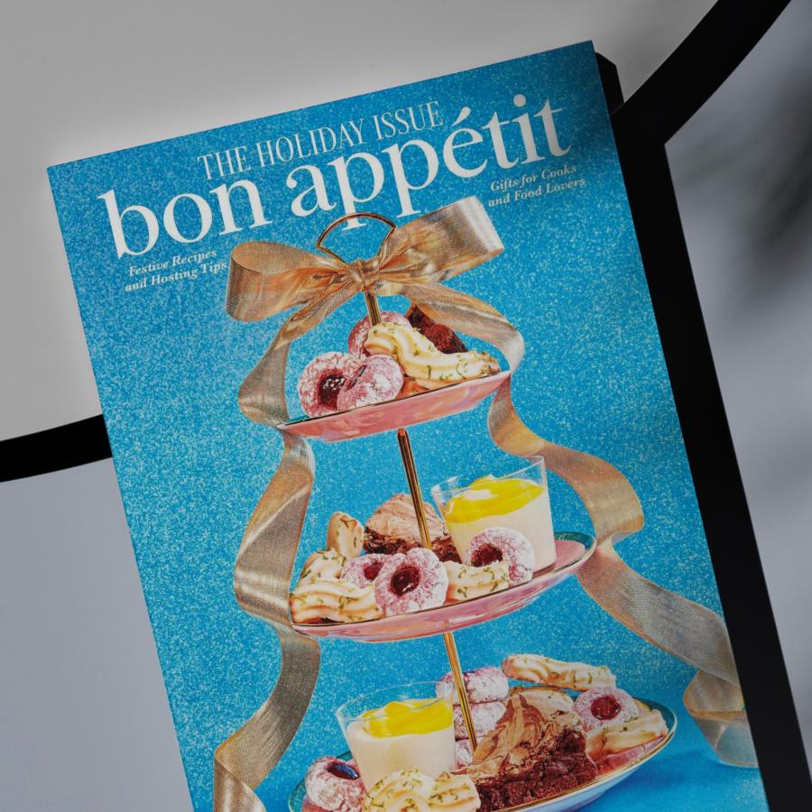
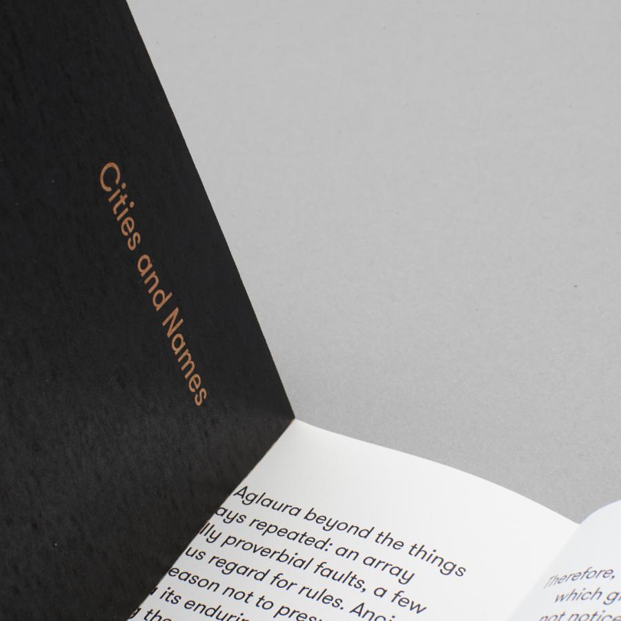
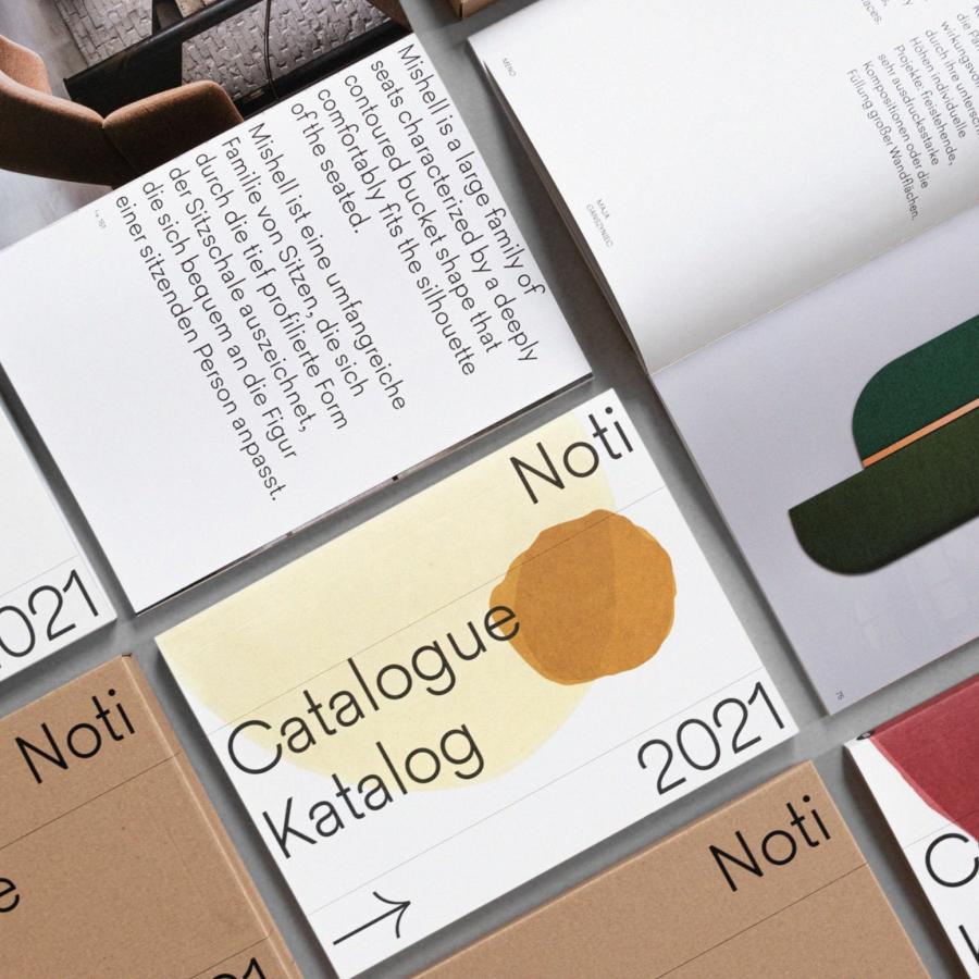
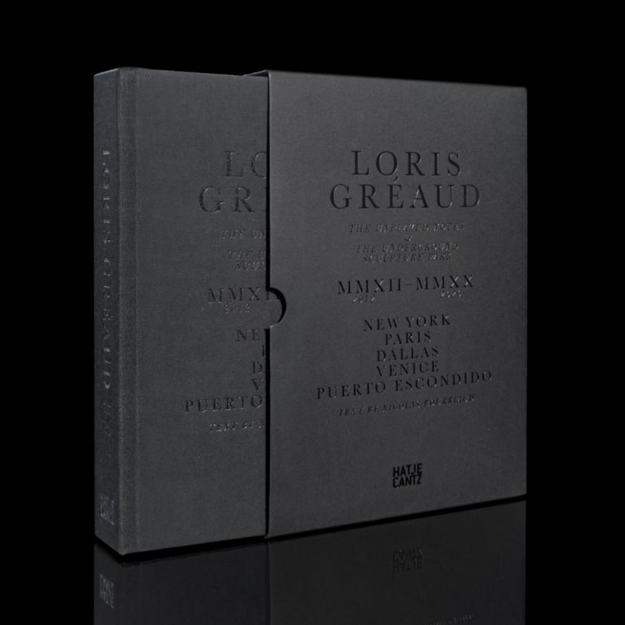
Simplicity is the biggest challenge for any designer. Well, at least it’s for me as I constantly battle to find ways to reduce elements, colors and pretty much anything without sacrificing usability. That’s why it’s difficult, however for some people it seems a bit easier, or they make it look easier, which highlights their talent. Ryan Anthony Ward is one of these designers and the B+W editorial design project he shared really illustrates that quite well. It’s pure typography and beautiful simplicity.
Editorial Design
