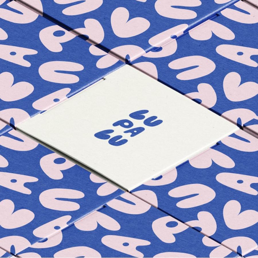
LUPALU ceramic studio showcases its vibrant branding and visual identity, merging whimsical shapes with a nod to traditional ceramic artistry.
In the heart of Warsaw, a ceramic studio named LUPALU is redefining the craft's visual narrative. Guided by designer Vera Leonovich, LUPALU’s branding departs from the expected, embracing vibrant hues and playful shapes. This design choice marks a clear distinction in an industry often swathed in earth tones and conventional forms.
The LUPALU logo is a dance of buoyant letters, evoking the studio's innovative spirit. It whispers of the clay's suppleness while boldly announcing its modern approach. The distinctive typeface and dynamic color choice reflect the studio’s commitment to crafting unique ceramic pieces, each with a personality as vivid as the glazes they bear.
As the branding unfurls across various mediums, one finds consistency in its flexibility—just like the transformative nature of clay itself. Whether it’s the delicate touch on a business card or the striking presence on digital platforms, the LUPALU identity is undeniably engaging.
This venture into the design of LUPALU’s branding not only captivates the observer but also sets a precedent. It’s an invitation to explore the boundless possibilities within the traditional art of ceramics, proving that heritage crafts can walk hand-in-hand with contemporary design.
As a focal point for those intrigued by the synthesis of tradition and modernity, LUPALU’s visual identity stands as a beacon. It’s a statement that in the hands of a visionary, branding can be both a nod to the past and a stride into the future. LUPALU is not just creating ceramics; it's shaping experiences, memories, and a brand that's as enduring as the art it represents.
Branding and visual identity artifacts
For more information make sure to check out Vera Leonovich on Behance.


