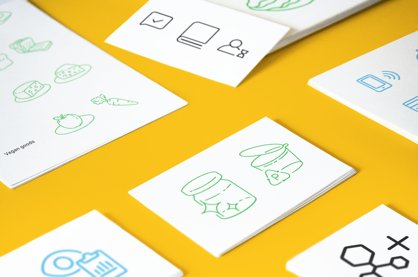
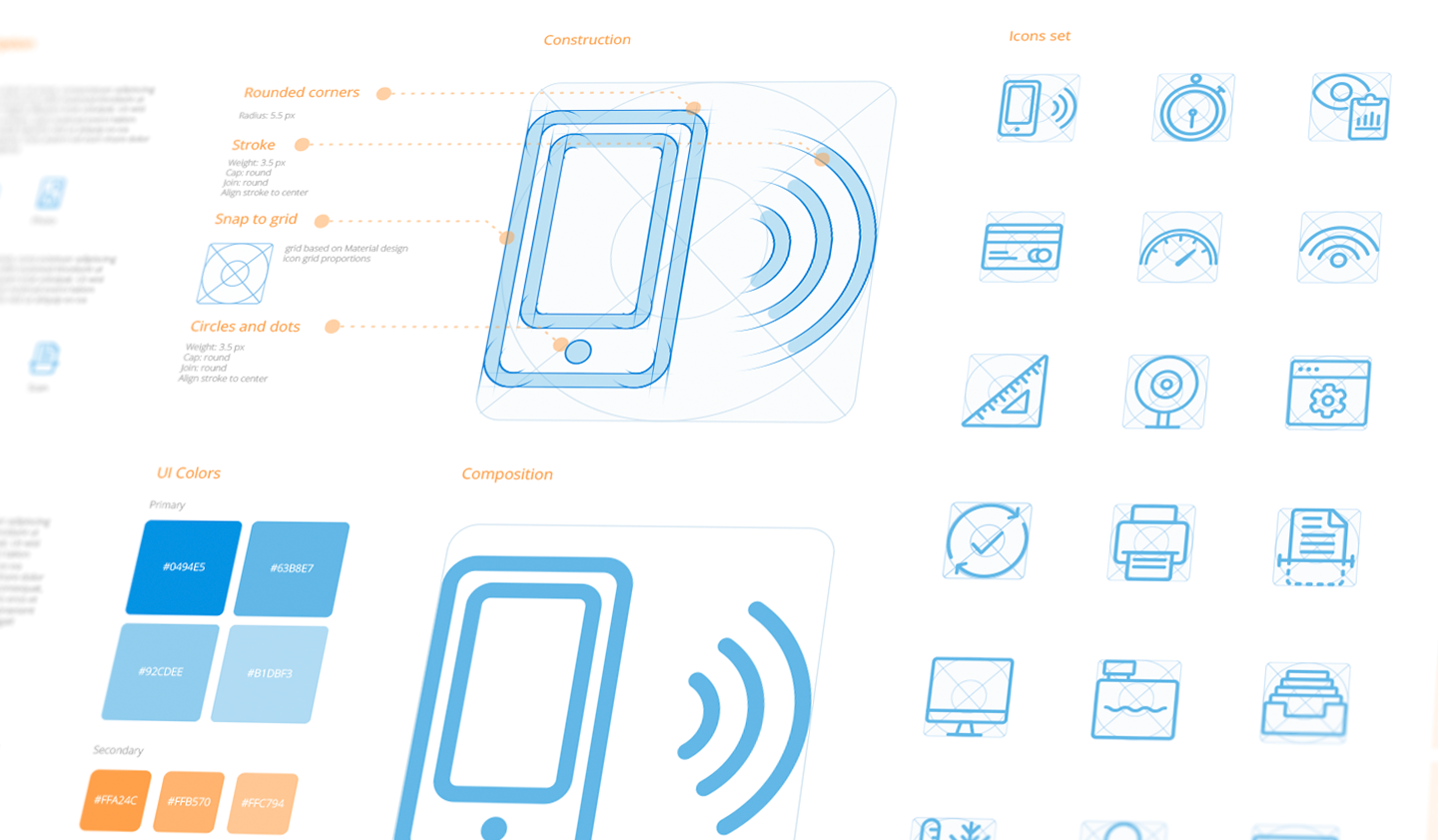
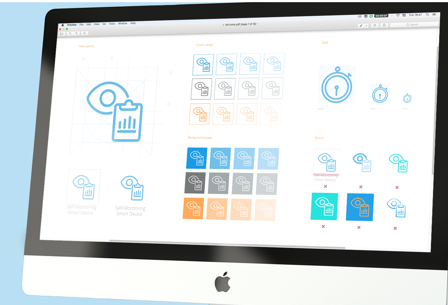
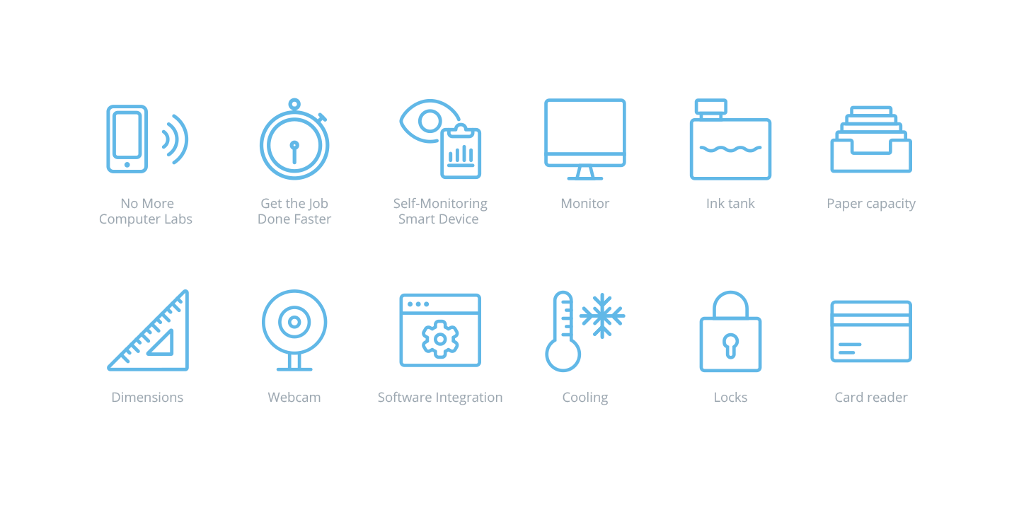
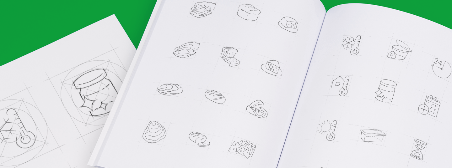
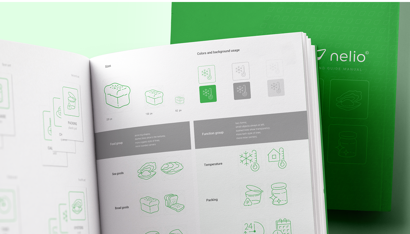
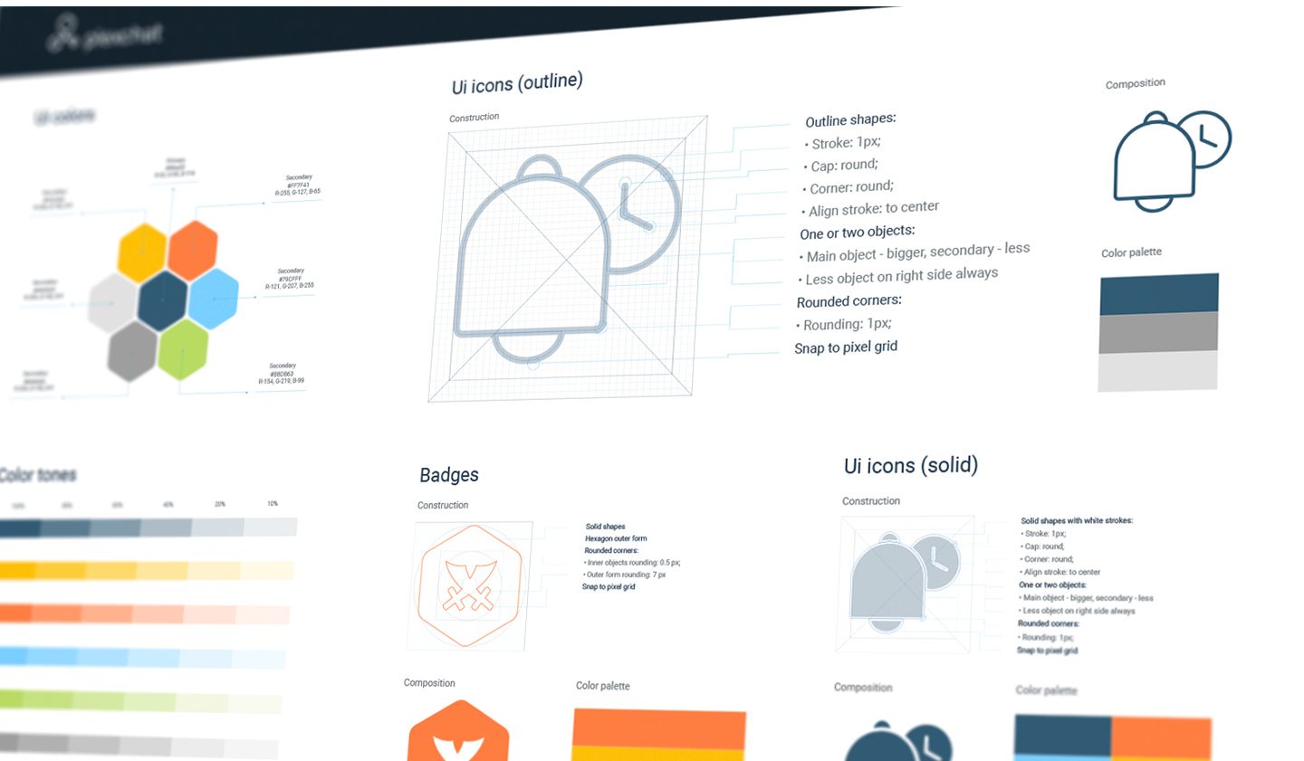
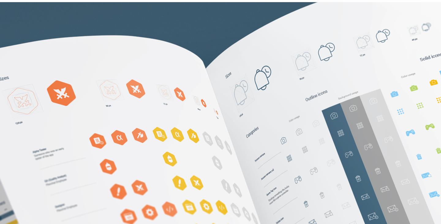
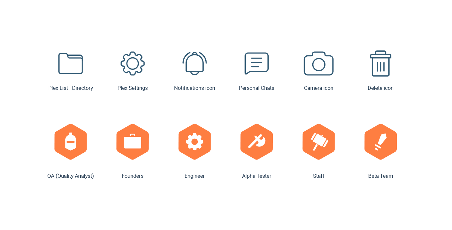
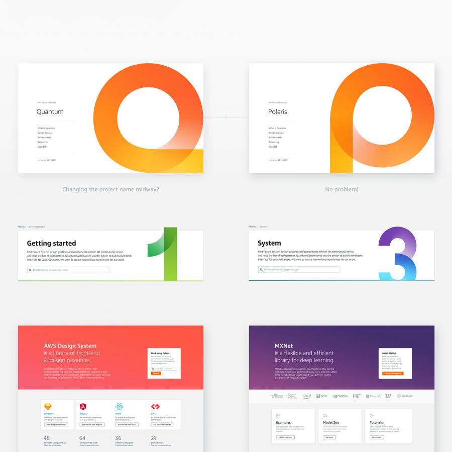
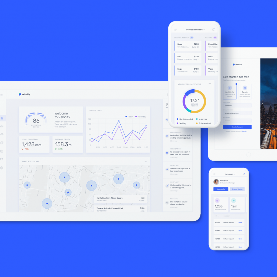
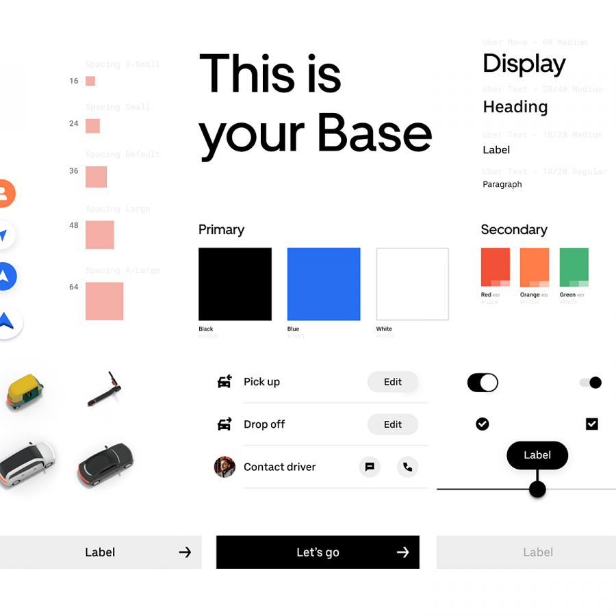
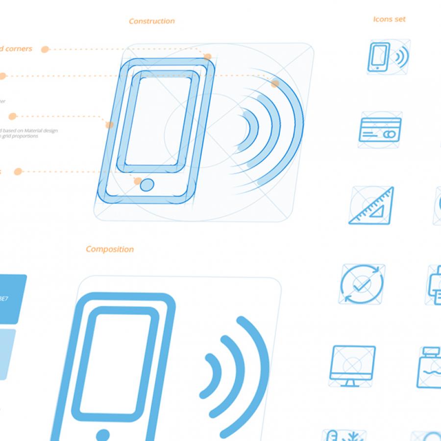
Currently in the middle of setting things up to build a design system at a large scale, for where I am currently working. One of the starting points are the icons who are part of the foundation of a design system. I decided to surf around for UI layout inspiration and I stumbled across the work of Ramotion. A UI/UX design & branding agency based in San Francisco, California that we have featured their work before on hottopbest. I thought it would be cool to share their latest round-up of UI collection based on Iconography, check it out.
More Links
Iconography is a unified visual language that can be understood by people from different locations and cultures. Icons are widely used for navigation in social places such as airports, train stations, production halls, museums, etc. They let people overcome a language barrier and navigate comfortably in conditions when the time is very limited (e.g. in an airport). The same principles apply to iconography systems for digital products. The right usage of icons helps to make in-product navigation more accessible and increase business metrics (CTR, number of successful onboarding sessions, etc.). Consistency, readability, and scalability are the core parameters of any design system. Consistency influences a general trustworthiness of a product, readability increases the speed of interactions, and scalability lets your product to grow effectively.
Iconography Guidelines
