Discover how Made Up Studio skillfully blends illustration and typography in their latest project for Turf, showcased at NeoCon Chicago.
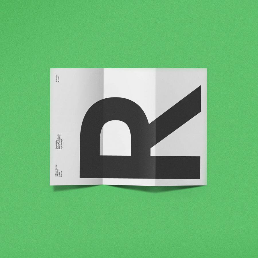
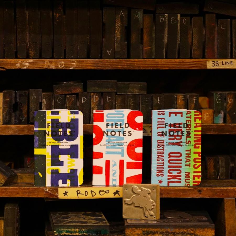
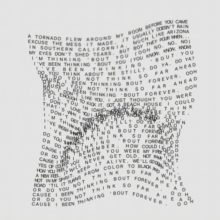
In the bustling world of commercial design, standing out requires a blend of innovation, creativity, and a deep understanding of one’s medium. This is precisely what Made Up Studio achieved for Turf, as they embarked on a unique project, commissioned to create a series of striking monochromatic type works. The designs were a highlight at NeoCon Chicago, an event celebrating the forefront of global commercial design.
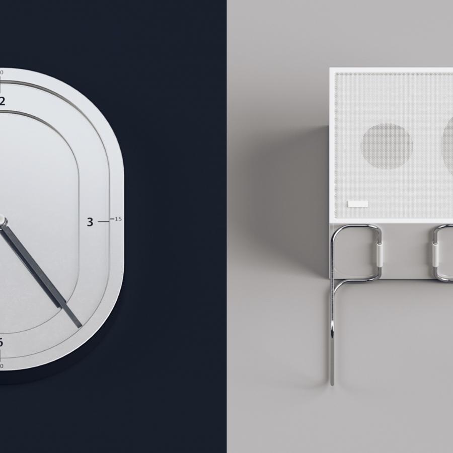
At the core of this project lay Turf's products—3D structures meticulously crafted to refine the aural dynamics of indoor spaces. These objects are not just functional; they are designed to bring serenity and peace to any environment. The challenge for Made Up Studio was to encapsulate this essence in their designs, merging the abstract with the concrete.
The journey began with a comprehensive sketching process. Made Up Studio explored various concepts, aiming to find a perfect balance between form and function. The selected designs embraced dimensionality and modulated control, subtly nodding to the physical presence of Turf's products. This approach not only honored the client's brief but also pushed the boundaries of conventional typography.
What sets these designs apart is the adept use of monochromatic palettes, adding a layer of sophistication and focus. Each piece serves as a testament to the studio’s ability to translate complex ideas into visually stunning graphics. The emphasis on monochrome enhances the textual elements, ensuring that each design stands out in its unique way.
Illustration and typography, when done right, speak volumes. Made Up Studio’s work for Turf exemplifies this, offering viewers a glimpse into the potential of text as both art and a medium of communication. The project demonstrates how thoughtful design can elevate a brand, making it resonate with its audience on a deeper level.
This project is not just a triumph for Turf or Made Up Studio; it's a vibrant example of how the art of design can transform a simple concept into a compelling visual narrative. It’s a reminder to designers and enthusiasts alike that at the intersection of illustration and typography lies endless possibilities waiting to be explored.
Work references
Illustration and typography artifacts
For more information make sure to check Made Up Studio website.
