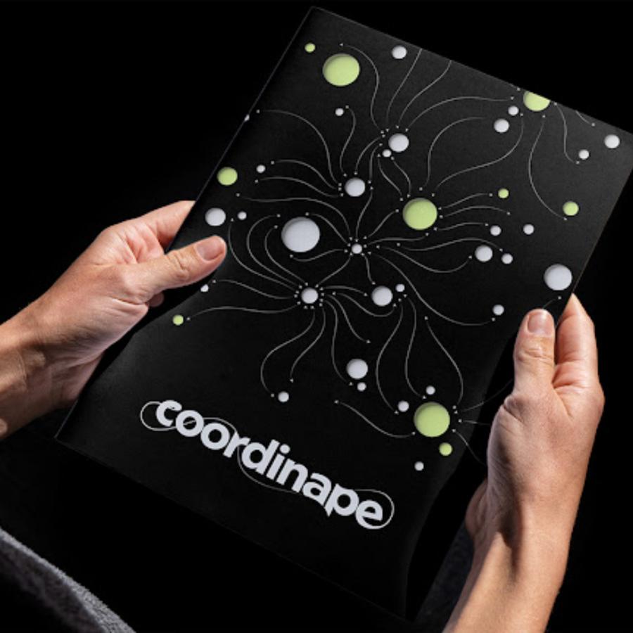
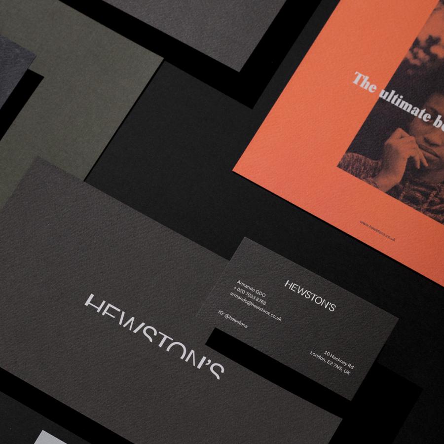
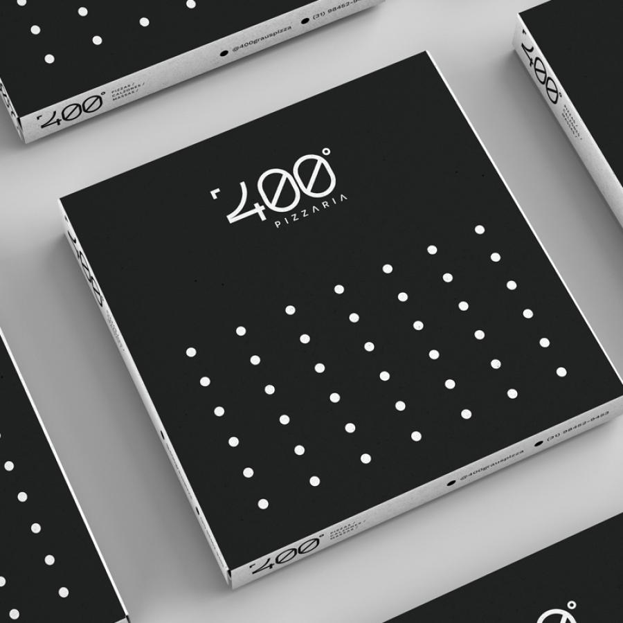
Discover how estúdio black shaped the resilient branding and visual identity of Cactus construction.
Cactus, a construction company, embodies resilience and sustainability, drawing inspiration from its namesake. Estúdio black crafted a compelling visual identity that mirrors these core values, combining strength with natural beauty. This article explores how the branding elements reflect Cactus’ mission to build inspiring and lasting structures.
The Vision Behind Cactus
Cactus isn’t just about construction; it’s about creating spaces that inspire and connect. The company views each project as an opportunity to innovate, reflecting their foundation of resilience and commitment to sustainability. This vision extends beyond bricks and cement, focusing on shaping the world with solid visions and values.
Estúdio black took on the task of creating Cactus’ visual identity. The challenge was to encapsulate the essence of resilience and sustainability in a visual format that resonates with the company’s ethos. The result is a brand identity that stands out in the construction industry for its unique blend of strength and beauty.
Key Elements of the Visual Identity
1. Logo Design: The logo reflects the sturdy yet adaptive nature of a cactus. Its sleek and modern design symbolizes the company’s forward-thinking approach and commitment to creating enduring structures.
2. Color Palette: The color scheme incorporates earthy tones, evoking a sense of natural strength and sustainability. These colors not only represent the physical materials used in construction but also the environmental consciousness of the company.
3. Typography: The fonts chosen are bold and solid, yet with a touch of elegance, mirroring the dual focus on strength and aesthetics.
4. Imagery: Visual elements include imagery of natural landscapes and construction projects, highlighting the harmony between built environments and nature. This reinforces the company’s commitment to sustainable building practices.
Connecting Through Design
Cactus’ visual identity goes beyond aesthetics; it tells a story of resilience and connection. Each branding element is meticulously crafted to communicate the company’s dedication to building not just structures, but also relationships and communities. The cohesive design by estúdio black ensures that every touchpoint, from business cards to project signage, conveys a consistent message of strength and sustainability.
Cactus’ branding and visual identity, designed by estúdio black, successfully encapsulate the company’s core values of resilience and sustainability. This well-thought-out visual identity helps Cactus stand out in the competitive construction industry, demonstrating how strong design can effectively communicate a brand’s mission and vision.
Branding and visual identity artifacts
For more information make sure to check out estúdio black at bento.me/estudioblack


