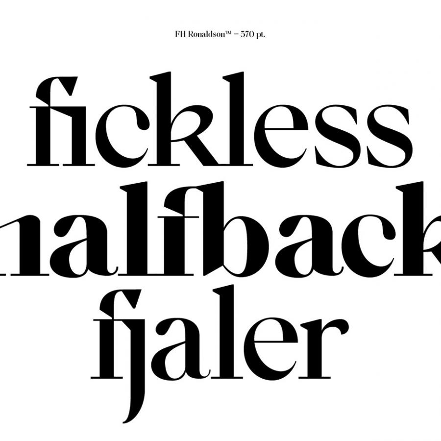
It's been a little over a week since my last article, It's always a pleasure to write about things that we do enjoy featuring on hottopbest. As a comeback, I would like to feature the work of Fatih Hardal and his font display family titled: FH Ronaldson™ Display. It's a beautiful, stylish, and modern (to its small details) display font. To my perspective, there are some similarities to the Didot Typeface but there are much more involved hereabouts to its core. If you find interesting and might wanna give a try. You can always do so via https://hardalstudio.com.
Links
FH Ronaldson was produced as a similar version of FH Phemister. Phemister type feet are used sharply. The name Phemister comes from Alexander Phemister. Inspired by Ronaldson Old Style, which came from the same letter foundry, the name FH Ronaldson was created. It has been released as the 2nd version of this series. Vertical Stress Thin strokes throughout Most capitals have uniform width The 2020 version contains all characters.
