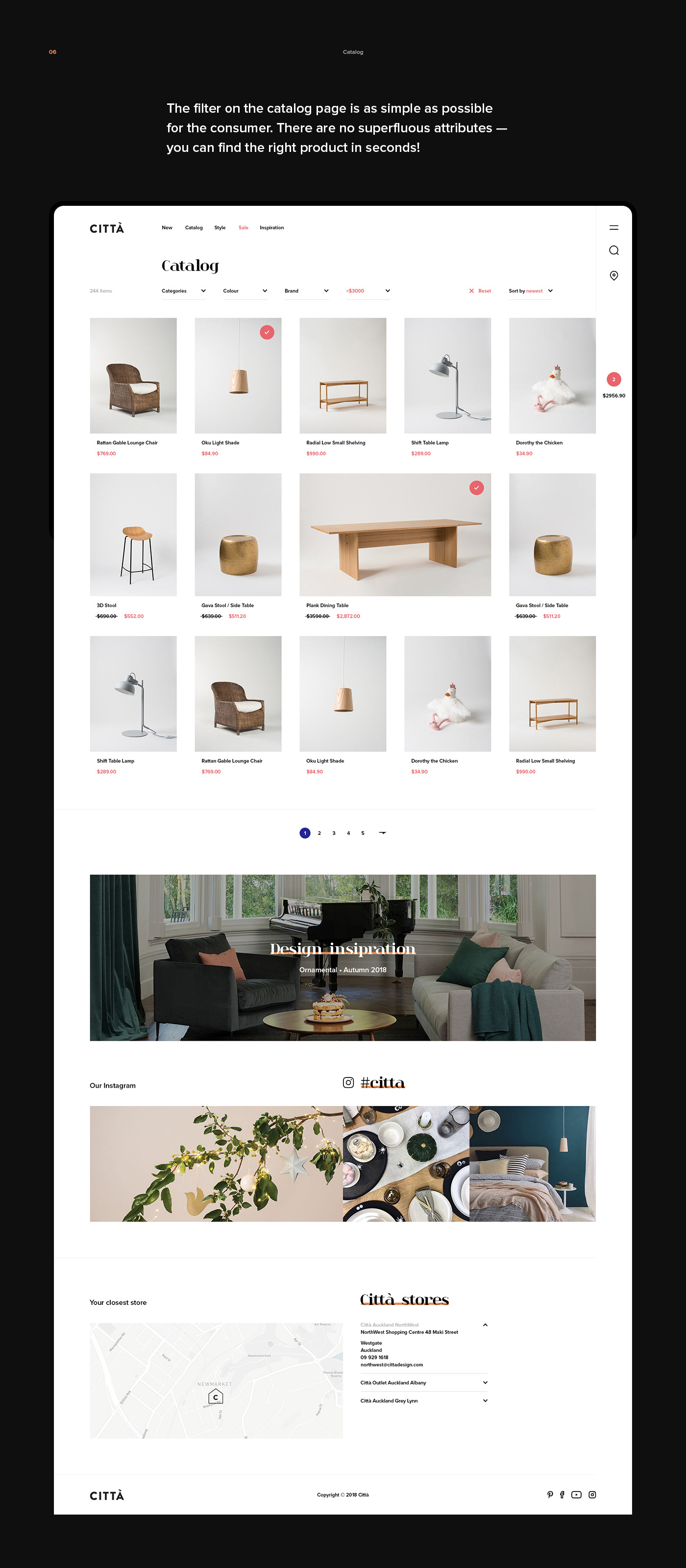
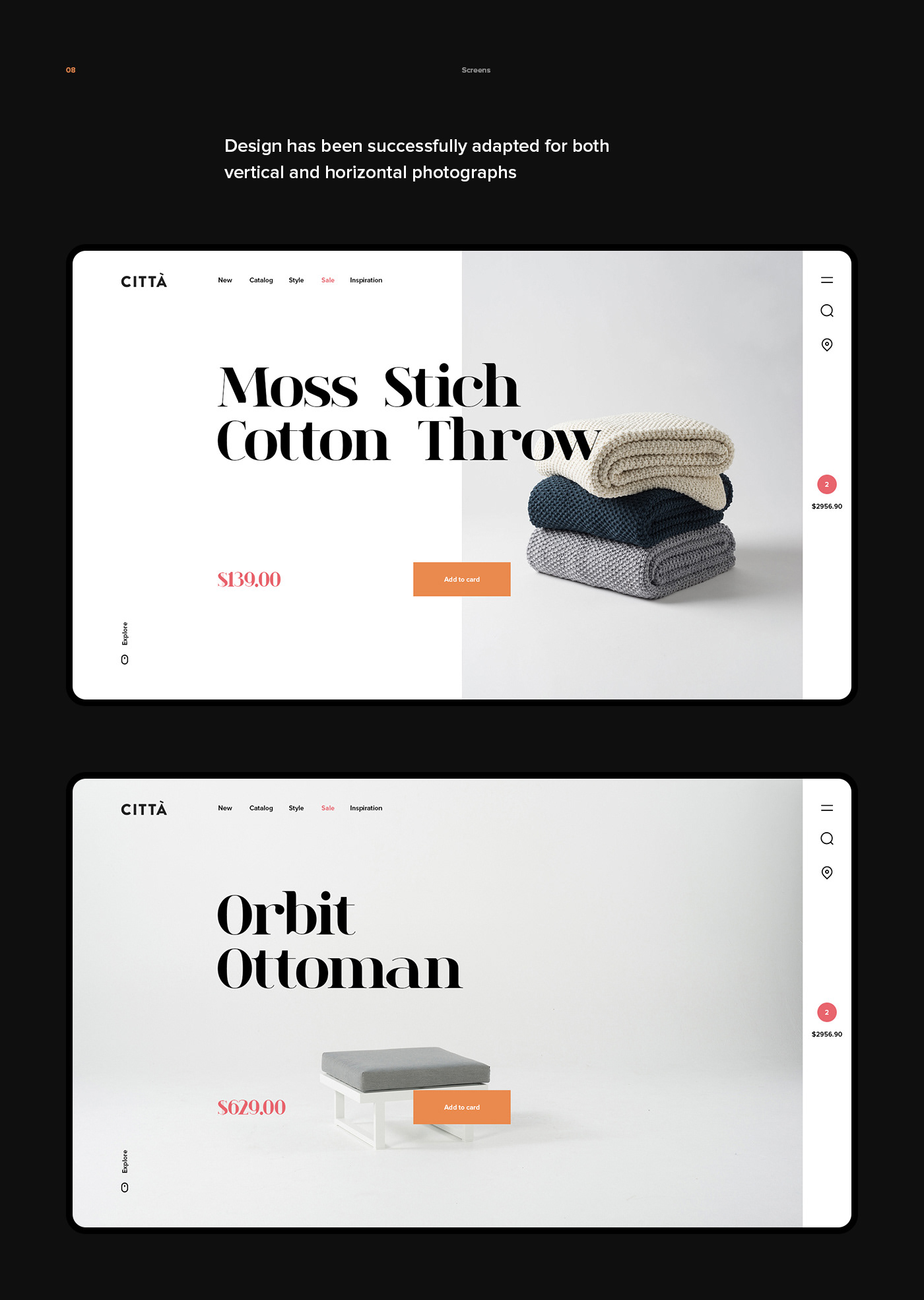
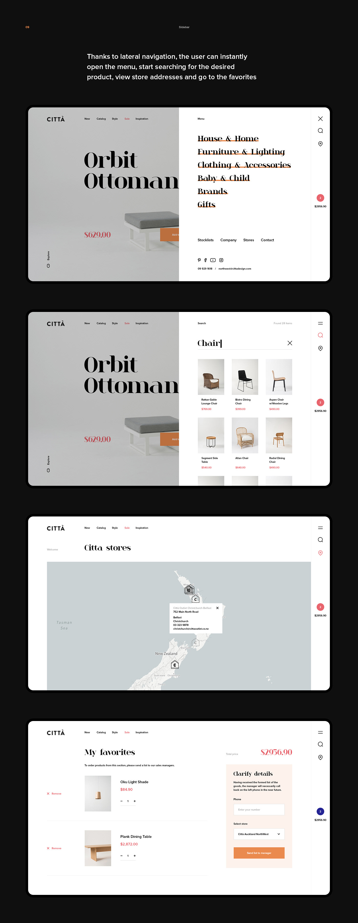
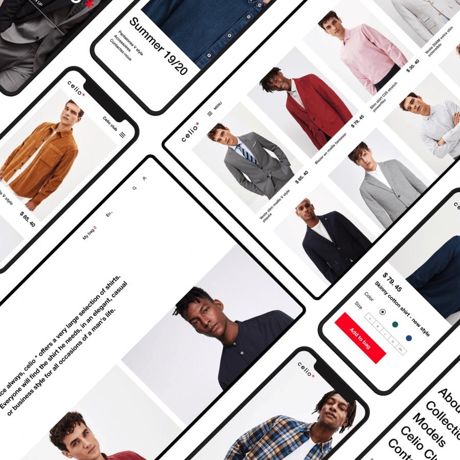
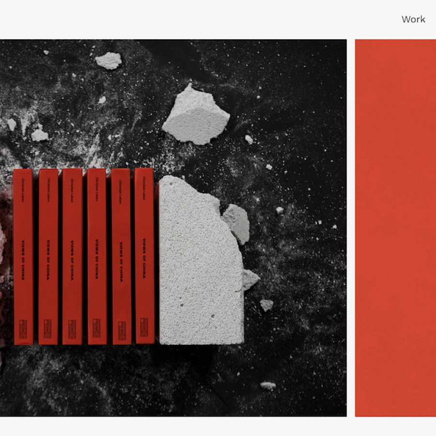
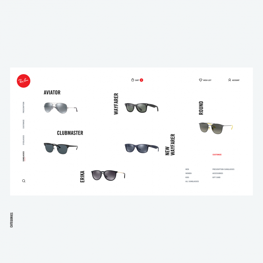
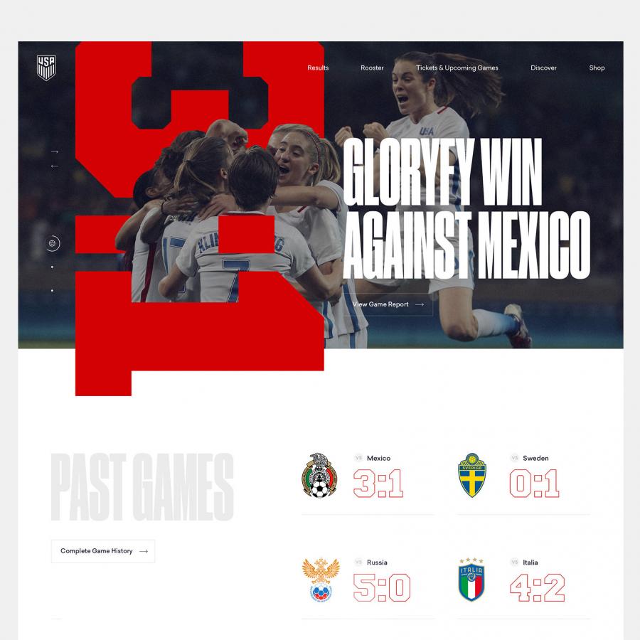
Let's take a look at this web design by Ovik Mooshlyan for a furniture website concept. He is a UI/UX designer at Cetis Branding Agency based in Moscow, Russian Federation. His retail concept has interesting points to share with having the total straight in the navigation bar. I personally liked the grid system which was pretty unconventional where he didn't use any shadows or blur. We are getting used of seeing more and more retail web designs looking more alike to each other, it's nice to discuss a design taking another direction.
More Links
Web Design


