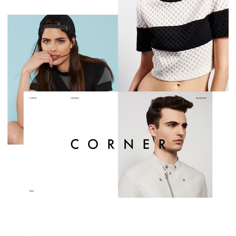
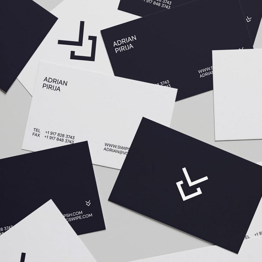
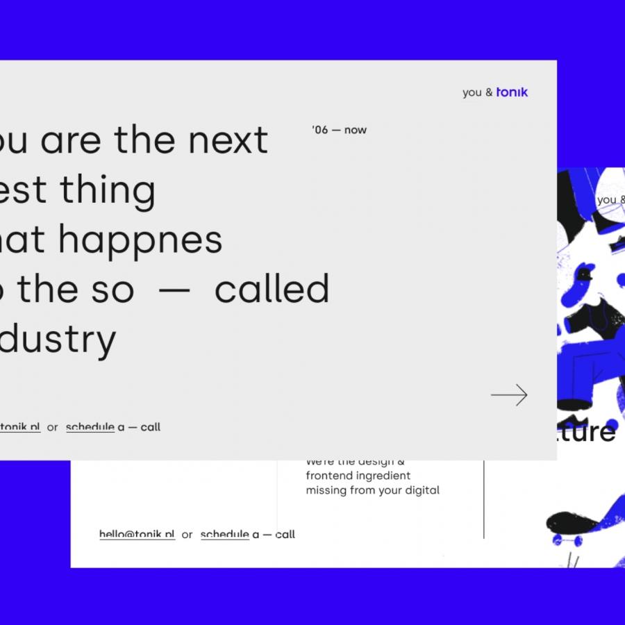
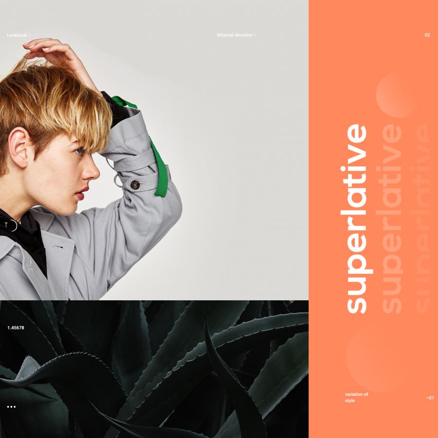
Concept projects are always fun and give us the opportunity to work on different ideas or solutions for companies we love. I am a believer that any exercise is always worth doing. I would probably not use a concept project in my portfolio, unless it’s something that I believe highlights a particular set of skills, let’s say, motion design. With that in mind, I think everyone should be always practicing, if you don’t have a personal brand to use as subject, taking your favorite company might do just fine like the project that MinJi Seo shared on Behance using Patagonia.
It’s interesting to see how MinJi describes the company and tries to illustrate the creative process based on that. I believe this project is a visual design exercise more than UX based on the information. Also if you compare the real site with the one she proposes, you will notice that her interpretations is much more minimalist in terms of links on the page. I believe for company that needs to sell merchandise, it’s important to have most of the links. I might be wrong, but as I said, I will treat this as a pure visual design inspiration and for that I believe it’s worth sharing here on hottopbest.
Visual Design
