by abduzeedo
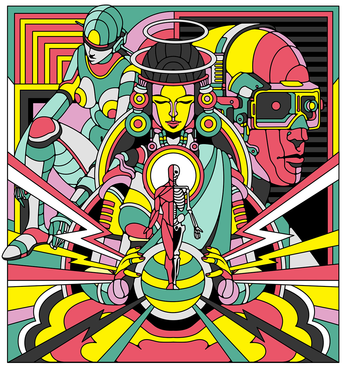
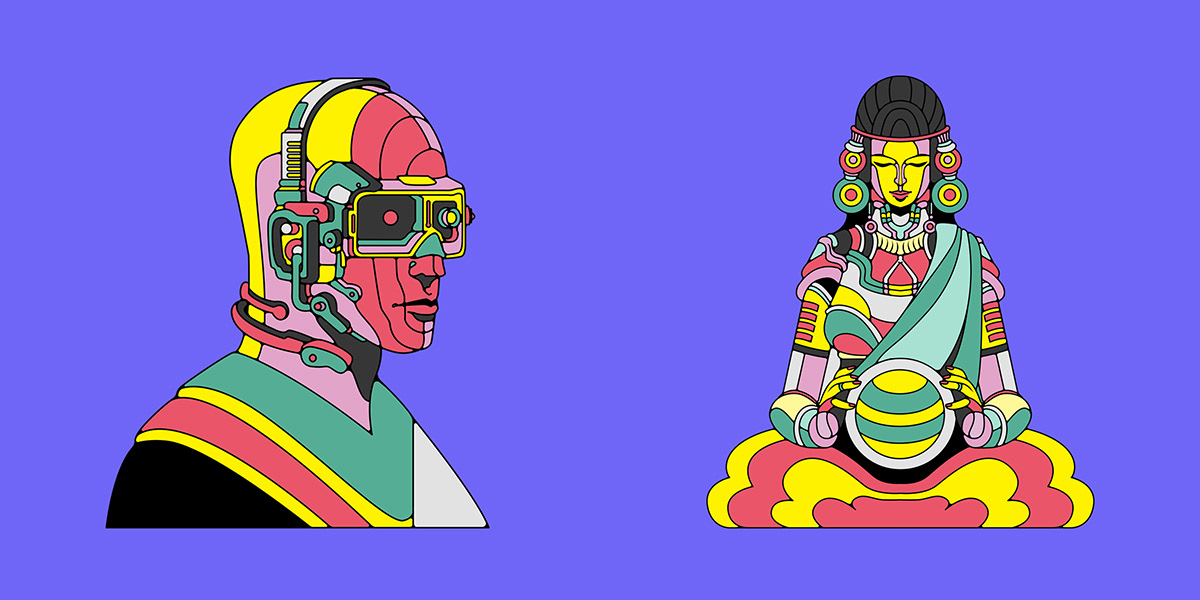
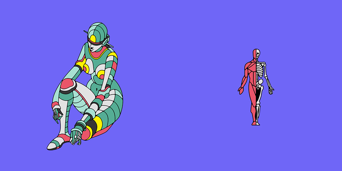
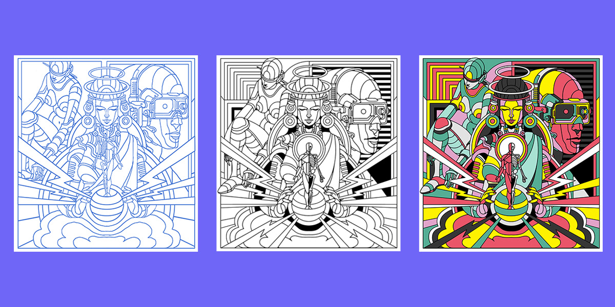
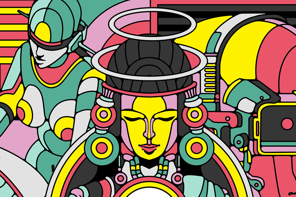
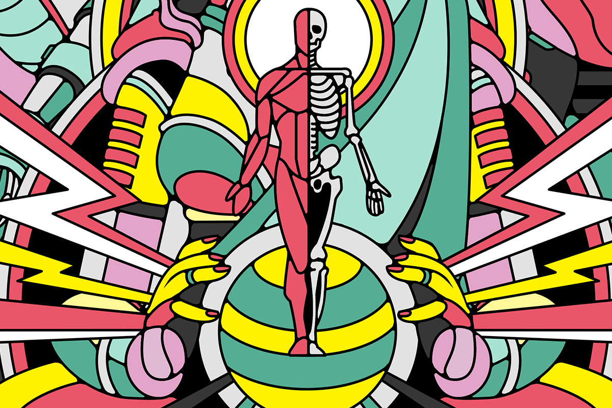
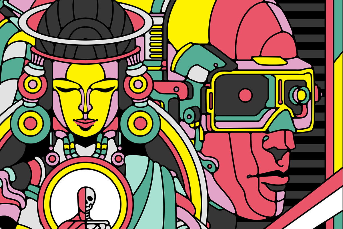
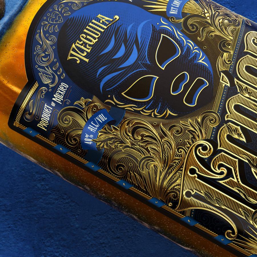
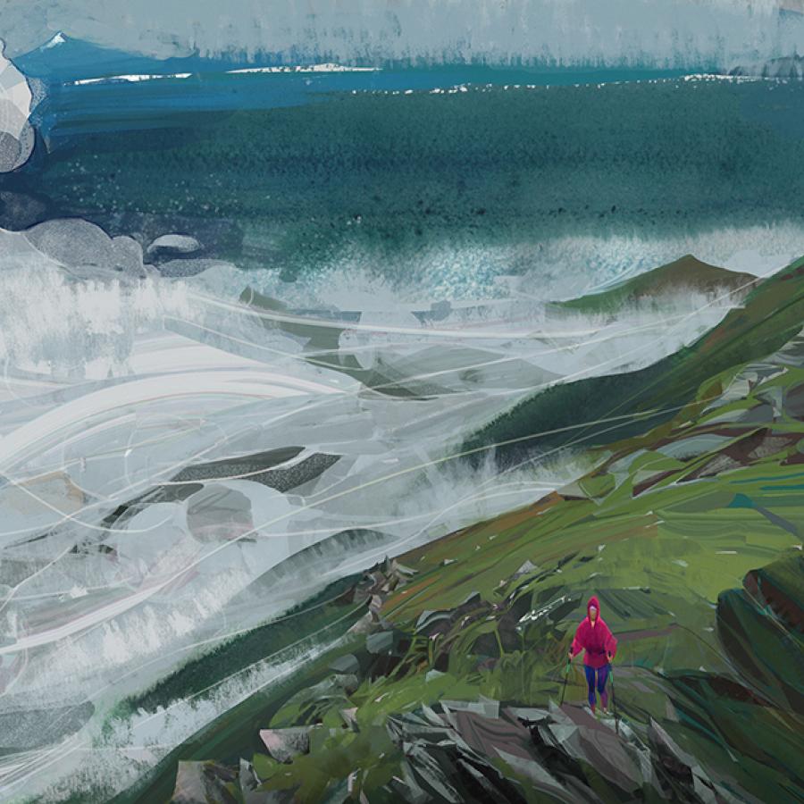
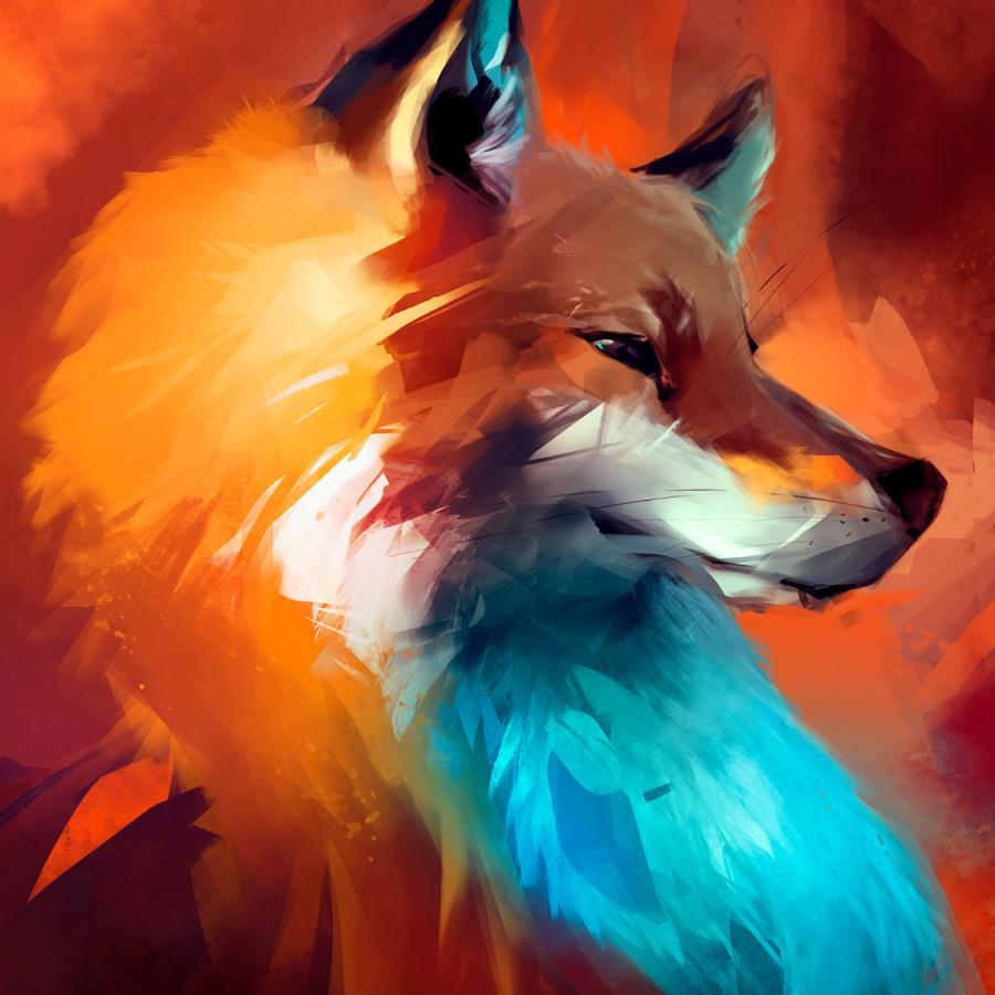
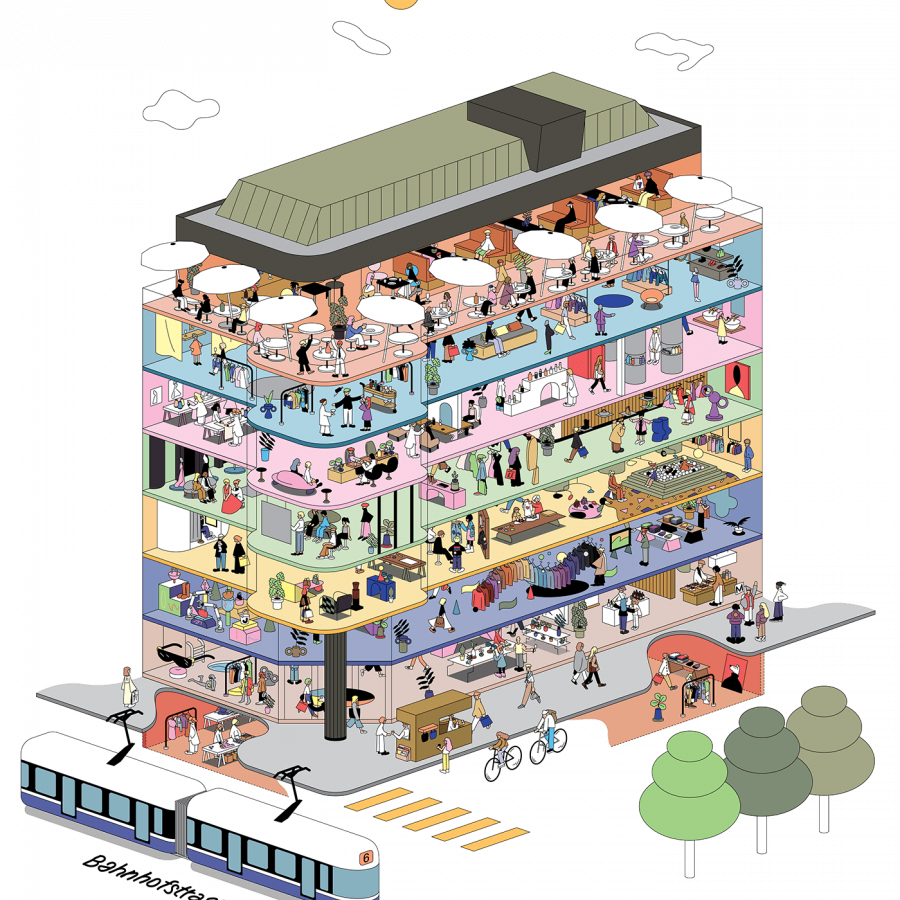
I haven't posted about illustration projects for a long time. I have been a bit too focused on brand identity and UI/UX probably because it's something closer to what I do at work, which helps me to get inspired. However the work of Raul Urias is simply phenomenal and I had to share it here with you all. The style is quite unique, with bold colors and a nice black stroke of color defining the forms. It feels super fresh but with that hint of old school/vintage look. It's hard to explain, so that a look and let me know what you think.
This illustration work was done for the French magazine Usbek & Rica. You can check out more about it at https://usbeketrica.com/. Also make sure to visit Rauls website and full portfolio, it's simply awesome, http://rauluriasart.com/
Illustration
