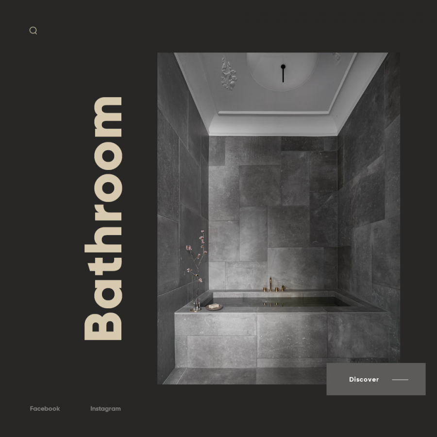
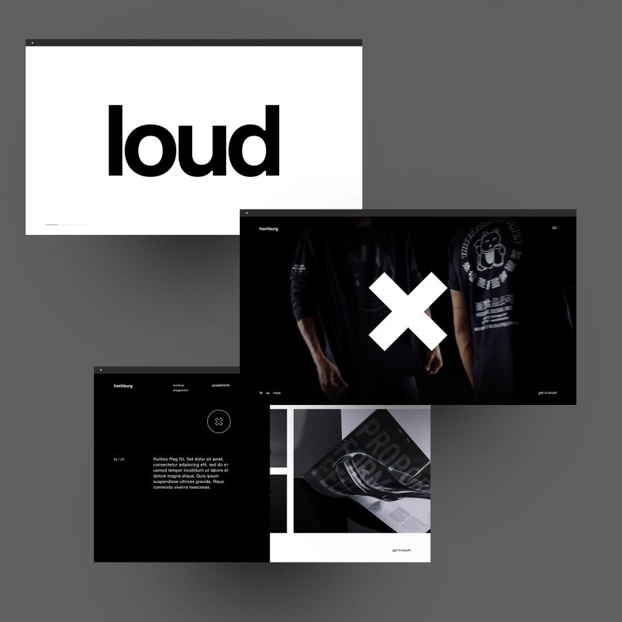
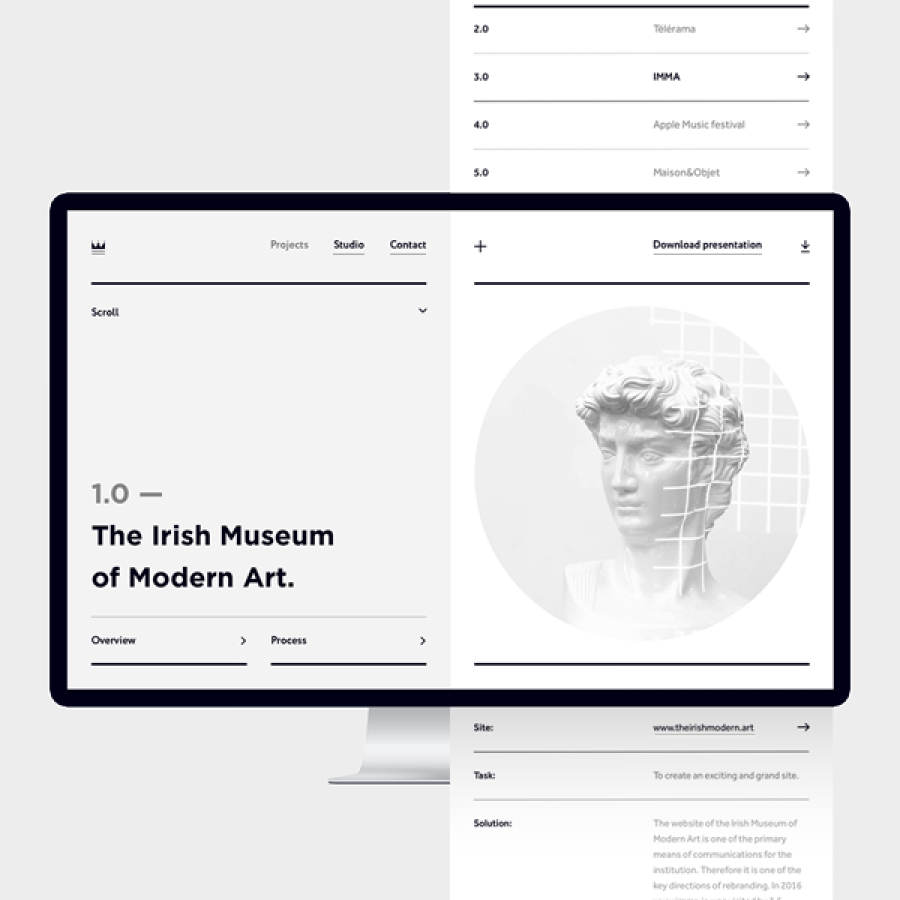
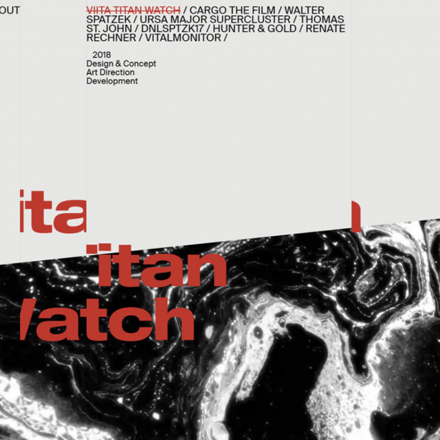
Hrvoje Grubisic shared a beautiful web design project featuring a crisp and classic typographical look. If you look at it very closely you will understand why I love it. It does remind me of some of the screens of the blog, but Hrvoje definitely did a much better job than I did here.
