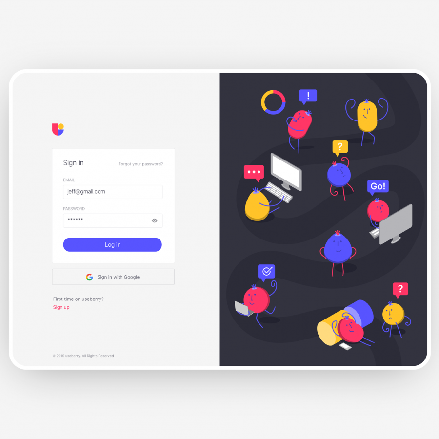
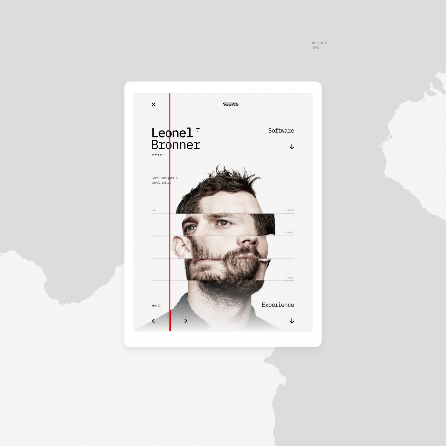
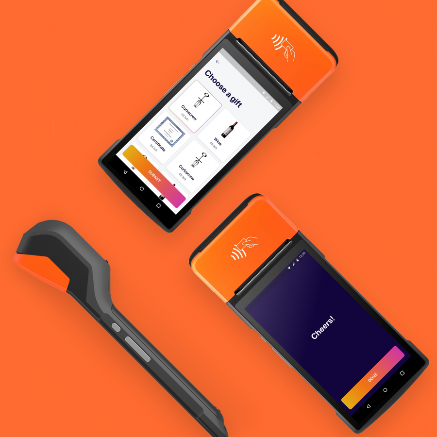
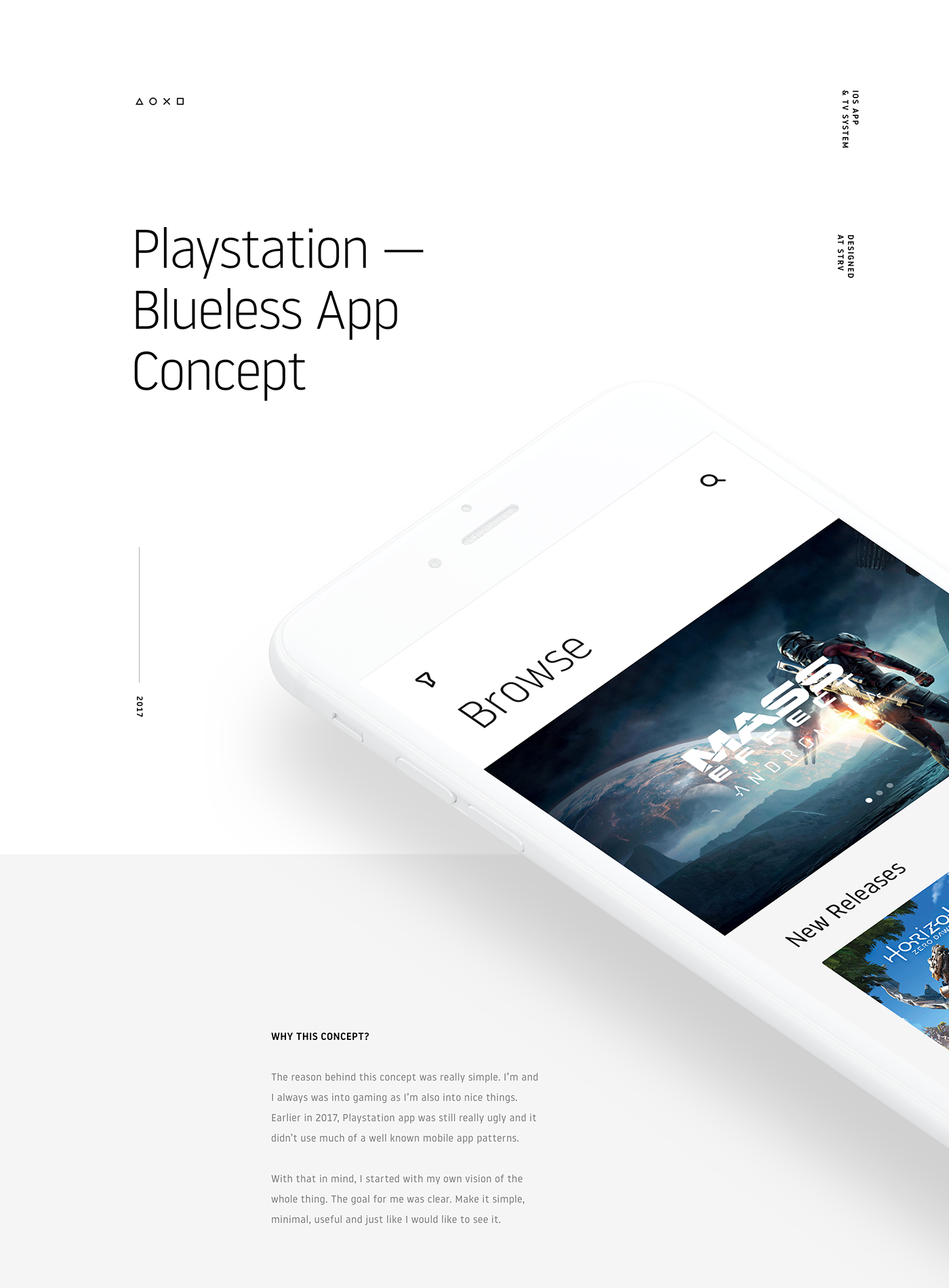
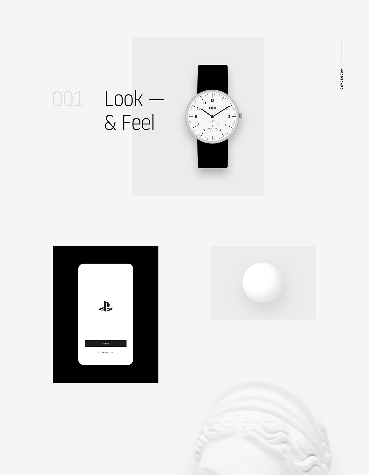
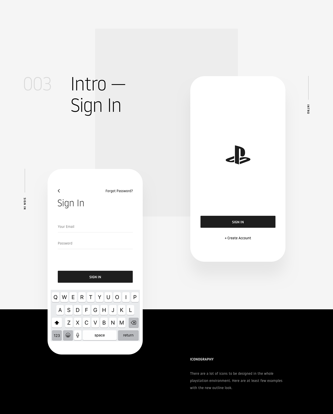
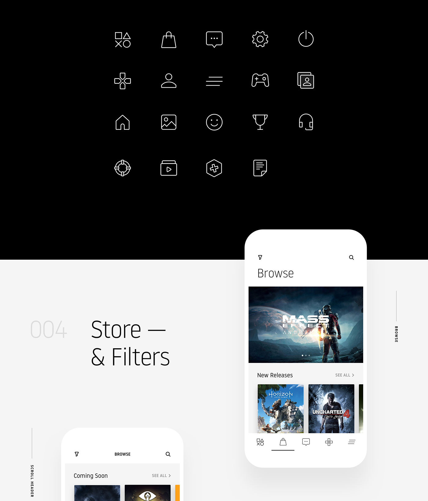
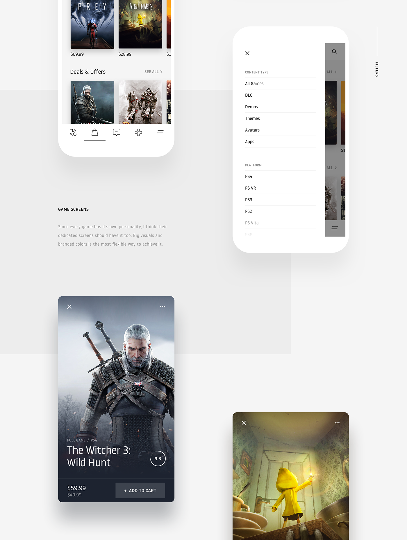
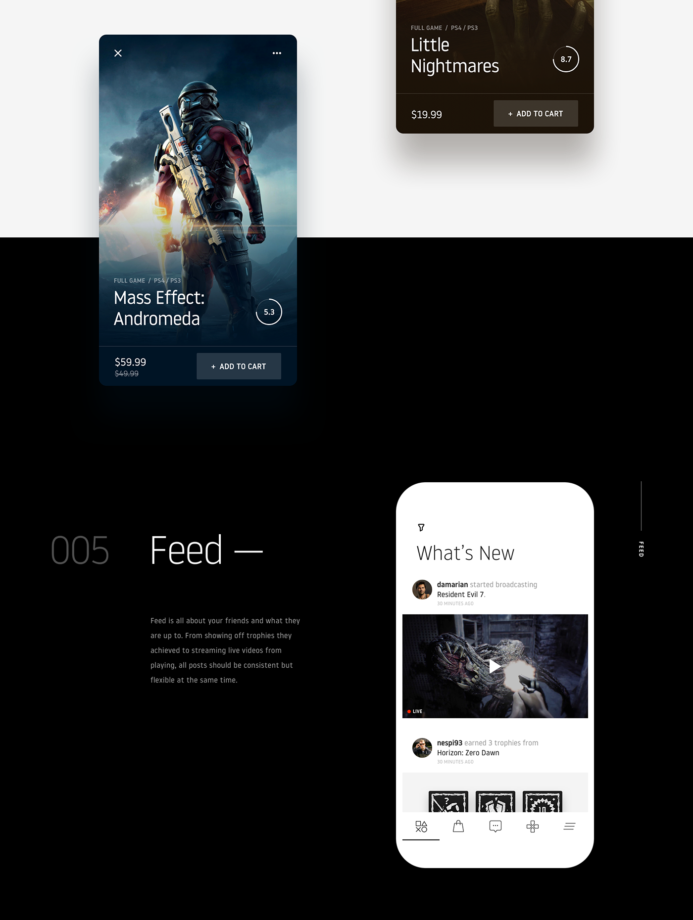
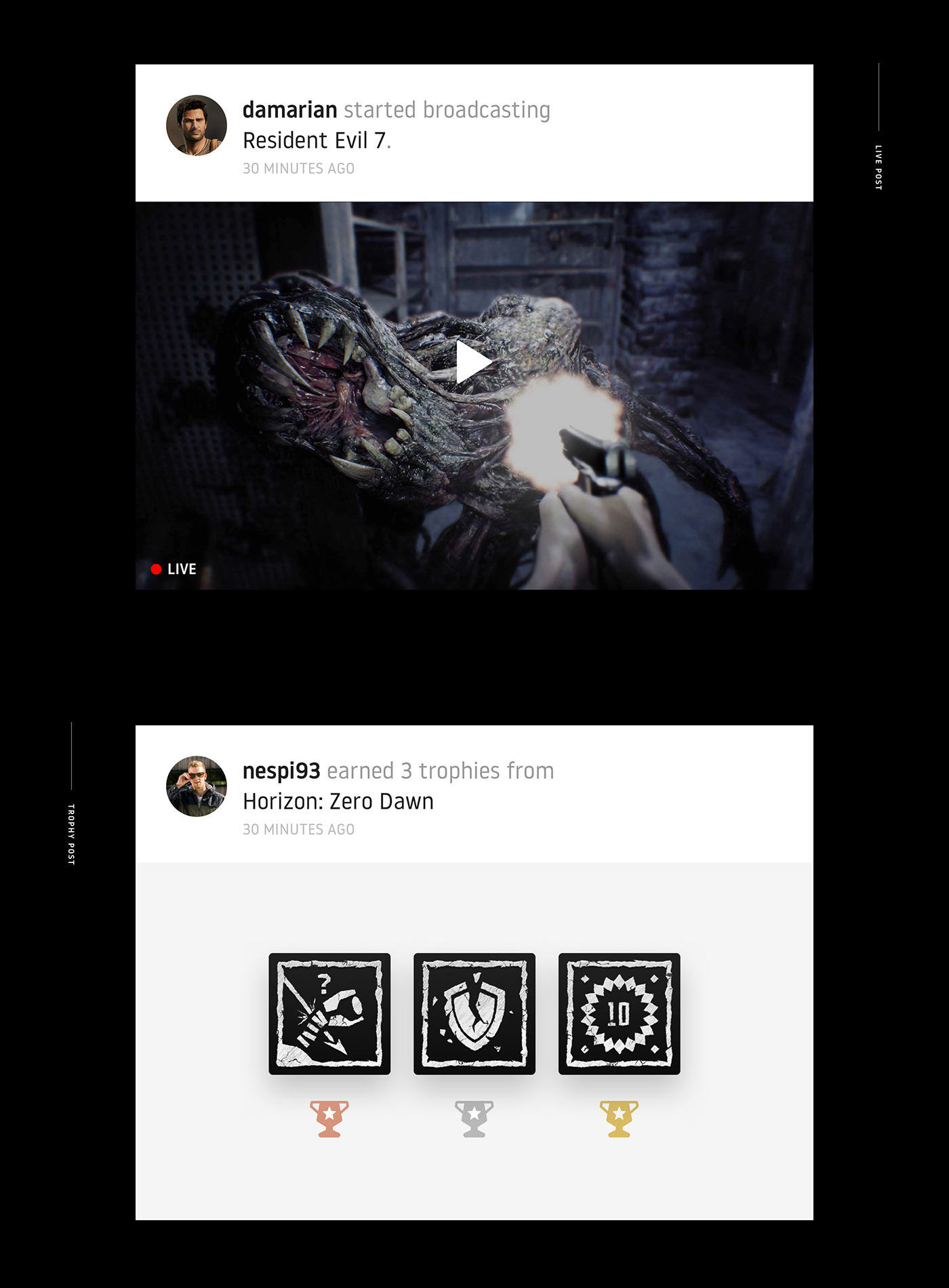
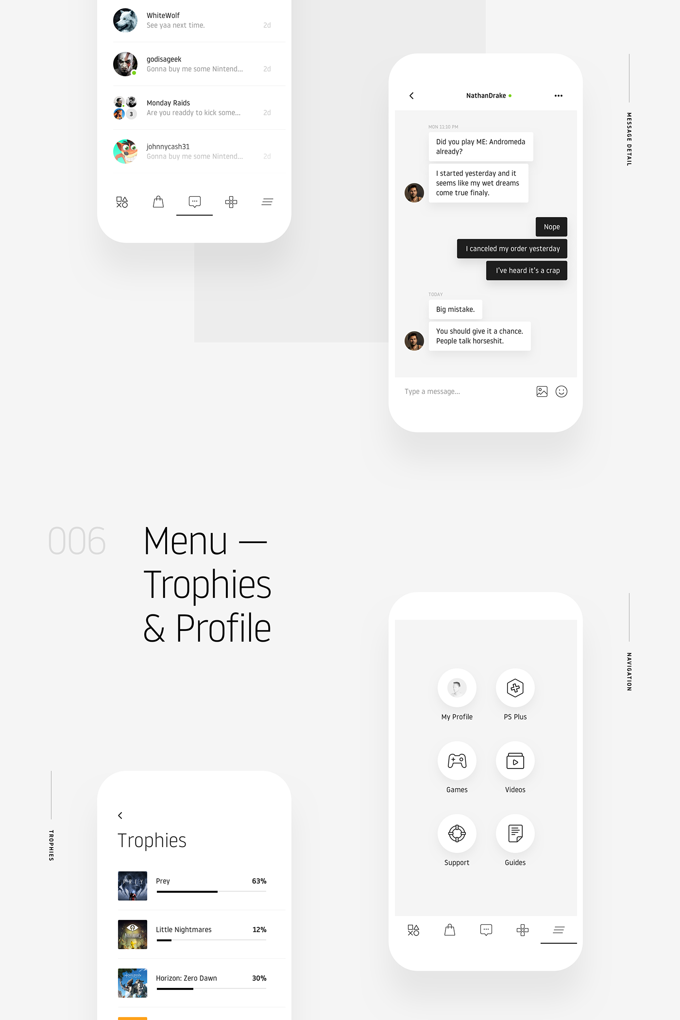
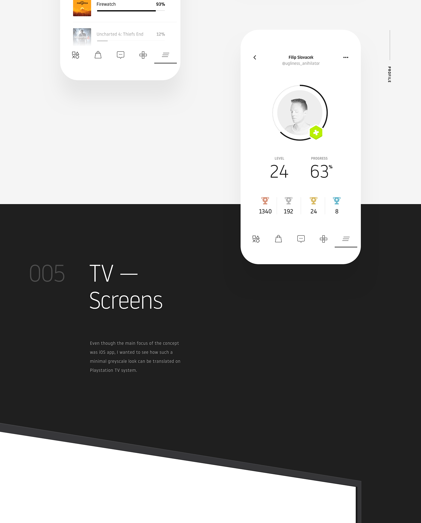
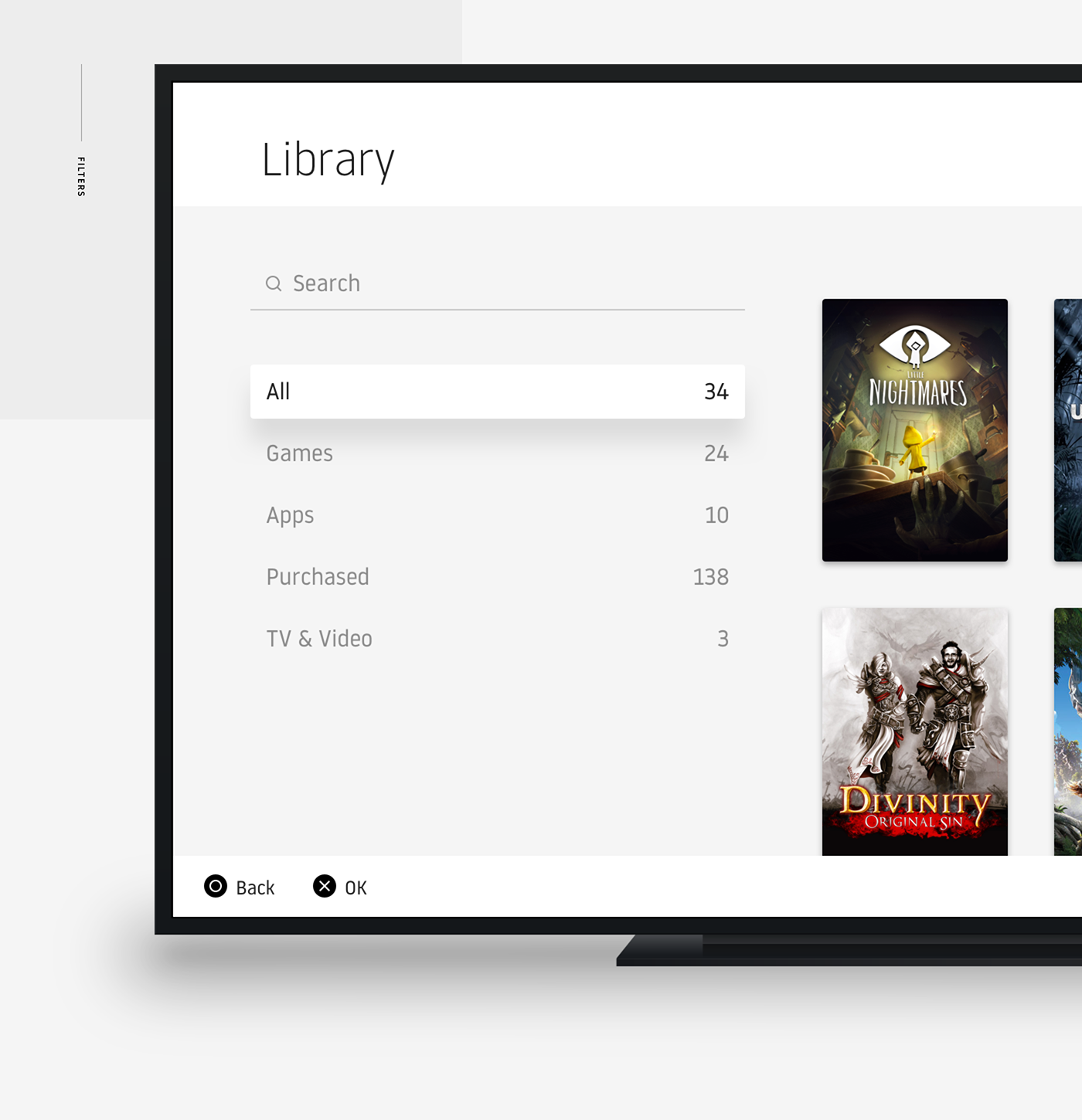
Minimalist app design seems to be more than a trend but a expected evolution for interface design. Before people were not familiar with these new touch devices, it was important to make sure things had a connection with the real things, therefore the hyper-realistic design full of shadows, depth, texture and colors. I am not saying that it's not important to highlight what is tappable or not and trust me, I am very familiar with the subject. But the more used people get with the devices the basic interface starts to take the passenger seat and let the content drive the user attentions. In the web 2.0 content was king, then we had context being the king. Now we have both at the same time. The app design concept that STRV Team shared for the Playstation app is a quite interesting one. There are a lot of things to love but also quite a few raised eye-browns. But remember, it's an concept so let's try to get inspired.
STRV Team is a design studio basedi n San Francisco with a quite elegant portfolio. For more information make sure to check out http://strv.com/
We love what we do, and we strive to provide the best services for our clients. The aim is to become part of your team, and with the help of our developers and designers create meaningful digital experiences.
Minimalist App Design Concept



Made with love in STRV
