Discover how Fable&Co. rebranded SUSI Partners, a sustainable investment firm. The new branding and visual identity, built on clean lines, fluid curves, and a strategic color palette, communicates trust, innovation, and a commitment to a greener future.
When it comes to branding in the investment world, clarity and trust are paramount. Fable&Co. took on the challenge of rebranding SUSI Partners, a Swiss investment firm focused on sustainable energy. The goal? To visually communicate SUSI's forward-thinking approach and commitment to a greener future.
The new brand identity is built on clean lines and a streamlined form. This minimalist style ensures versatility across platforms while projecting an image of efficiency and transparency. The logo's upward-sweeping lines and the fluid curves used throughout evoke a sense of progress and optimism.
Color plays a vital role in the rebranding. The chosen blues and greens aren't just visually appealing; they carry deep associations with nature, technology, sustainability, and innovation. This color palette subtly reinforces SUSI's core values and mission.
Typography and graphic elements further enhance the brand's personality. The combination of modern typography with a grounded design creates a balance between established expertise and progressive thinking. The overall effect is one of trust, dependability, and a global perspective on energy solutions.
The new website is the centerpiece of SUSI's brand identity. It's designed to be both practical and engaging. Meticulous planning and subtle animations create a seamless user experience, effectively showcasing SUSI's mission, approach, and culture.
Fable&Co.'s work with SUSI Partners demonstrates how thoughtful branding can reinforce a company's core values and resonate with its target audience. In a world increasingly focused on sustainability, SUSI's visual identity positions them as a leader in the energy transition.
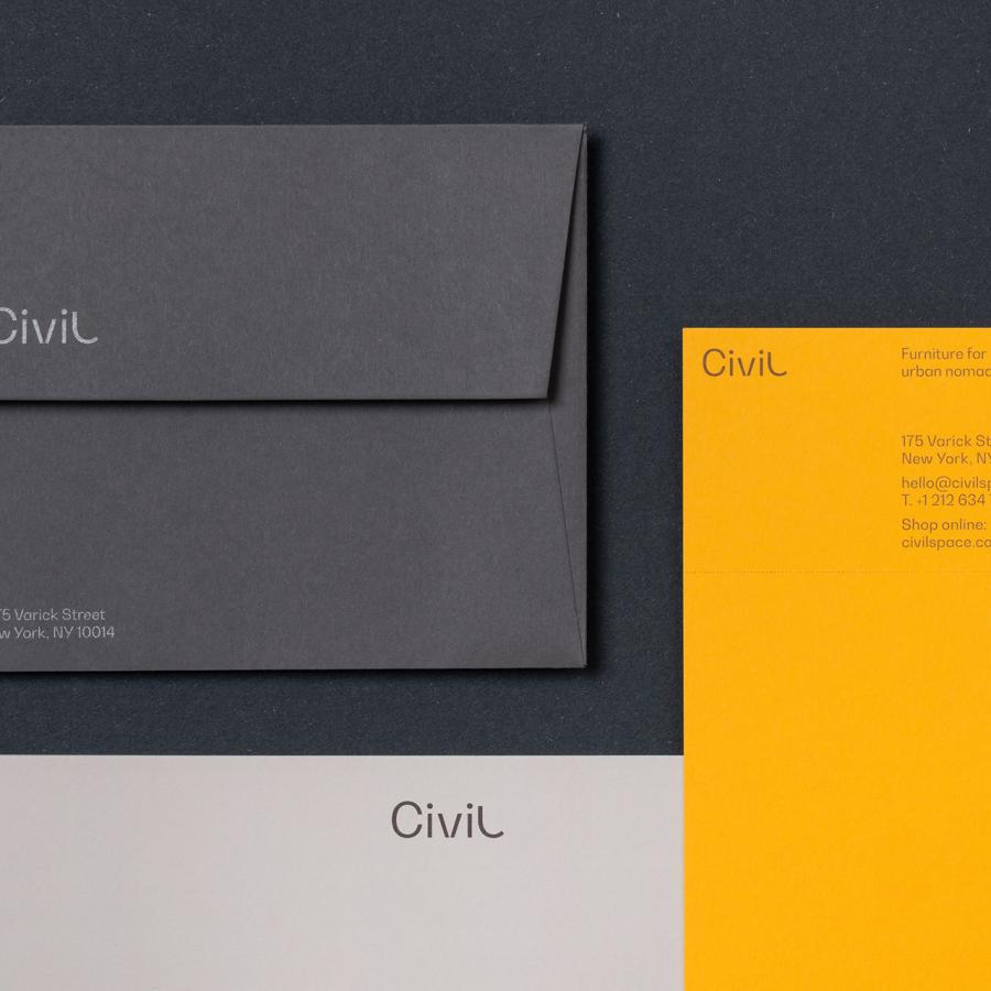
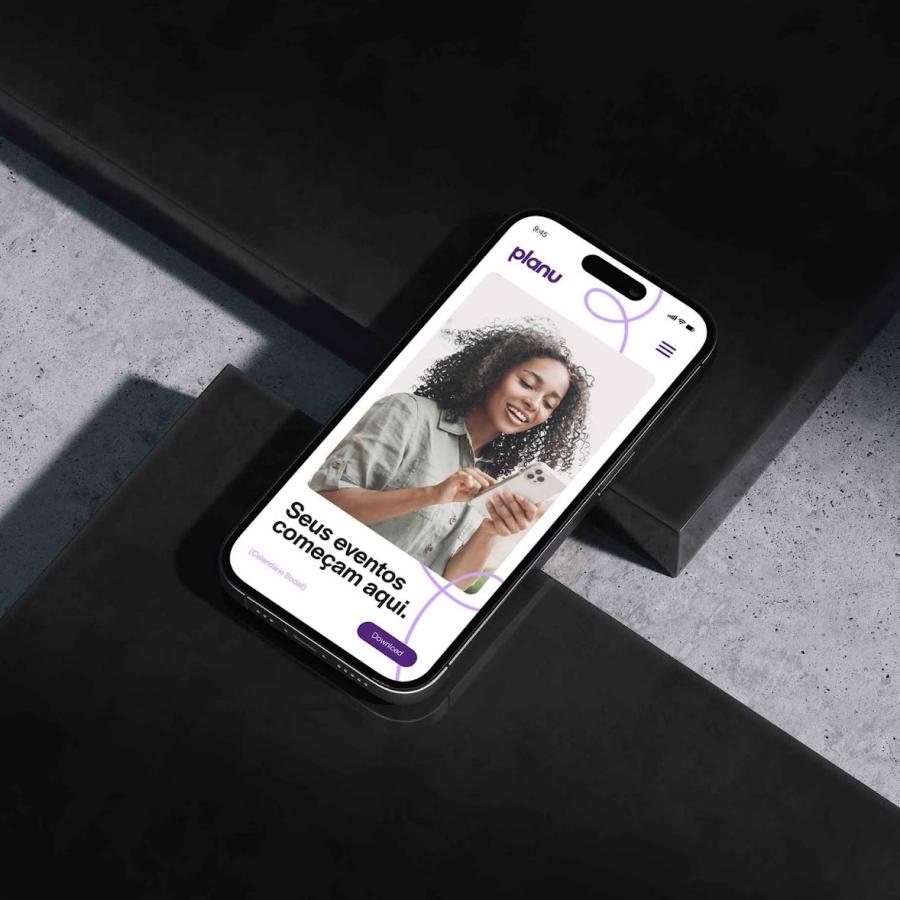
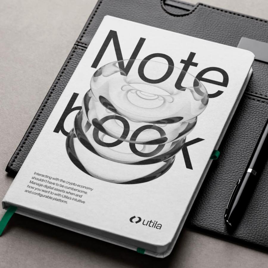
Branding and visual identity artifacts
For more information make sure to check out fableco.uk/


