by abduzeedo
Dive into the innovative branding and visual identity of O BLOCO, where creativity meets avant-garde design.
In the world of advertising, maintaining a creative and avant-garde identity can be challenging. This is where O BLOCO, designed by Manoel Michael, stands out. It’s not just a party or a stage for artistic interventions. It’s a platform where music, technology, tattoo art, unexpected experiences, and unlikely combinations come together to create a unique event.
O BLOCO has developed a changeable brand system with infinite possibilities. This system reflects the different perspectives of understanding what a block is and what the event could become. This variety helps to tell the story of O BLOCO and to create unique visual identities.
The visual branding system forms the foundation for building the visual identity. This ensures that there will always be unique visuals linked by a brand and a general concept of construction. For unique events, it’s necessary to have unique visuals, where everyone is interconnected by an always unique brand.
In conclusion, O BLOCO is more than just an event. It’s a testament to the power of branding and visual identity in creating a unique and memorable experience. For more information, visit Manoel Michael’s portfolio on Behance.
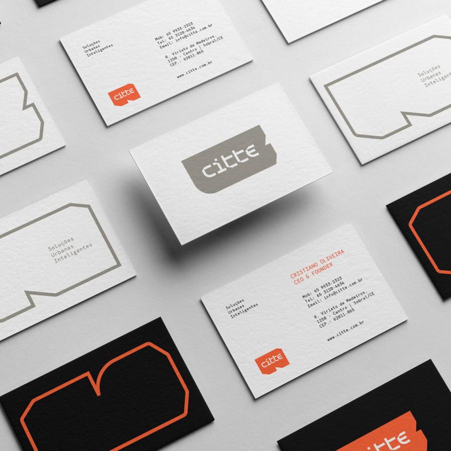
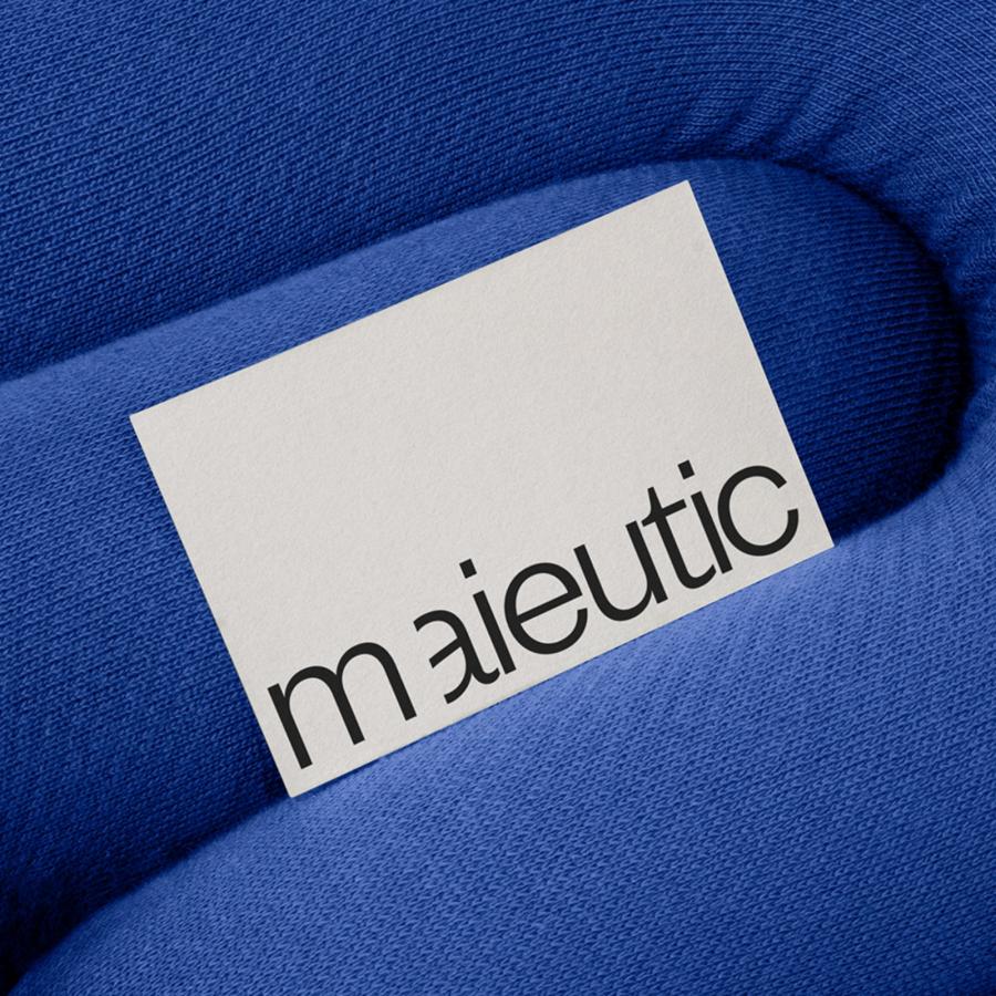
Branding and visual identity artifacts
Credits
- Studio: Agencia Ampla
- Designers and collaborators: Manoel Michael, Ricardo Barros, Thiago Couceiro, Yago Santana, Aliwton Carvalho, Henrique Pereira.
- More info: co.blo
For more information make sure to check out Manoel Michael Behance profile.
