Forest IQ is an innovative tech platform focused on protecting our rainforests. The company recently embarked on a branding effort with Mondial Studio that would position it as a more corporate-focused entity rather than a traditional NGO.
The main goal of the project was to create a branding and visual identity that felt more at home in the technology and finance worlds, without resorting to cliché environmental charity graphic language or earthy colors. To achieve this, the Forest IQ team went back to the drawing board and came up with a new visual identity that reflects the company's core values while also appealing to a more corporate audience. The new visual identity is centered around a symbol that represents data storage while abstractly depicting trees, which symbolize the company's commitment to preserving our planet's rainforests.
The symbol is versatile and can be used in different ways to build the brand identity. It can be used as a frame for image containers or to graphically depict supply chains, demonstrating how the Forest IQ database tracks the entire journey from rainforest to consumer.
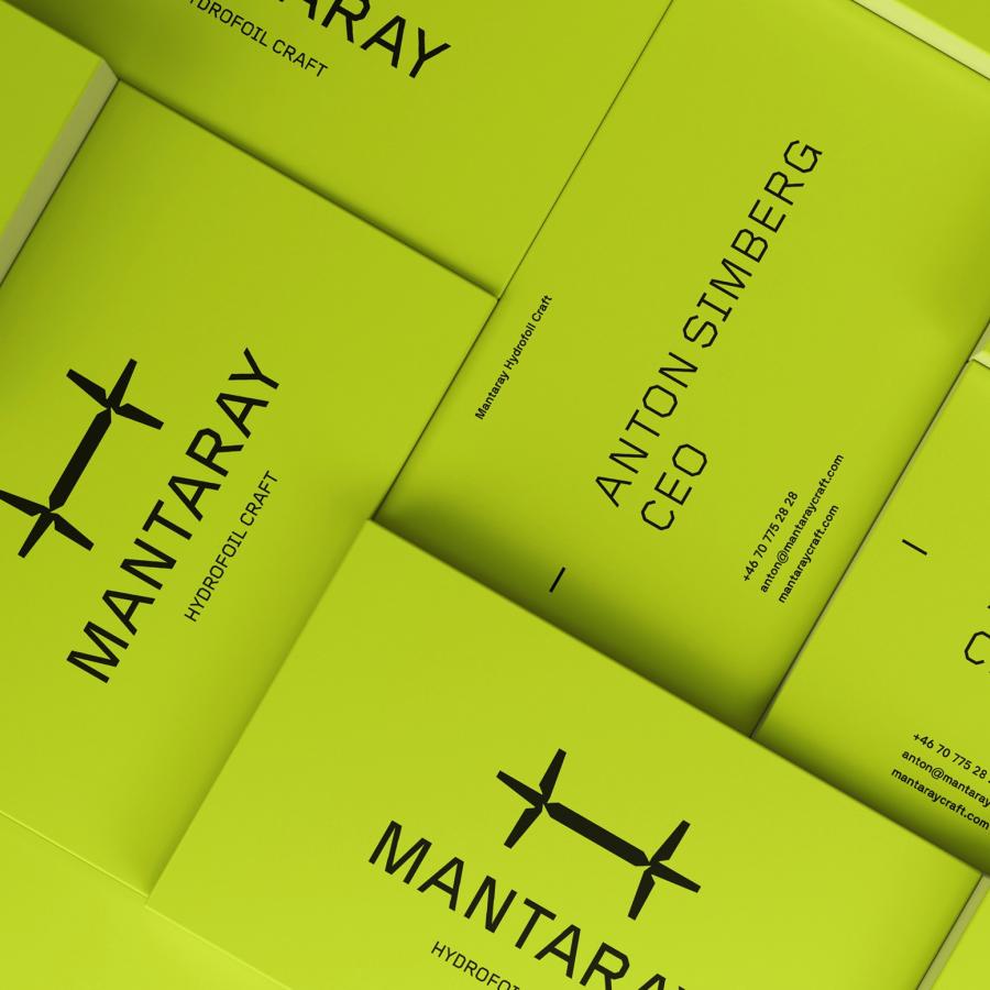
The color palette was carefully selected to strike a balance between vibrancy and professionalism. A lime/yellow hue was chosen for immediacy and urgency, while a deep blue provides a more sober and professional tone to the overall brand. This combination of colors helps to evoke a sense of urgency in the viewer while also conveying the company's professionalism and credibility.
In conclusion, the Forest IQ rebranding effort has successfully positioned the company as a more corporate-focused entity, without losing sight of its core values. The new visual identity is versatile, modern, and aligned with the company's mission to protect the world's rainforests. With its vibrant color palette and versatile symbol, Forest IQ is poised to make a significant impact in both the technology and finance worlds, attracting clients who value sustainability and environmental responsibility.
https://lh5.googleusercontent.com/e6-NFeAzUPqDyI_1nnHh--8hUxq2CifGpsJTA…" />
https://lh3.googleusercontent.com/e-MRY1J4Onej_6OkL90W4TGLT318uIotLrnbf…" />
https://lh5.googleusercontent.com/BtnehnCZKvGZDMsBllNTE0QqQHiavAokjwkw_…" />
https://lh3.googleusercontent.com/egYLrfi1a1W6ELmh-ZPQUziSgLt1Jh8rgOMjd…" />
https://lh6.googleusercontent.com/FoDcfTGn1p4n3Ur95uatSaWJZrgiKH-lhewsl…" />
https://lh5.googleusercontent.com/fXLHzmZEcn-WUPTeE846OoUiV6kqdRmcr-Vg5…" />
https://lh4.googleusercontent.com/yefgXGbd6D4WSXnALFlD5S3nMQ9DKMP0OdLuP…" />
https://lh3.googleusercontent.com/5NDmx-hpKpRYVkyb8zQC60lp2em8BzI-dGNd-…" />
https://lh6.googleusercontent.com/s1Hyyit154XU5k4BWipKH0GAl5rdzc_z4jFFC…" />
https://lh3.googleusercontent.com/EF9DpZ2paYWc3b5kXWOqAtBPvdRYETg4arGex…" />
https://lh5.googleusercontent.com/35jsnqXbbE6frdOgF2mvgnXmMV2OssopELWQ_…" />
https://lh4.googleusercontent.com/xCJF7xO8tdrL7_8vlpqga4QY4BOvxtrNyVca6…" />
https://lh3.googleusercontent.com/4WDMSvKD3Ua1sM1si_i0eHTcfGBGiVrJj5NIf…" />
TL;DR
- Forest IQ branding redesign to appeal to a more corporate audience.
- The new visual identity features a versatile symbol representing data storage and trees.
- The color palette balances vibrancy and professionalism with lime/yellow and deep blue tones.
For more information check out Mondial Studio’s website
