by abduzeedo
Michał Markiewicz shared a branding and visual identity project for Passiflora Films, a creative production company based out of Warsaw, with over 10 years of production experience in the Polish and Worldwide markets. The scope of my work encompasses comprehensive rebranding including logo, key visual and printed materials.
- The Passiflora Films symbol was developed as a result of simplification of the letters 'P' and 'F'. The letters are reflected in basic figures such as the triangle and the circle.
- The whole sign simultaneously discreetly refers to the shape of the camera.
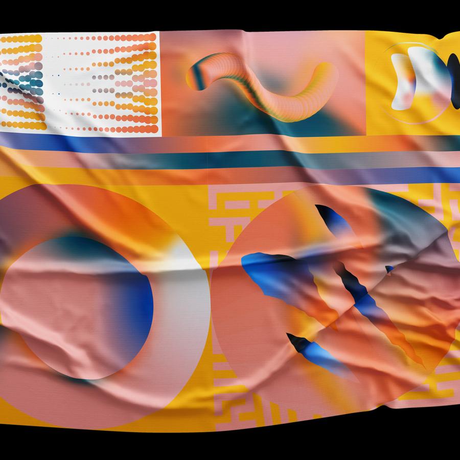
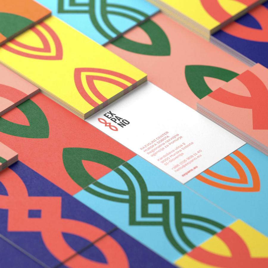
- Elements of the symbol have been used in the patterns and are more widely used across the whole visual identity system. Patterns also fulfill the function of a modular grid, in which elements such as a logo, logotype or promotional slogans are placed in various arrangements.
- The logotype was made with a Helvetica Neue typeface, in order not to produce any additional, undesirable associations with the name.
The company's recognition and character are to be built through the entire system, the sum of the elements; logo, complementary marks, colors and layout.
For more information make sure to check out
Stationery photos by Axela Frank. Also visit passiflora-films.co
