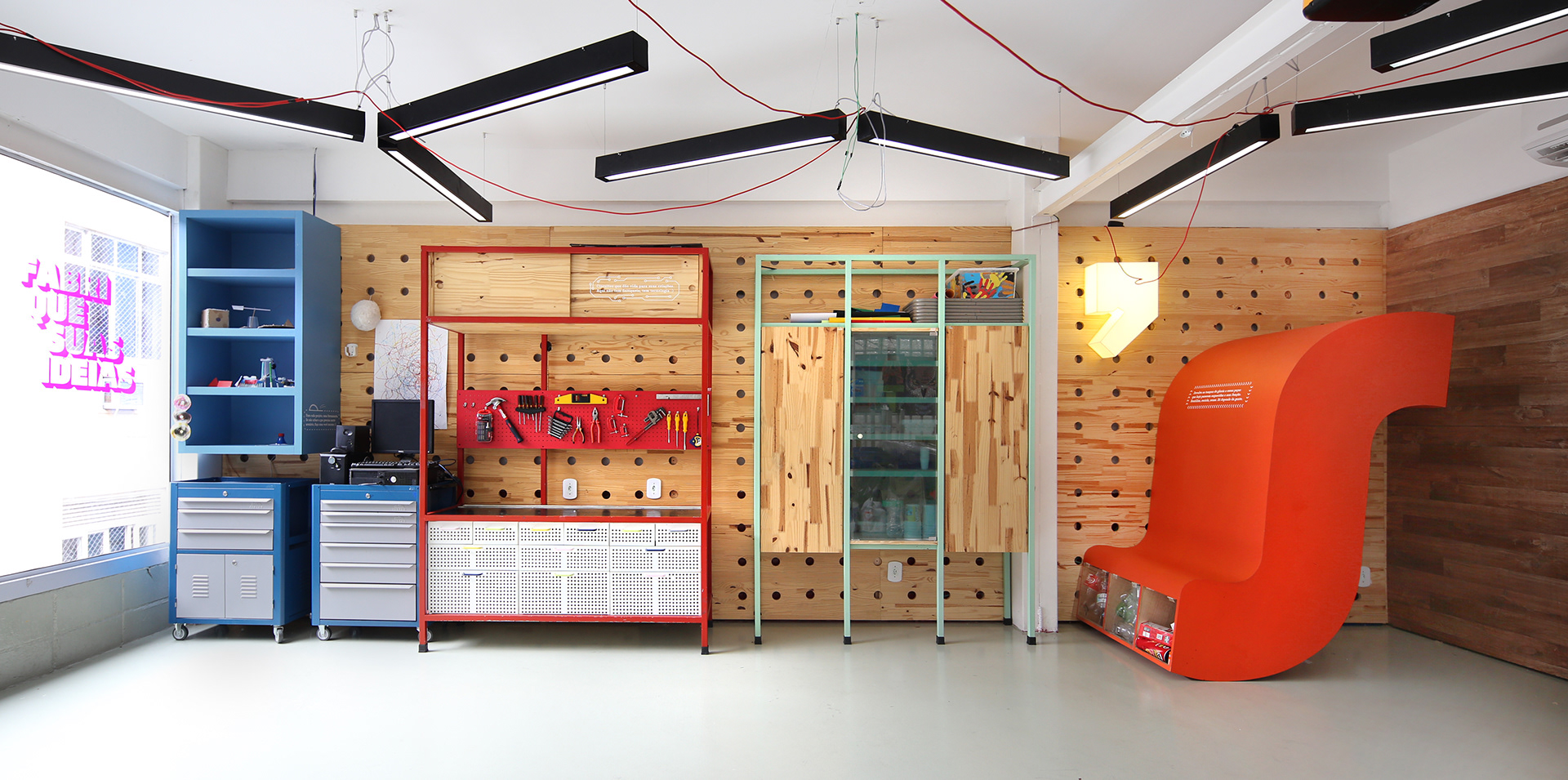
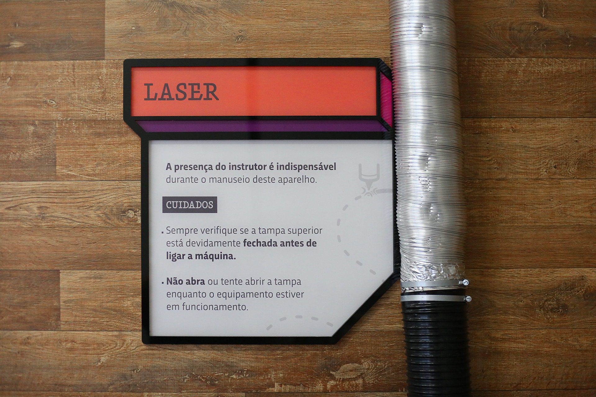
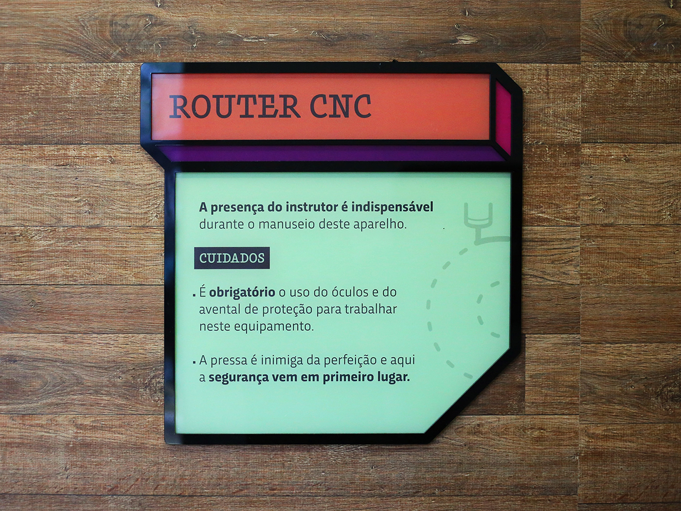
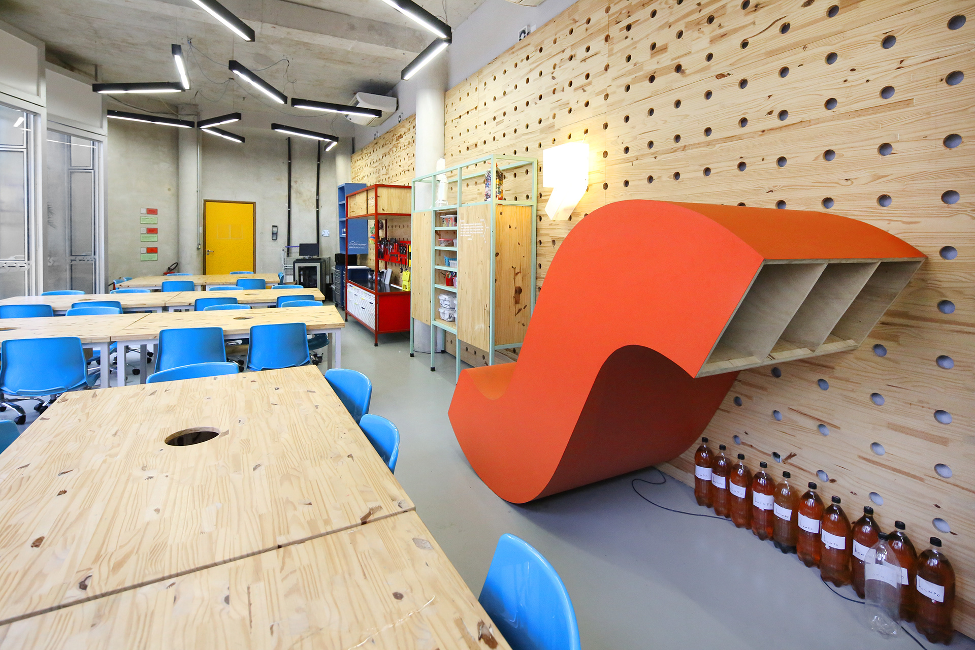
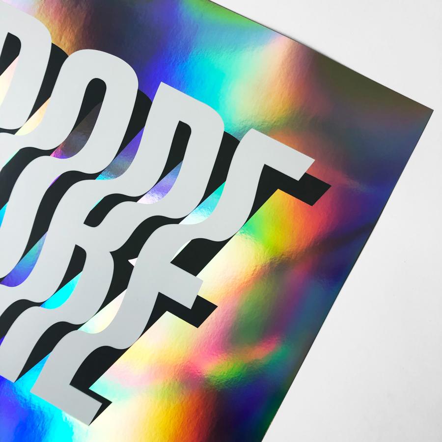
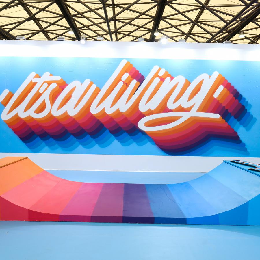
We are transporting ourselves to Rio de Janeiro to check out this space called: LET'S Makerspace, designed by Plau for the Mopi. You just gotta love this incredible mixture of typography and architecture. Props to everyone involed in this project, it's incredibly cool to bring this initiative forward and to actually listened to the students, in order to understand what made a classroom innovative. Their vision gave us a great starting point. Check it out!
Mopi is a Rio de Janeiro school with an award winning green building and a knack for innovation. When it came to design their maker space, they turned to us at Plau for the branding and communication and to Plano, led by architect Davide Dulcetti, for planning and constructing the space.
Links
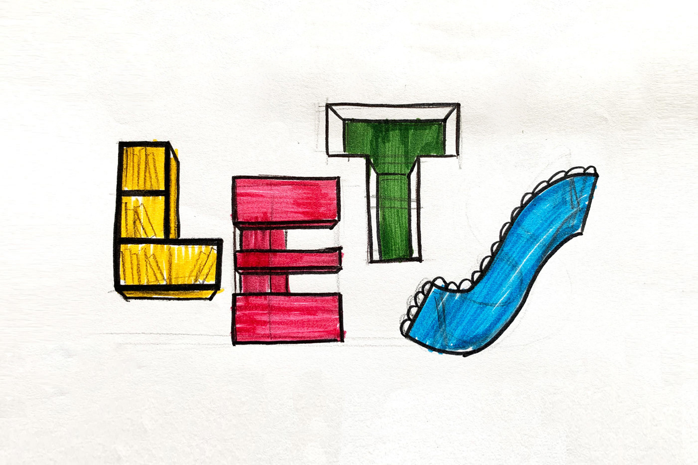
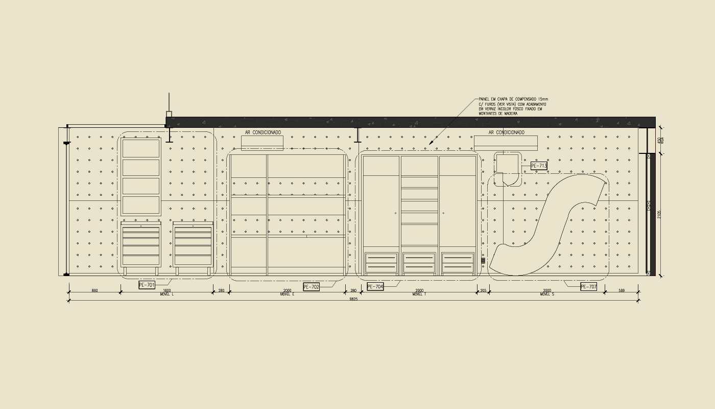
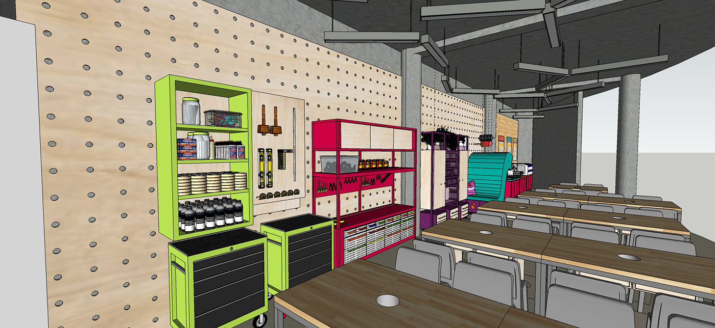
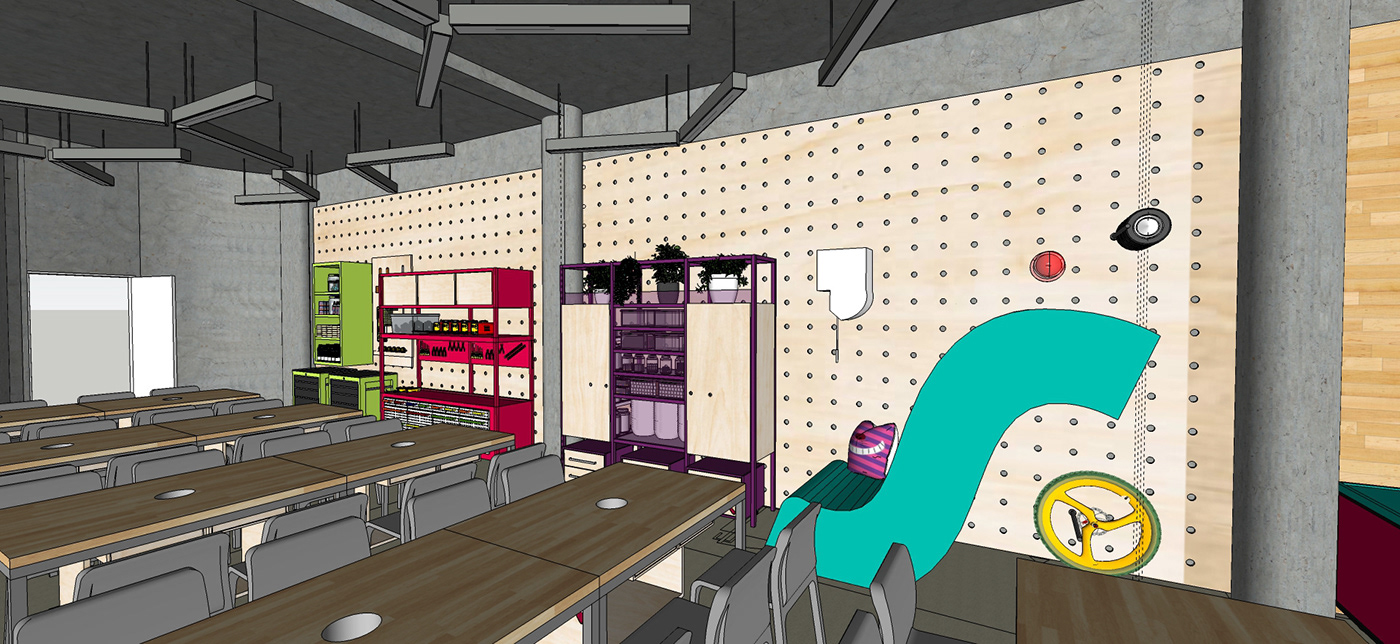
We played with the shapes of each letter and sketched four pieces of furniture for each requirement: storage, electric, chemistry and recyclables. Every letter of the name became a part of the puzzle and the apostrophe was made into an idea lamp, all designed and fabricated from the ground up.
