Explore the new branding and visual identity for MAHO architecture firm, designed by Will Gomes and Pedro Zanarchi, focusing on simplicity, beauty, and functionality.
Discover the exquisite visual identity of MAHO, an architecture firm led by Marcelo Honório, crafted by designers Will Gomes and Pedro Zanarchi. Known for their innovative approach in architecture, MAHO specializes in the creation and remodeling of buildings, aiming to simplify the process for clients by blending simplicity, beauty, and functionality.
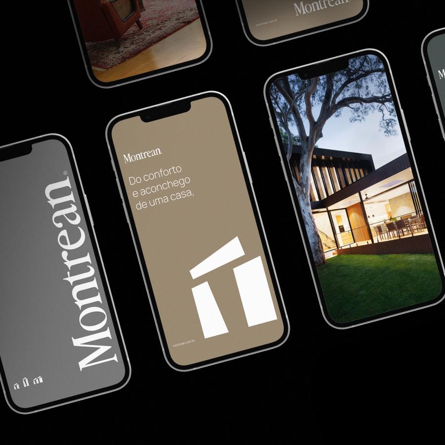
Gomes and Zanarchi have meticulously developed a comprehensive visual identity manual for MAHO. This includes a modern update to their old symbol, the cobogó, transforming it into a versatile graphic element that forms the cornerstone of the firm's new branding strategy. The result is a consistent and unique visual identity that stands out in the competitive field of architecture.
The design process focused on creating a cohesive brand that reflects MAHO’s philosophy. Stationery kits and marketing materials were also crafted, ensuring every client touchpoint is aligned with the firm’s brand values. The new visual identity is not only aesthetically pleasing but also highly functional, embodying the essence of MAHO’s architectural vision.
Each element of the branding was thoughtfully considered to ensure it conveys the firm’s commitment to simplicity and elegance. The clean lines and minimalist approach reflect MAHO’s design ethos, while the versatility of the cobogó symbol allows it to be used across various mediums, reinforcing the brand’s identity.
By integrating these elements, MAHO’s new branding effectively communicates its mission and values, making it easier for clients to connect with the firm’s vision. The updated visual identity not only enhances the firm's aesthetic appeal but also strengthens its market presence.
Branding and visual identity artifacts
For more information make sure to check out Will Gomes and Pedro Zanarchi
