When Kieran Reilly set out to craft the branding and visual identity for "Life Risk News," one might imagine he began with a compass of clarity in one hand and a palette of precision in the other. After all, encapsulating the vast realm of capital markets participation in life risk is no small feat.
"Your trusted source for..." many things, surely, but how to convey trustworthiness, expertise, and timeliness all in a singular emblem? Look no further than the iconic monogram. Subtly nodding to the graphs and charts paramount in the monthly editorial, Reilly transforms intricate data into eloquent artistry. In fact, one could jest that this monogram is worth a thousand data points.
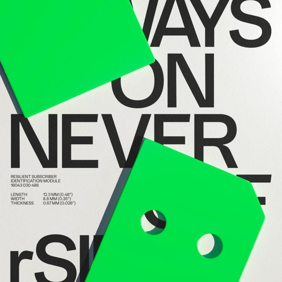
Then, we delve into color: the robust red accent, not just an aesthetic choice, but a narrative one. It speaks volumes, juxtaposed against crisp black text. The result? A riveting contrast that captures the gaze and holds it. Add to the mix a geometric, somewhat brutalist symbol, comprising two rectangles and two circles, and you're left pondering, "Is it abstraction, or sheer design genius?"
Beyond just aesthetics, the design's ethos translates seamlessly into the editorial composition. Modern? Undoubtedly. Beautiful? Decidedly so. It's a visual symphony where every element plays its part, yet the ensemble resonates harmoniously.
In the ever-evolving world of design, where the line between minimalism and monotony often blurs, Reilly's work for Life Risk News stands out. Fresh, stylish, and undeniably professional - an ode to design enthusiasts and the casual observer alike.
It's safe to say, with such branding, Life Risk News is not just informing its audience, but doing so with panache and a dash of elegance. Bravo, Mr. Reilly, for reminding us that design, when done right, can be as riveting as the news itself.
Branding and visual identity artifacts
For more information make sure to check out Kieran Reilly website or follow them on Behance.
