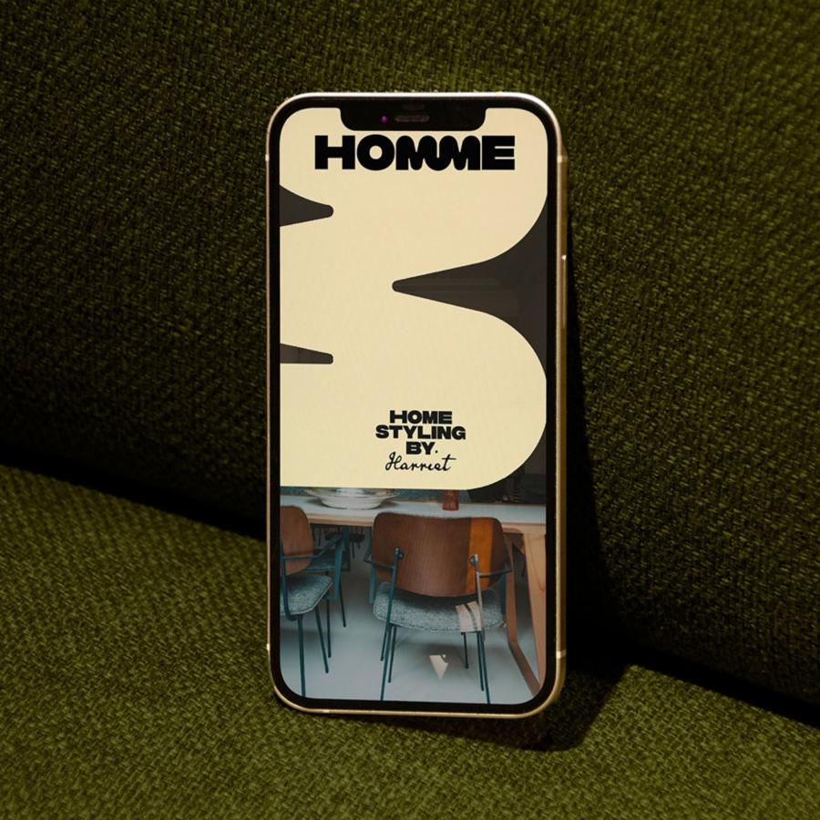
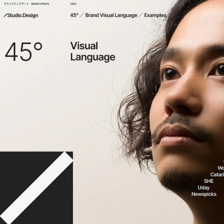
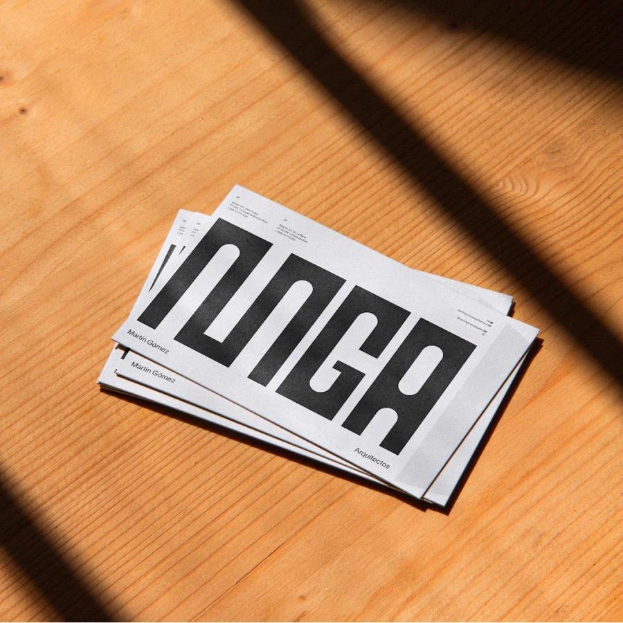
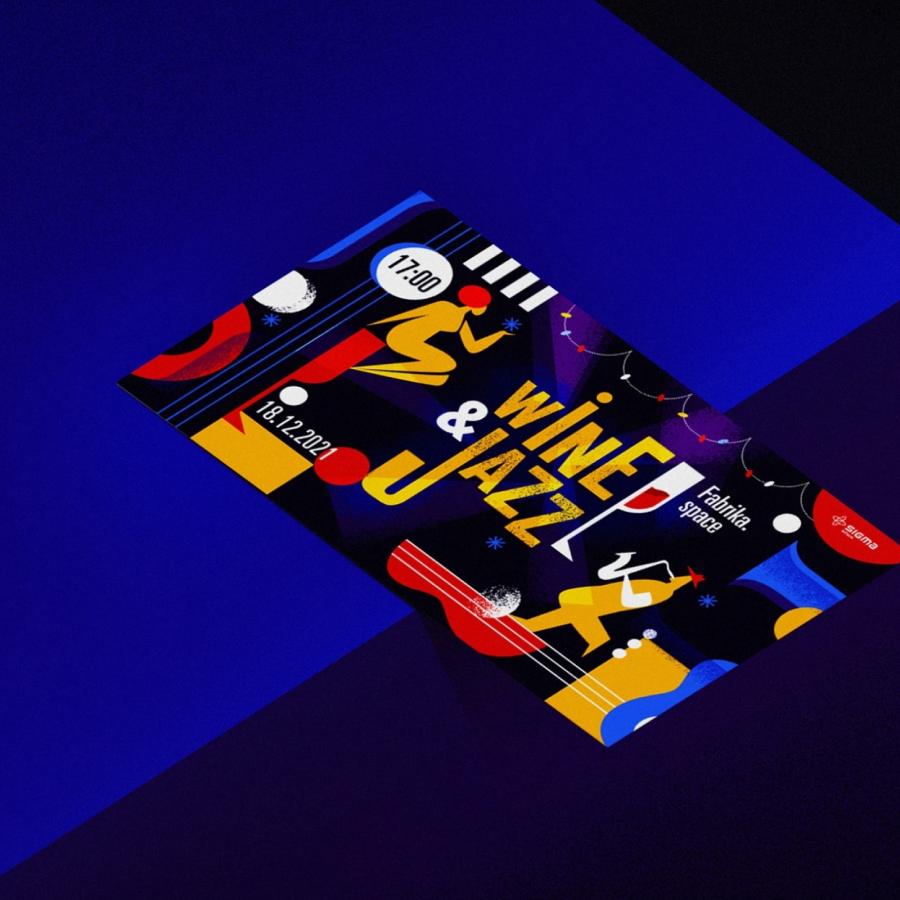
Discover how designer Lee CEE created a striking branding and visual identity for Katalist, a brand focused on innovation and disruption.
Explore the bold logo, vibrant color palette, and versatile brand system that sets Katalist apart.
In the competitive landscape of modern business, a strong brand identity is essential. Katalist, a brand with a focus on innovation and disruption, sought to establish a visual presence that would capture attention and leave a lasting impression. To achieve this, they turned to the talented designer Lee CEE.
Lee CEE, known for their bold and expressive style, crafted a brand identity for Katalist that is both visually striking and conceptually rich. The logo, a stylized wordmark with sharp angles and dynamic lines, exudes a sense of energy and forward momentum. The color palette, dominated by vibrant reds and oranges, further reinforces the brand's bold and energetic personality.
But the visual identity goes beyond just a logo and color scheme. Lee CEE developed a comprehensive brand system that includes custom typography, graphic elements, and imagery. This system ensures consistency across all brand touchpoints, from marketing materials to product packaging.
One of the standout features of Katalist's brand identity is its versatility. The design elements can be easily adapted to different contexts and applications, while still maintaining a cohesive and recognizable look and feel. This flexibility allows the brand to effectively communicate its message across a variety of channels and platforms.
Katalist's brand identity is a testament to the power of design. By partnering with a skilled designer like Lee CEE, the brand has established a visual presence that is not only memorable but also reflective of its core values and mission.
For more information make sure to check out LEE CEE™️ on Behance and at madmuma.com
Branding and visual identity artifacts
