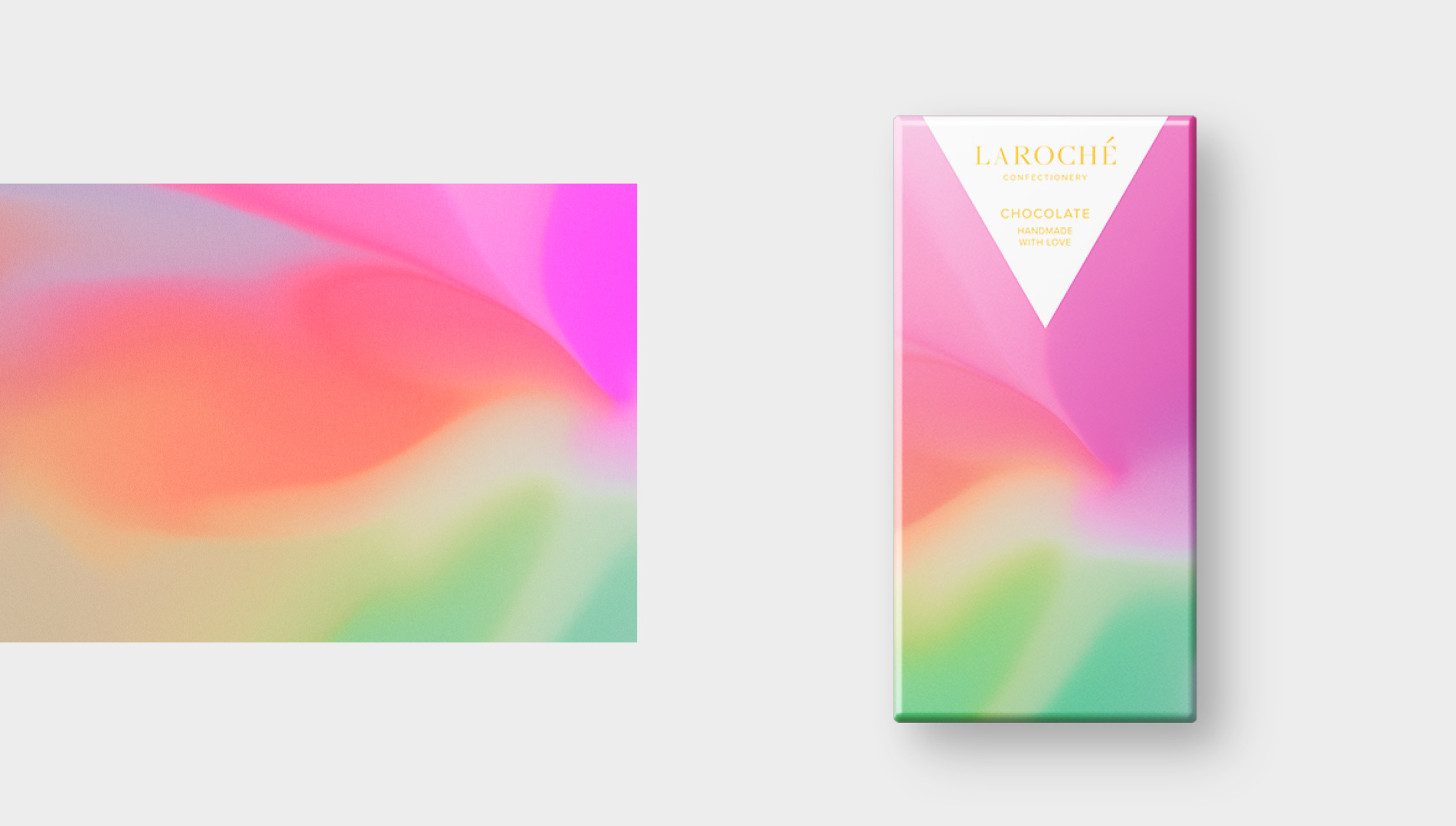
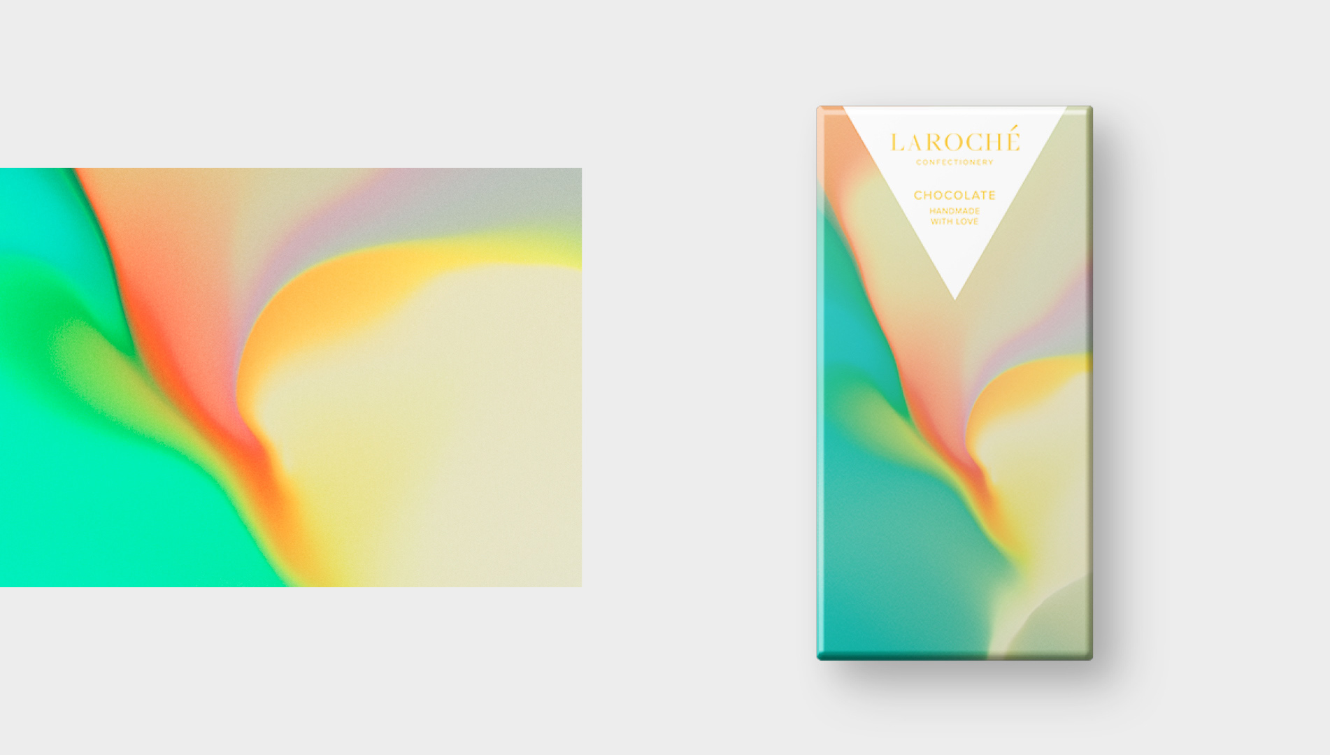
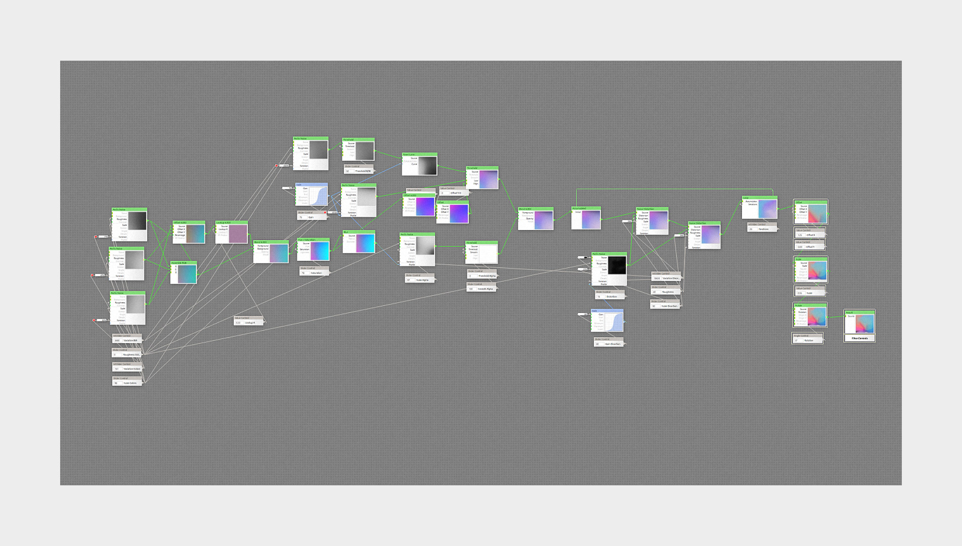
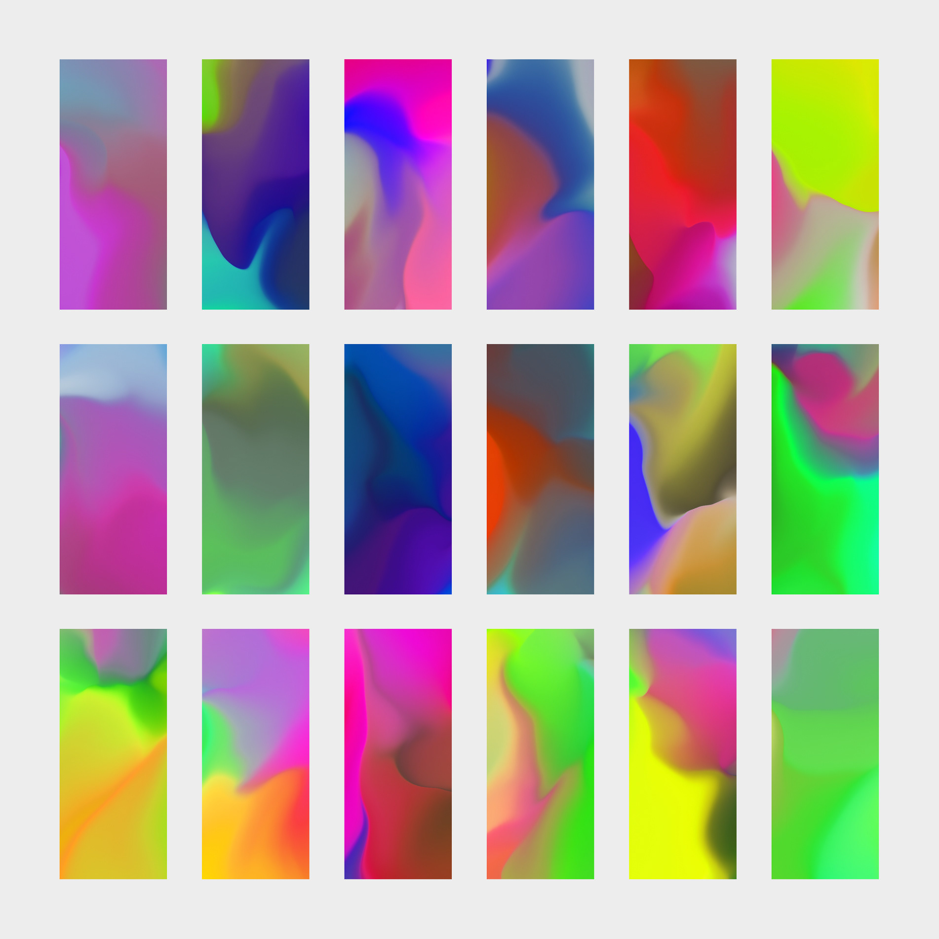
Martin Naumann and Andrius Martinaitis have shared a colorful and abstract-feely packaging for Laroché Chocolate. They posted their full project on Behance, make sure to give it a look. Other than loving this visual direction to express a chocolate product but I do like that they shared a snapshot of the development. It's easy to think this is just a gradient but there is more to the visual being worked out through the process. Would you be more pleased if the colors were fitting to the different flavors or going all loud with different sets of tones.
The abstract textures were parametrically generated to visualize the unique taste experience of each flavor. The series contains packagings for the flavors ruby, caramel, bittersweet and milk chocolate.
Packaging & Graphic Design
More on Martin Naumann
More on Andrius Martinaitis



 By Martin Naumann & Andrius Martinaitis