In the bustling world of design, there are projects that manage to stand out effortlessly, capturing the essence of simplicity and elegance. Thought & Found, a renowned design studio based in Australia, recently showcased their impeccable skills in a remarkable brand and visual identity project for Branch. The collaboration resulted in a captivating logo design and collaterals that exude a sense of understated sophistication. By utilizing a simple sans-serif font and drawing inspiration from the Swiss style, Thought & Found has crafted an aesthetic that is both timeless and striking.
Thought & Found's logo design for Branch is a testament to the power of minimalism. The designers opted for a clean and uncomplicated approach, utilizing a sleek sans-serif font. The logo portrays a sense of professionalism and modernity while maintaining a welcoming and approachable feel. The carefully selected typography exudes confidence and clarity, reflecting Branch's values and goals. It serves as an iconic symbol that can easily be recognized and associated with the brand.
The visual identity of Branch designed by Thought & Found follows a Swiss style inspired grid, further enhancing the overall elegance of the brand. The designers employed a harmonious combination of white space and well-organized layouts, creating a balanced and visually pleasing experience across all collaterals. This meticulous attention to detail reinforces Branch's commitment to excellence and professionalism.
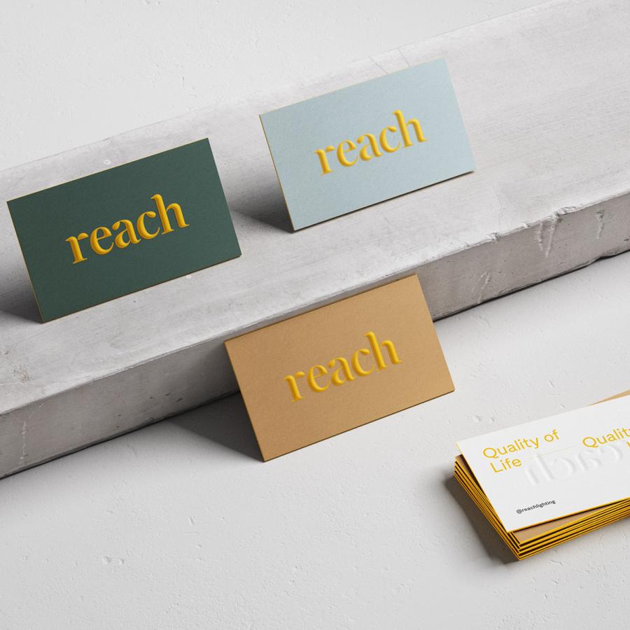
From business cards to letterheads, Thought & Found has ensured that every collateral piece reflects the refined nature of the brand. The choice of a consistent color palette, featuring a minimalist blend of neutral tones, adds to the overall sophistication. The collaterals are meticulously crafted, offering a seamless integration of the logo and typography. This thoughtful execution not only reinforces brand recognition but also creates a cohesive and memorable visual experience for Branch's audience.
Thought & Found's brand and visual identity project for Branch is a testament to their remarkable design expertise. By adopting a minimalist approach and drawing inspiration from the Swiss style, they have managed to create a visually striking and timeless brand identity. The simplicity and elegance of the logo design, coupled with the meticulous execution of collaterals, establish a cohesive and professional visual language for Branch. Thought & Found's collaboration with Branch serves as an inspiration for designers seeking to achieve a balance between simplicity, elegance, and brand authenticity.
Brand and visual identity
Credits
- Project: Branch
- Branding: Thought & Found
- Instagram: @thought_found


