In the realm of design, the art is often in the details. Such is the case with the recent branding and visual identity created by Tática Studio and Paulo Barbosa (@paulojsbarbosa) for Clínica Sinua. Sinua is a celebration of the inherent beauty of the human form. It's an ode to the curves, the gentle movement of skin, the nuances of a smile.More than anything, Sinua is about subtlety and valuing the tiniest of details that make us who we are.
Clínica Sinua's essence revolves around respecting and highlighting these beautiful details, and it was imperative for the branding to resonate with this core principle. The design journey embarked by Tática Studio and Paulo Barbosa was highly collaborative. Maria and Lucas, the visionaries behind Sinua, showed immense trust in the process and dived deep into the studio's unique methodology. This partnership allowed the team to carve out a branding identity that not only reflects Sinua's ethos but also ensures its distinctive positioning in the market.
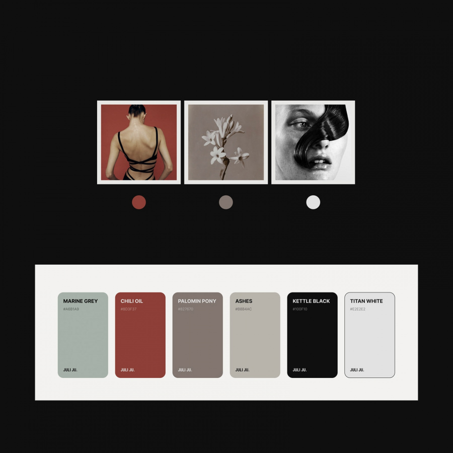
The task was multifold. On one hand, the name "Sinua" needed to align with the clinic's ethos, the architectural essence of the space, and the narrative of its partners who prioritize unparalleled excellence in every procedure. On the other hand, a strategic color palette was conceived after a thorough analysis of the local market to ensure that Sinua would make a mark and stand out distinctively.
Branding and visual identity
Credits
- Client: Sinua
- Service: Naming and Brand Identity
- Year: 2023
- Design: Paulo Barbosa
- Strategy: Paulo Barbosa and Carol Lopes
- Motion: Maurício Alves
- Photography: Lara Imperiano
For more information make sure to check out Tática Studio website and follow them on Behance.
