Explore the masterful editorial design and graphic design of FLAASH Magazine, where artistry meets anticipation in a dark, reflective universe.
Studio Plastac’s FLAASH Magazine stands as a beacon in the world of editorial design and graphic design, offering a unique blend of cultural critique and visual storytelling. The magazine’s latest issue delves into a dark universe where reality and fiction collide, presenting readers with a thought-provoking exploration of what the future may hold.
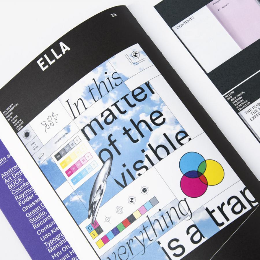
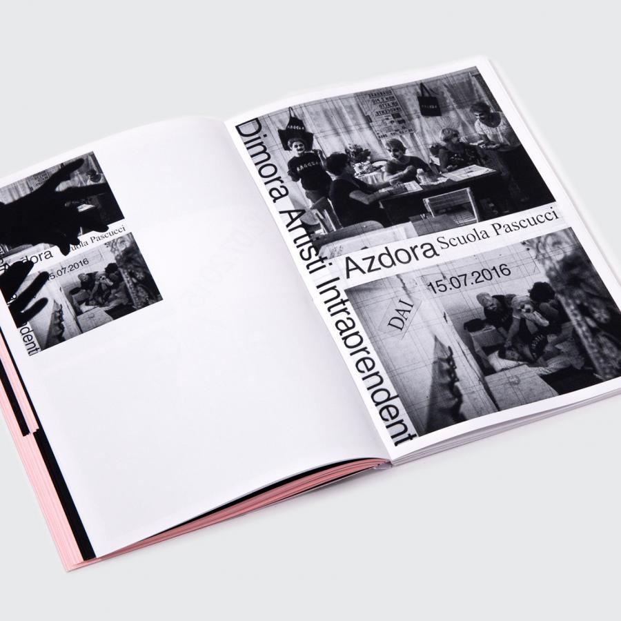
At the heart of FLAASH’s visual identity is a carefully crafted design that speaks volumes about its content. The title’s typography is bold and impactful, demanding attention and curiosity. The typographic choices are not merely aesthetic; they are a narrative device, guiding readers through a journey of anticipation and reflection.
The color palette is a deliberate selection of cold grays juxtaposed with saturated colors, creating a visual echo of the magazine’s thematic focus on the future. This choice of colors is not random; it is a reflection of the magazine’s commitment to providing a multifaceted view of what lies ahead, whether through interviews, speculative fiction, or visual art.
FLAASH’s design extends beyond its pages, with a size of 20 cm x 27 cm and a glued square spine binding that ensures durability and a professional finish. The magazine’s 128 pages are a testament to its dedication to quality and depth, offering readers a substantial and immersive experience.
In conclusion, FLAASH Magazine is more than just a publication; it is a platform for artistic expression and cultural discourse. Its editorial design and graphic design are a testament to Studio Plastac’s vision and skill, inviting readers to engage with a world where anticipation meets artistry. For more information, visit www.flaash.fr and discover the visionary world that FLAASH has to offer.
Editorial design and graphic design artifacts
For more information make sure to check out Studio Plastac website and Behance profile.


