by abduzeedo
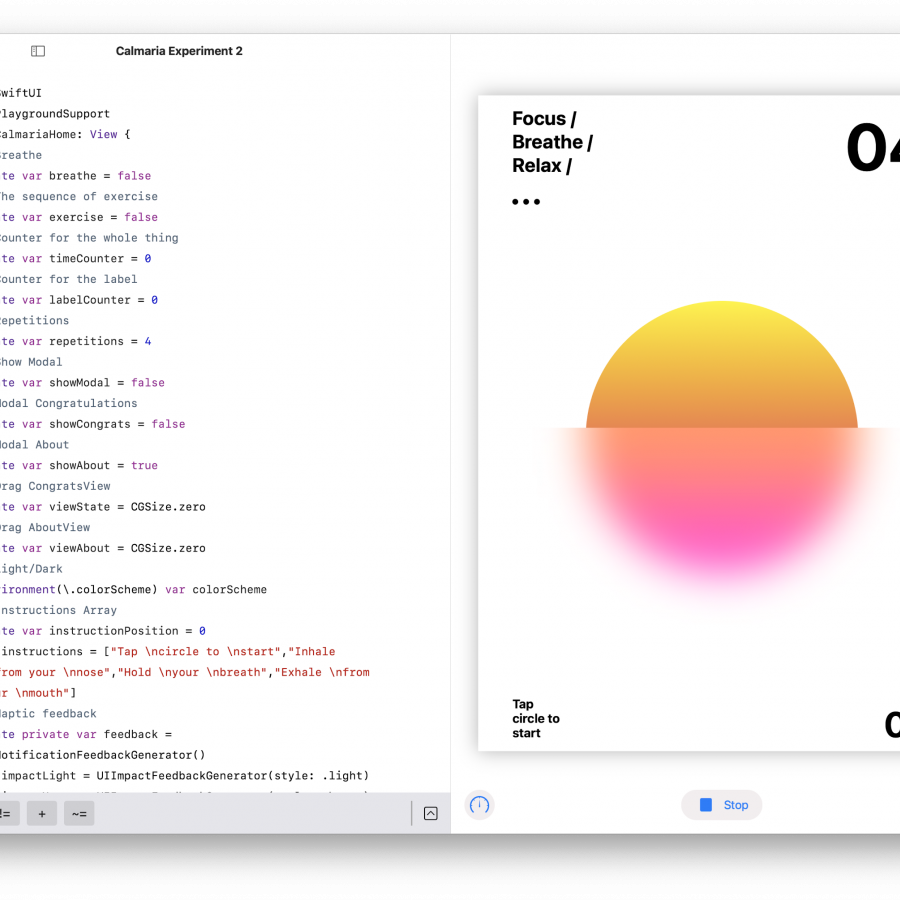
Last weekend, I found myself with a unique challenge. It was one of those quiet Friday evenings; my son and wife were deep in sleep, and there I was, with my trusty laptop and a mission in mind: to sculpt the Abduzeedo app for Android using Jetpack Compose. Now, while I've ventured into simple Android apps before (hello, Calmaria.app), this was playing in the big leagues. We're talking loading content from a myriad of JSONs, weaving intricate screen layouts, navigating webviews, and curating images.
Every grand quest starts with a single step. For me? It was sketching out the app's blueprint. Having crafted an iOS app a couple of years back gave me a solid starting point. But then came the learning curve of mastering Jetpack Compose. I knew the basics, like crafting views with Text(), Box(), and Columns. But, honestly, merging all these elements seamlessly was where I hit a snag. Previously, Google and sites like StackOverflow were my go-to. But this time? I had AI as my lead engineer.
Here's the thing about AI: you can drill down to specifics. I began by laying out all my queries in a Google Doc and tossed them at both ChatGPT and Bard. Both had their merits, but ChatGPT’s design had an edge. The clear demarcation between text and code was just more intuitive. Bard, though helpful, felt a tad cluttered for a coder's eyes.
With a handful of AI-generated code snippets, I took the plunge into Android Studio. It was a dance of coding, pausing, revising, and occasionally turning to AI for a quick "Hey, why's this doing that?". At the heart of it, though, it wasn't just about building the app, but really getting into the groove with Jetpack Compose.
Here’s my Android Studio setup
After three hours on Friday, I managed to load the JSONs into a list (albeit without style), render the images, and even set up a clickable item that led to another screen showcasing the blog post. The progress was palpable, and that truly was the highlight. The ability to pull content from the site and display it in the app was a significant step forward. Exhausted but content, it was bedtime for me.
Come Saturday morning, I laced up for a treadmill run while cueing up some Jetpack Compose lessons on my iPad. My go-to was Philipp Lackner’s "The Jetpack Compose Beginner Crash Course for 2023 💻 (Android Studio Tutorial)". This tutorial gave me a clearer insight into Jetpack's mechanics and clarified several framework terminologies I'd been trying to get the AI to explain.
Rolling on with my Saturday, I dived into adding the app's styles. I delved into UI theming in Jetpack, harnessing MaterialTheme, and expanding my repertoire of typography and color styles. Moreover, I familiarized myself with displaying HTML content in a webview and integrating CSS styles, essentially crafting an offline HTML page for display. By evening, the app transitioned smoothly from the Feed to Details, looking rather snazzy. However, the categories and menu sections were still in the pipeline, and I knew that would involve some hefty refactoring, given that my code was tethered to a single JSON.
As I contemplated creating category screens, which meant fetching distinct JSON URLs tailored with specific parameters for each category, it seemed daunting. Yet, to my astonishment, the process was straightforward, guiding me on which codes to adjust, what elements to introduce, and the methods to invoke the fresh functions. It was a genuine "mind-blown" moment. And just like that, I decided to power down, step out, and embrace the Saturday vibes.
After a refreshing Sunday morning spent surfing at the beach, I jumped back into app mode by the afternoon. With the categories now active and the foundational functions in place, I shifted my attention to refining the app's aesthetics—tweaking typography, enriching colors, and streamlining layouts. In this creative spree, I dabbled with varied interaction designs and deepened my understanding of NavHost. I've always aimed for best practices, leaning towards utilizing readily available components and widgets, or as I often say, "using just off-the-shelf bits."
By the time the sun began its descent, I was quite pleased with the app's progression. Visually, it was a treat, but I noticed some rough edges, particularly within the navigation department. The current motion designs and transitions, with their default fade-in-out effects, could use some sprucing up. Additionally, optimizing the app for larger devices, like foldables and tablets, is on my radar—but that's a task for another weekend. For now, here's a glimpse of the app's journey thus far:
Next steps
- Make it responsive
- Finalize the navigation system
- Improve overall motion design
- Create the icon launcher
- Submit it to the Play Store
- Launch!
