by abduzeedo
Explore Nexus' branding and visual identity revolution, a blend of precision and innovation, shaping the future of global logistics.
In the bustling arena of global logistics, Nexus stands as a beacon of innovation and reliability. Their recent collaboration with HALO LAB has resulted in a striking brand identity, marrying contemporary design with logistical precision. This article delves into the elements that make the Nexus brand not just functional, but visually compelling.
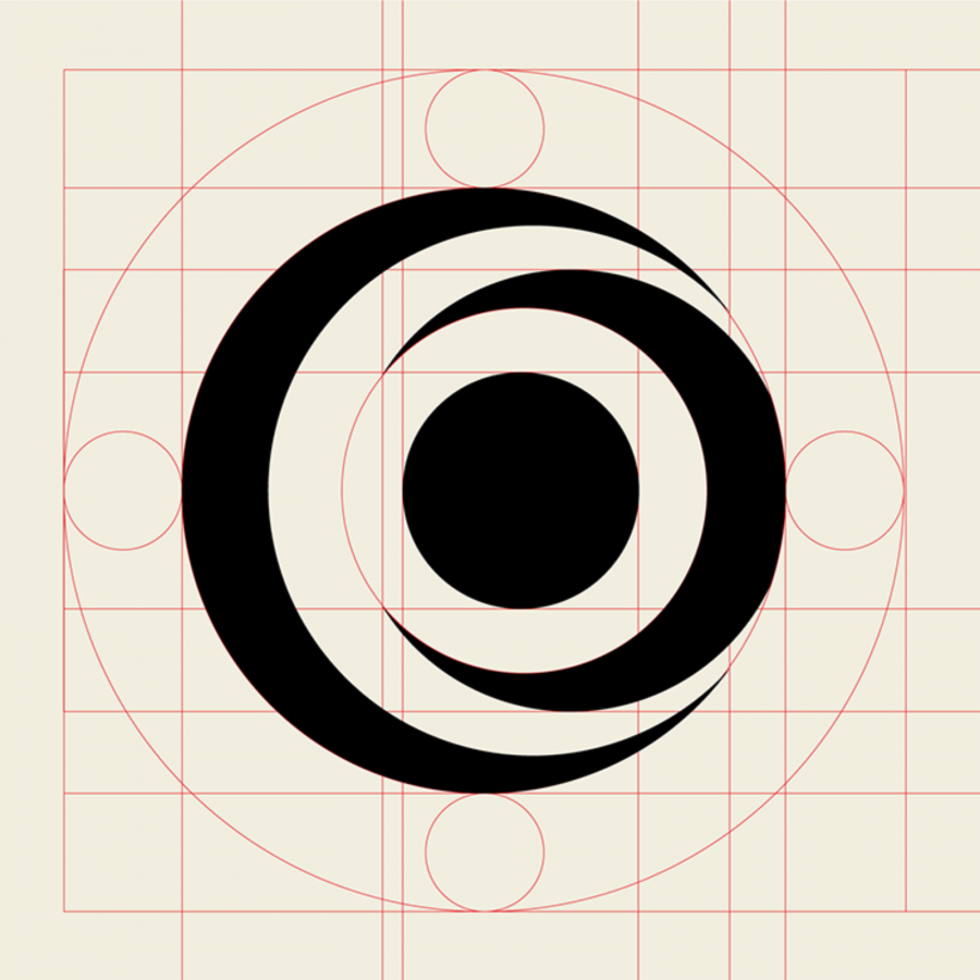
At the heart of Nexus Logistics' visual identity is its logo, an ingenious blend of geometric shapes. The design fuses semi-circles with squares, ingeniously crafting an abstract portrayal of the letters "N" and "S". This emblem is not just a symbol; it's a narrative of the brand's core values—precision, dynamism, and innovation.
The color palette chosen for Nexus is both bold and warm, featuring a range of hues from white to a vibrant red-orange. This spectrum not only captures the energetic spirit of the brand but also resonates with the warmth and reliability that Nexus promises to its clients. The use of Sora typeface in Regular, Semibold, and Bold further adds to the brand's modern and approachable character.
A distinctive feature of Nexus' branding is the 3D variation of the symbol. Rendered in a glass-like material, it adds a layer of sophistication and depth to the brand's identity. This 3D aspect is not merely aesthetic; it symbolizes the brand's commitment to transparency and clarity in its services.
Situated in Boston, Massachusetts, Nexus' project with HALO LAB goes beyond mere aesthetics. It's a comprehensive brand identity transformation, encompassing motion design and a holistic branding strategy. This rebranding signifies Nexus' dedication to providing efficient, seamless transportation of goods worldwide.
In a sector where precision is paramount, Nexus' branding and visual identity are more than just visual elements. They are a testament to the company's commitment to excellence and innovation in global logistics. Through this thoughtful design strategy, Nexus not only communicates its values but also sets a new standard in the logistics industry.
Branding and visual identity artifacts
Credits
- Client: Nexus
- Location: Boston, Massachusetts
- Project: Brand identity, Motion design
For more information make sure to check out halo-lab.com and follow them on Behnce, Dribbble & Webflow.
