Explore B.T Vision's approach to minimalist web design and UI/UX. Discover how this project enhances user experience with its focus on imagery and clever text orientation.
In the ever-evolving world of web design and UI/UX, B.T Vision stands out with its minimalist approach that balances aesthetics and functionality. This project, showcased on Behance, exemplifies how simplicity in design can lead to powerful user experiences.
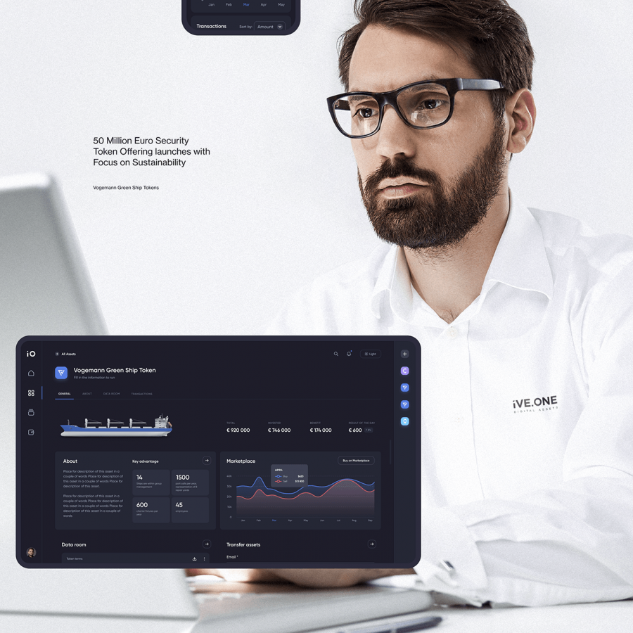
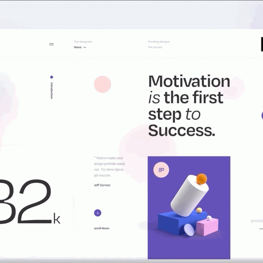
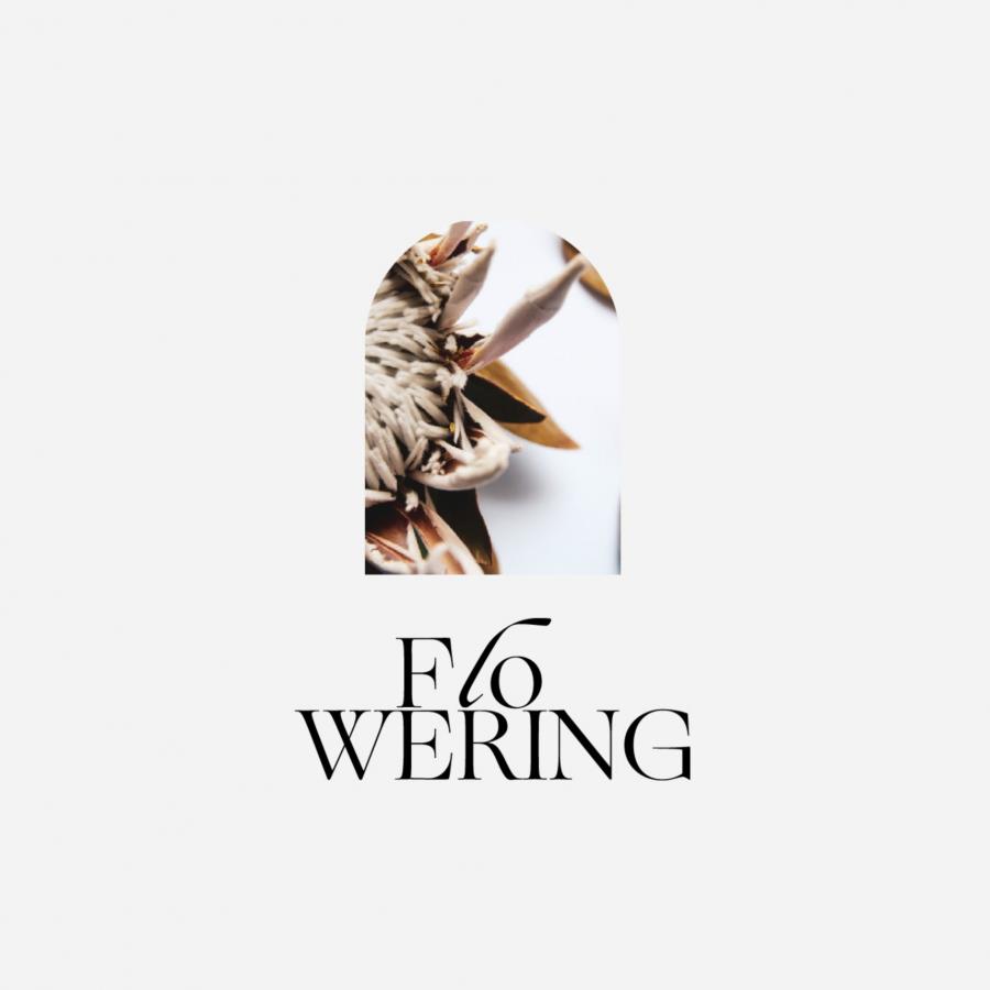
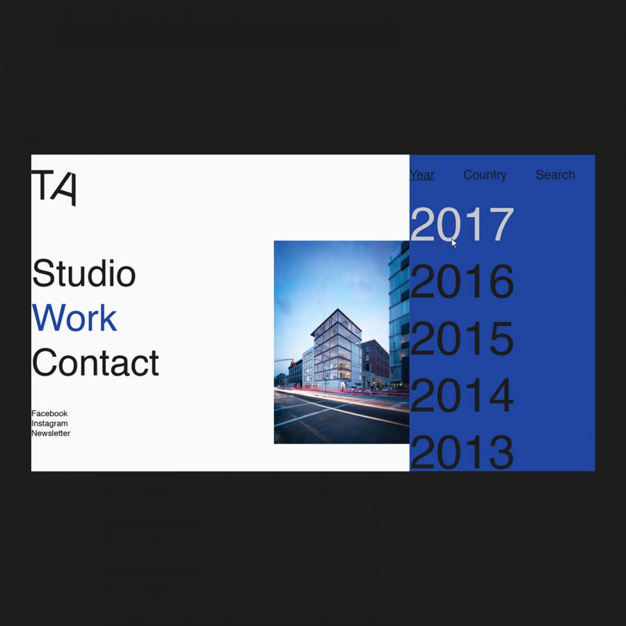
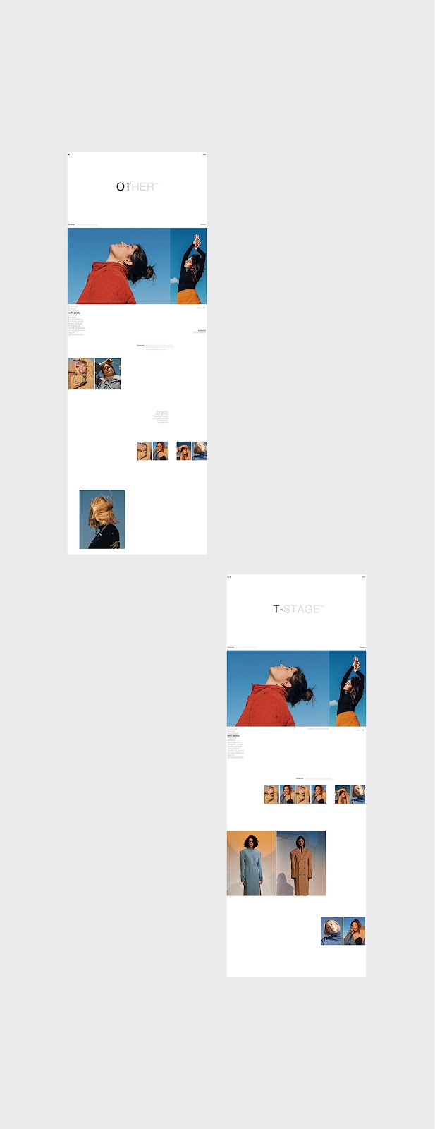
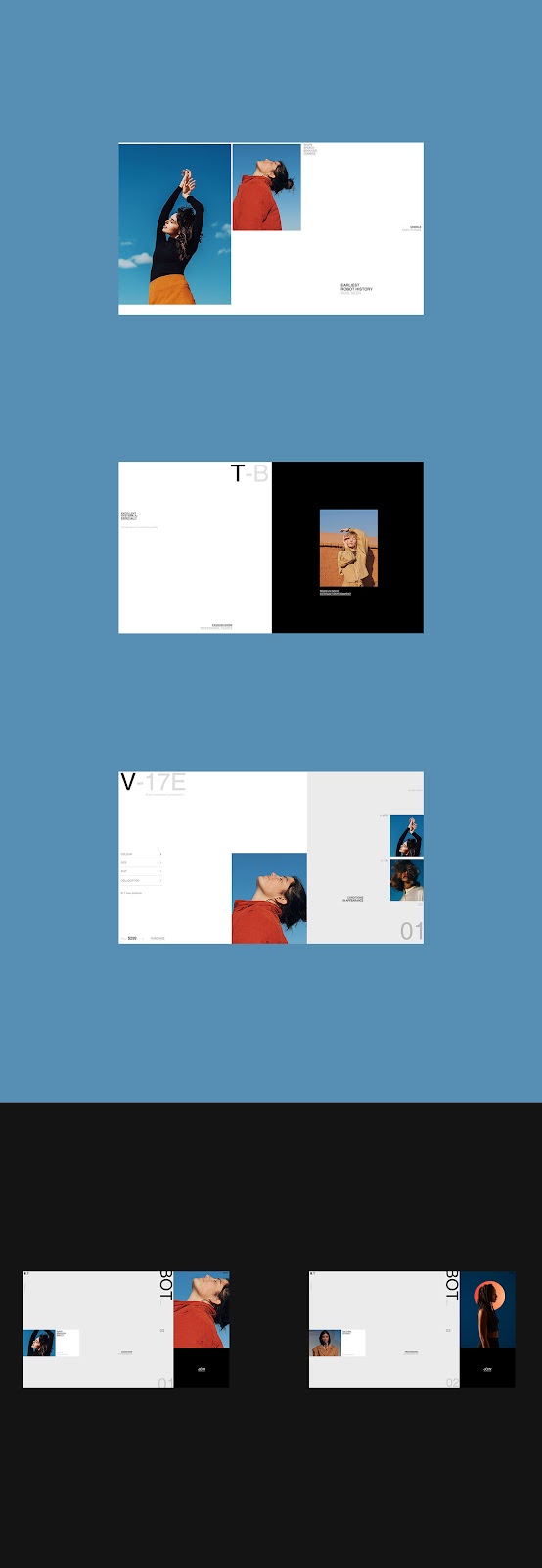
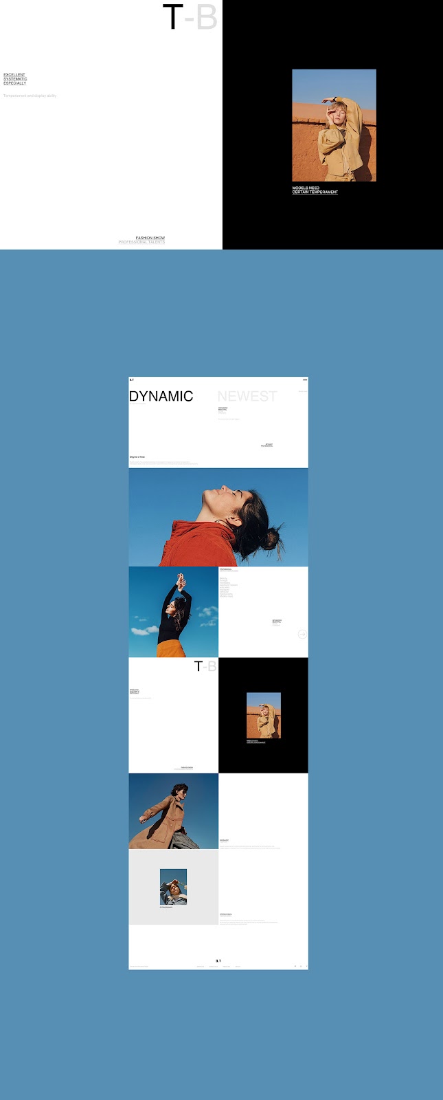
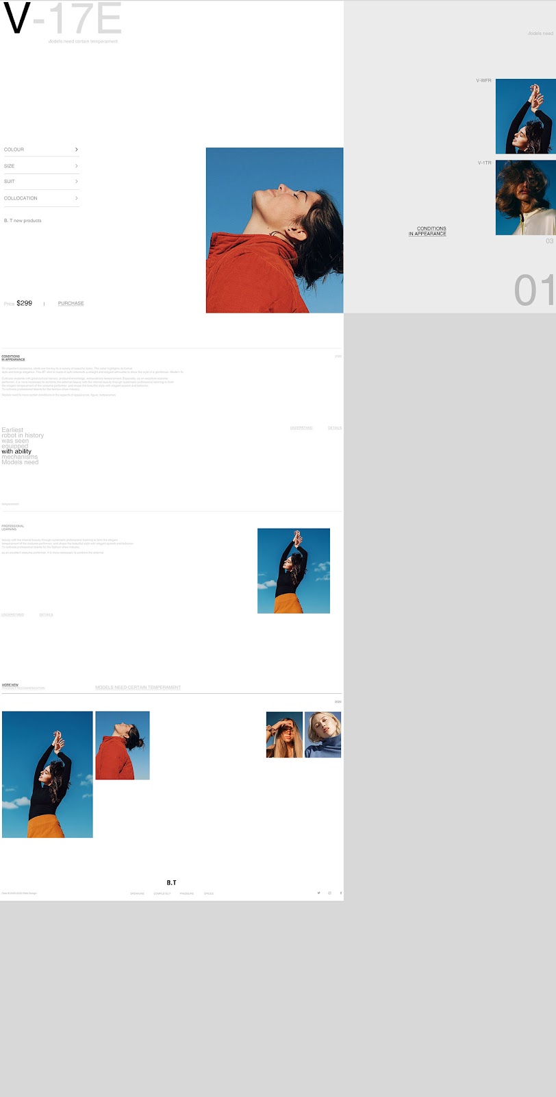
At the core of B.T Vision's design philosophy is the prioritization of imagery. The layouts, reminiscent of editorial designs, convey messages through visuals rather than text. This strategy aligns with current web design trends, where engaging visuals are paramount in capturing user attention.
However, it's not just the images that draw the eye. The project makes intelligent use of text orientation, introducing vertical text in places, which adds a dynamic and modern twist to the interface. This technique not only breaks the monotony of traditional layouts but also underscores the brand's innovative spirit.
One striking aspect of the B.T Vision project is its restraint in using text. Captions are concise and purposefully small, ensuring that they support rather than overpower the visual elements. This decision underscores the importance of visuals in conveying a message, a key aspect of effective UI/UX design.
In conclusion, B.T Vision’s project on Behance is a great example in minimalist web design and UI/UX. It demonstrates how less can indeed be more and how breaking norms, like with vertical text, can create a memorable user experience. For those in the field of web design, this project is a valuable reference for understanding how to balance visuals and text to create an engaging and intuitive user interface.
UI/UX and web design artifacts 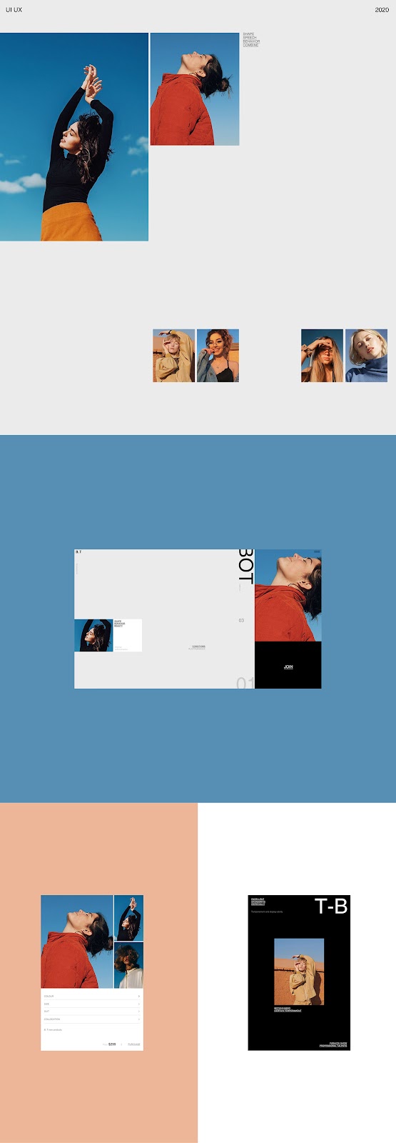


For more information make sure to check out L urg website and Behance.
