In the bustling streets of Porto Alegre, a design tale unfolds – where the profound meets the subtle, and the intricate dances with simplicity. Sweety&Co., a Brazilian design studio, recently spearheaded a minimalist branding and visual identity project for Básico&Co., aiming to mirror the basic ethos of this burgeoning digital brand universe.
The Setting
Brazil, known for its vibrant culture, has been seeing a shift towards minimalism in the digital landscape. Básico&Co. stands testament to this, aiming to become the vanguard of digital native platforms and brands, taking inspiration from the unadorned and uncomplicated lifestyle. Its flagship brand, Basico.com, has already etched its presence as a premier essentials e-commerce platform in Brazil.
The Challenge
The task was clear yet complex: Design an identity resonating with the modern, minimalist core of the brand, drawing from Basico.com's identity and elements. A design that speaks without shouting, simple yet memorable – this was the call of the hour.
The Solution
The brilliance of Sweety&Co's approach lies in its reductive artistry. They zeroed in on the letter 'B', transforming it into a versatile and modular emblem for the brand. This singular element effortlessly transcends its alphabetic origin, morphing into a point, a photographic support, and a pivotal brand asset. It’s as if the ‘B’ becomes the brand's heartbeat, subtle but essential, making its presence felt across all brand touchpoints.
In conclusion, Sweety&Co's branding solution for Básico&Co is an exemplar in minimalist design. They've achieved the fine balance of echoing the brand's essence while ensuring the design remains clean, uncomplicated, and instantly recognizable. The Porto Alegre-based design studio once again underscores the beauty of minimalism: Less can indeed be more. And in the world of branding, such clarity and simplicity often leave the most lasting impressions.
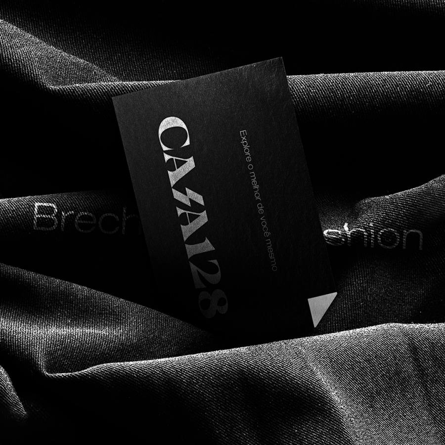
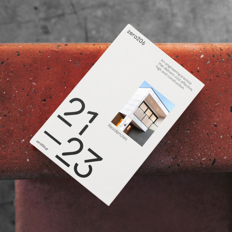
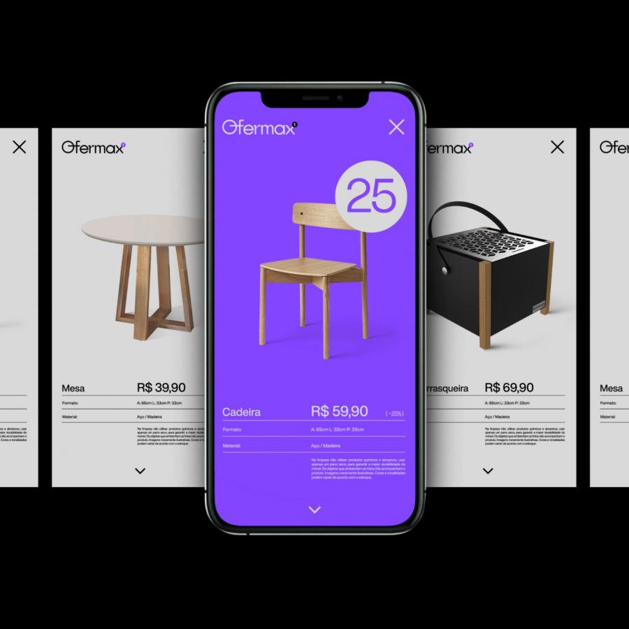
Branding and visual identity artifacts
For more information make sure to check out Sweety & Co. on:
