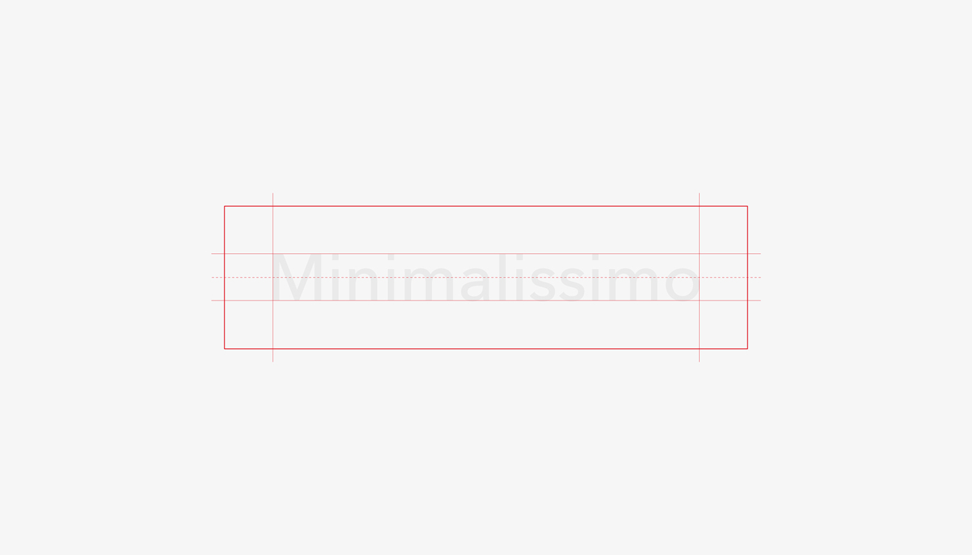
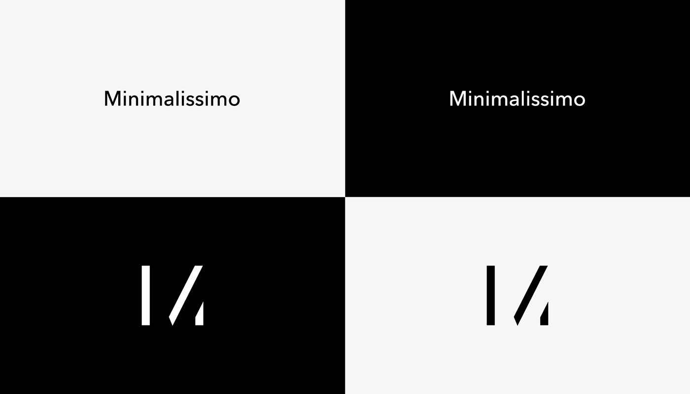
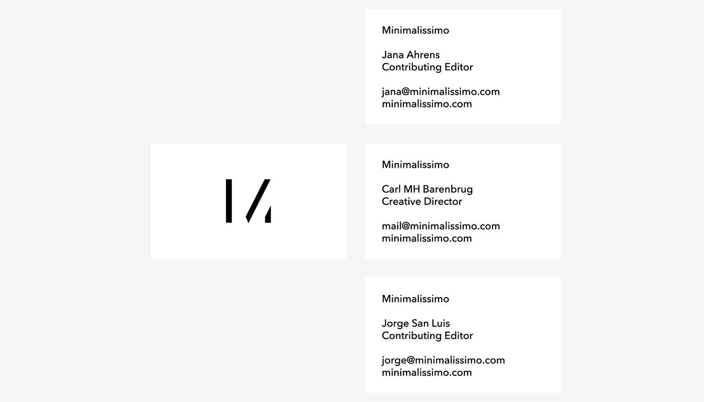
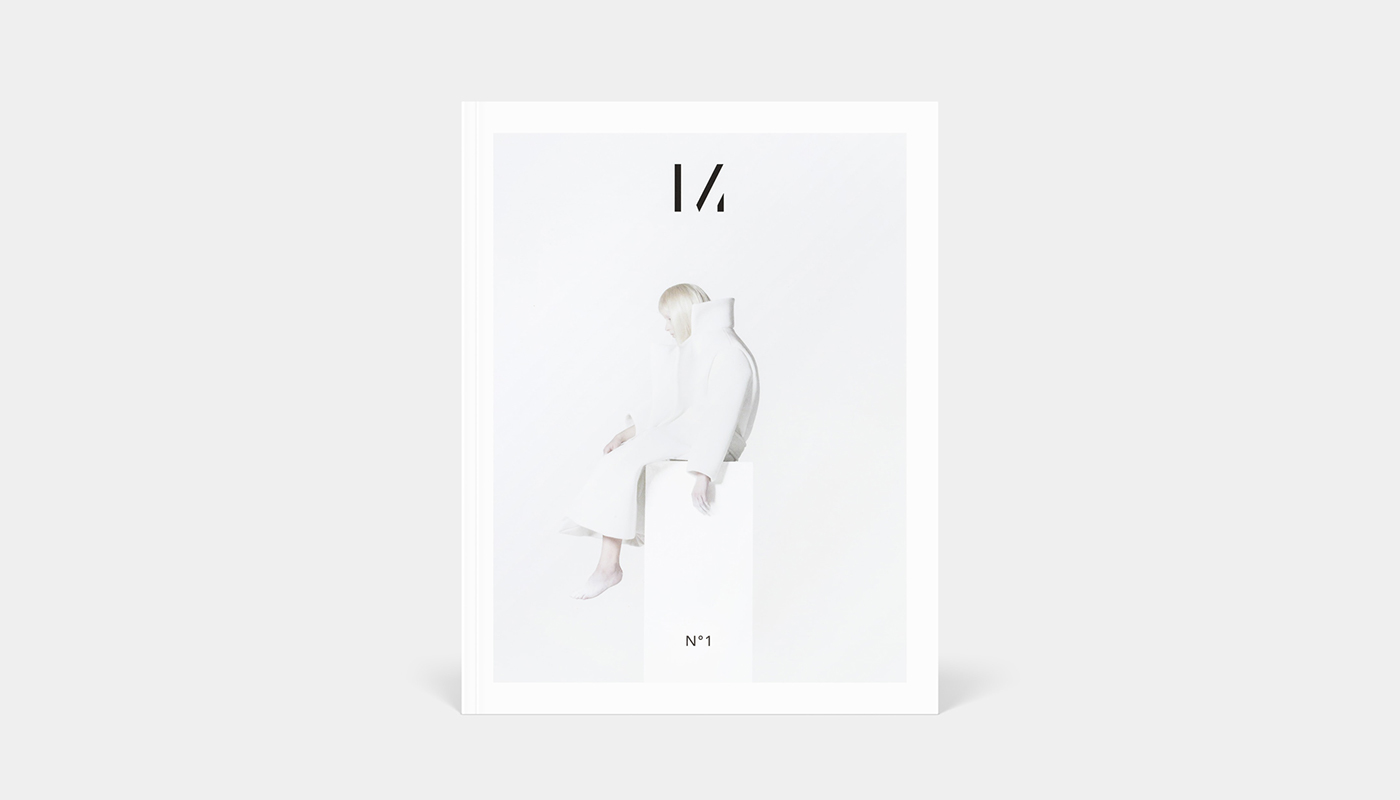
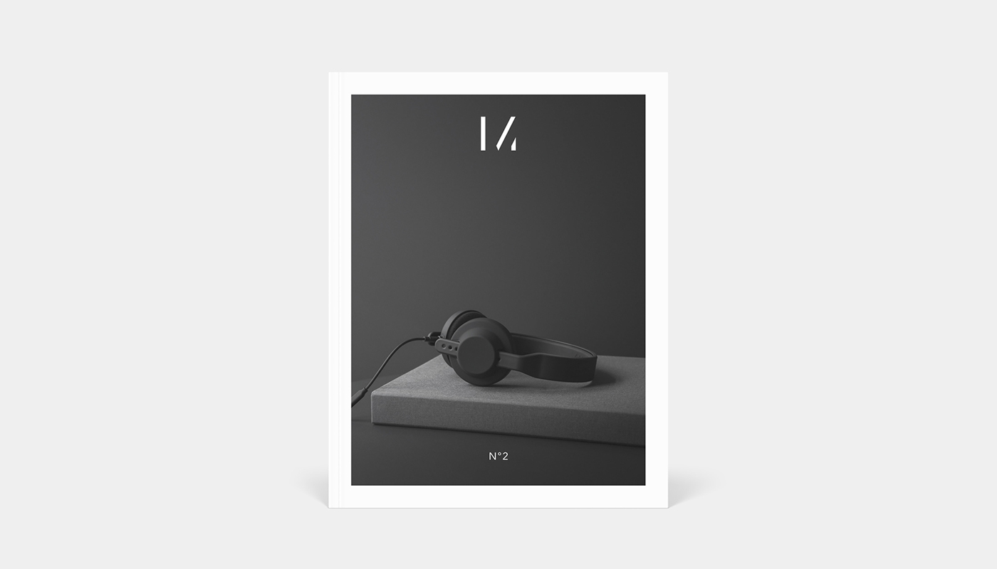
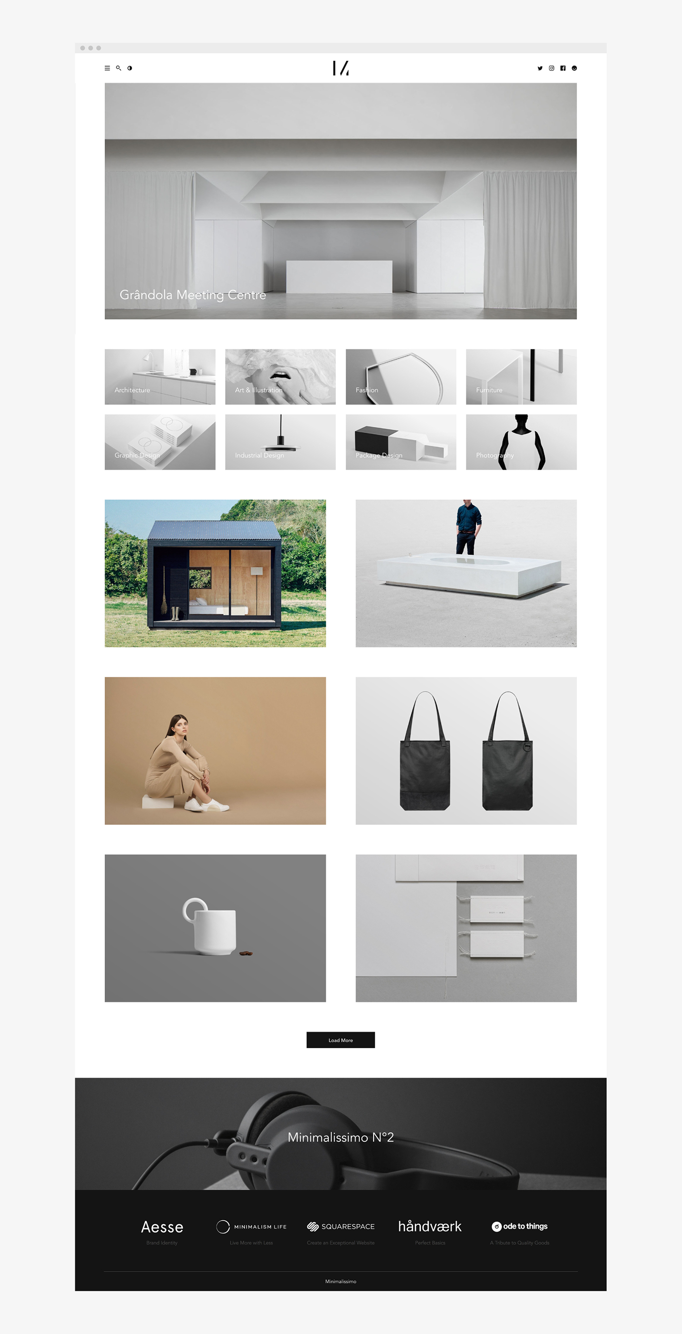
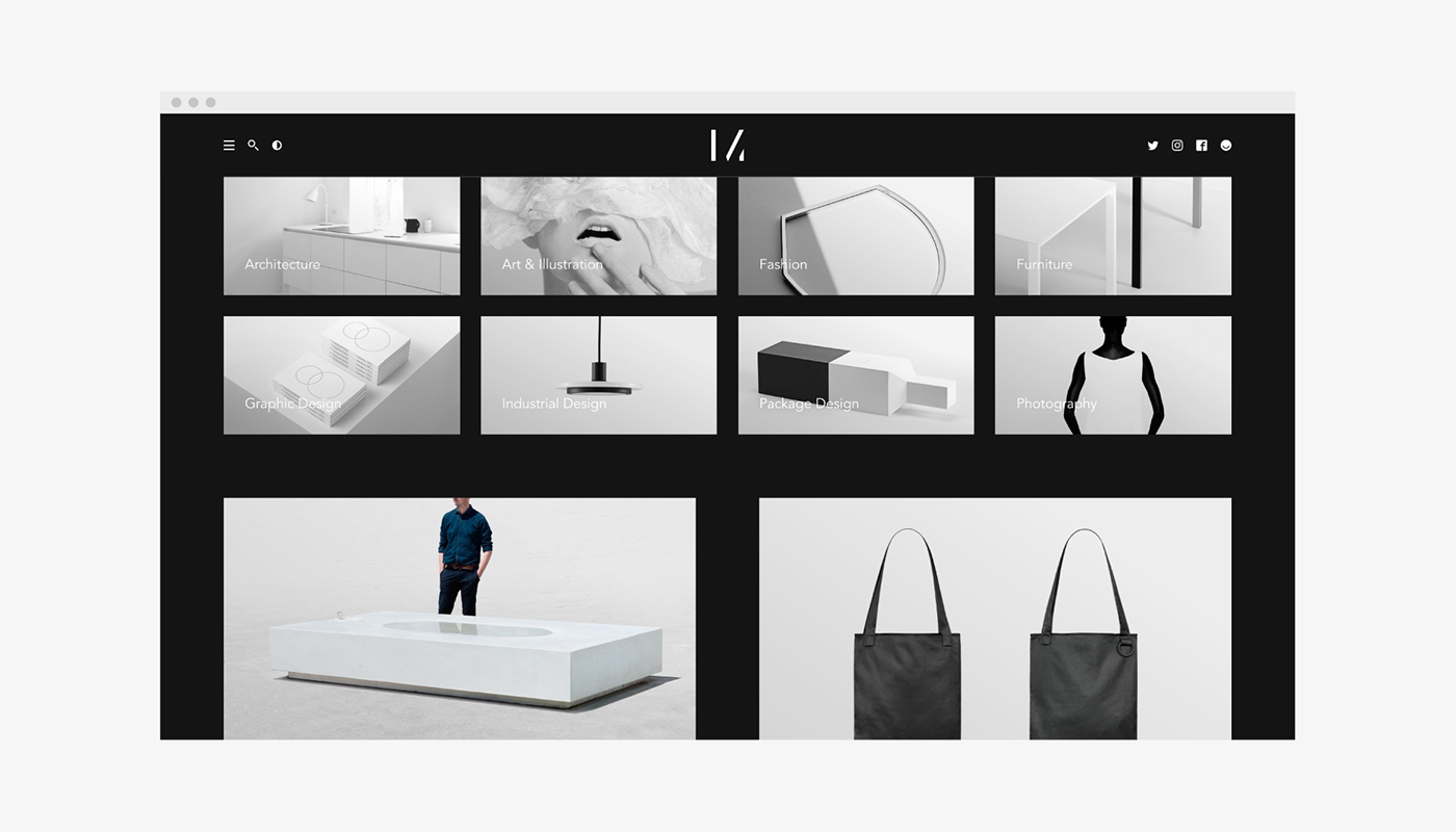
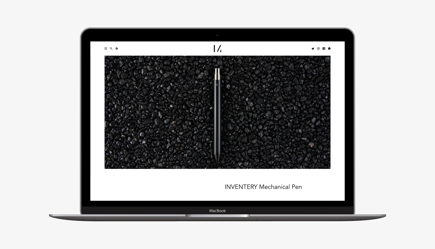
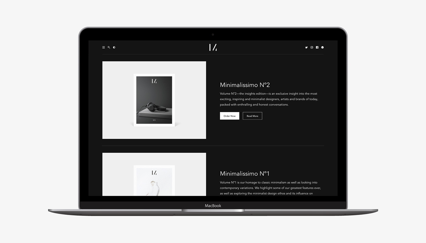
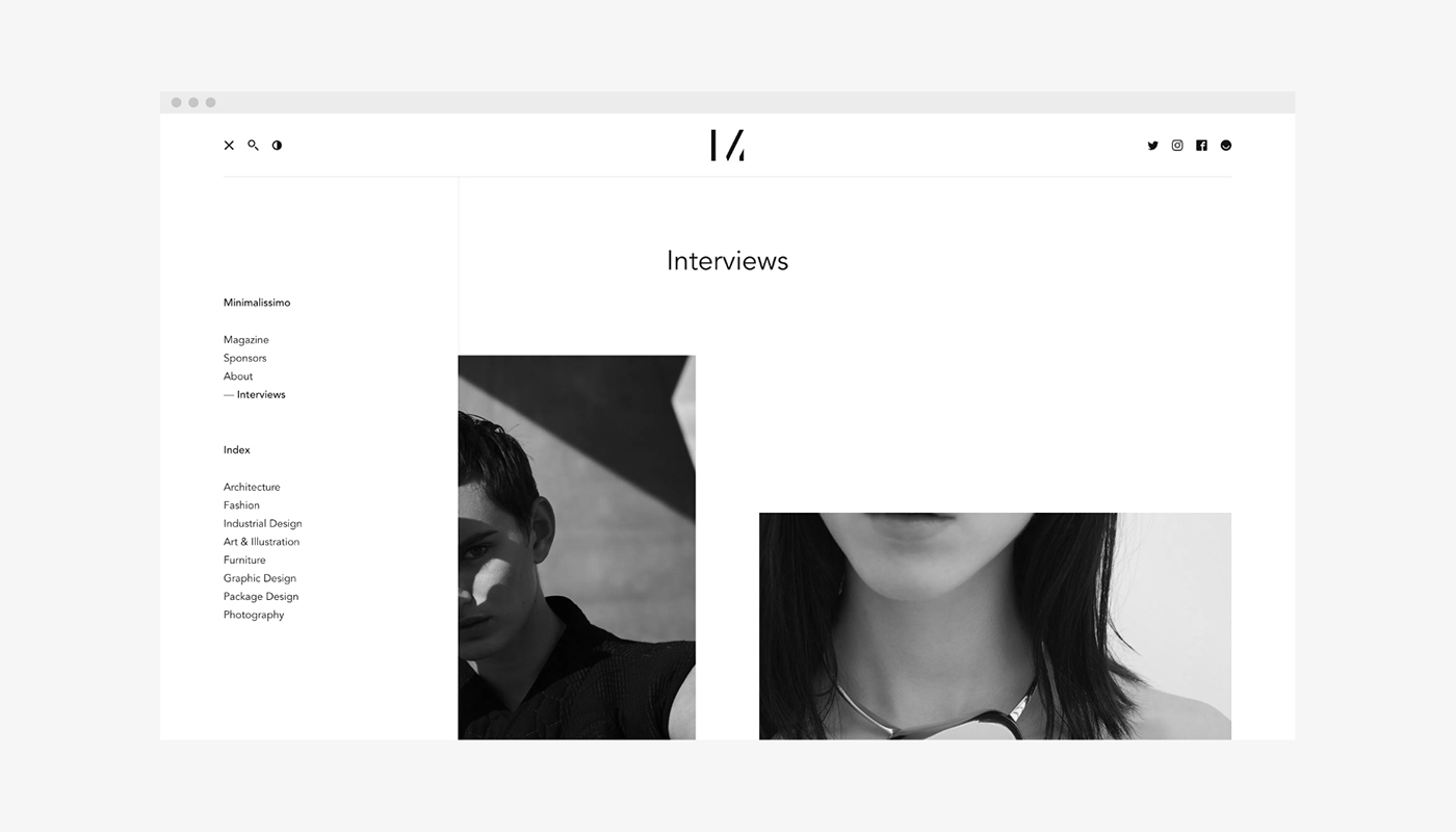
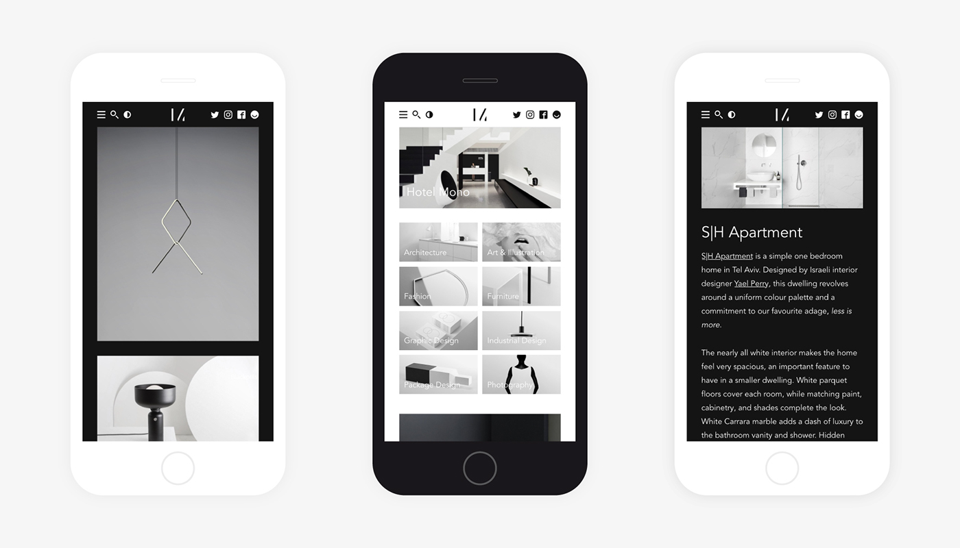
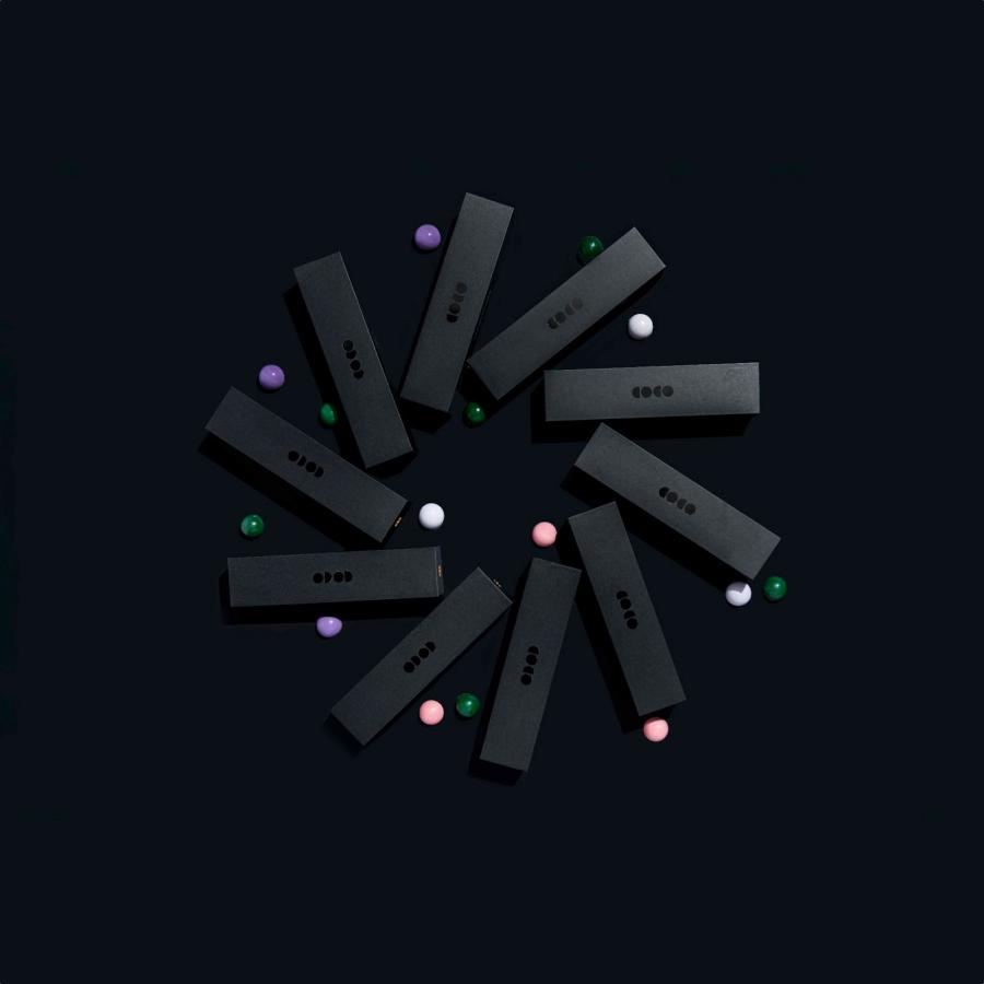
Minimalissimo is one of my favorite websites, especially for everything minimalist. I love their logo and for my surprise, I found the brand identity project created by Alessandro Scarpellini for it on Behance. It is really nice to see how the different mediums converge to the same aesthetics. I had only seen the site before, but looking at collaterals and some print examples you can definitely see the consistency of the branding system created by Alessandro. The best thing about this project though is the fact that is not new. It dates back to 2015. I know it's just three years, but for this day in age, especially for digital content that can be a long time. It is also another important proof of the power of simplicity to create long-lasting designs.
Alessandro Scarpellini is a brand designer and art director from Italy. For more information make sure to check out http://www.alessandroscarpellini.it/
Rebranding work and new site for Minimalissimo, a magazine that celebrates the best of minimalism in design from the past and present.
Brand identity


