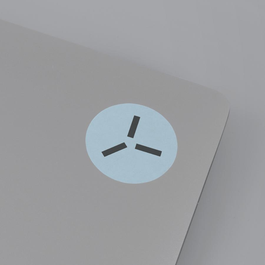
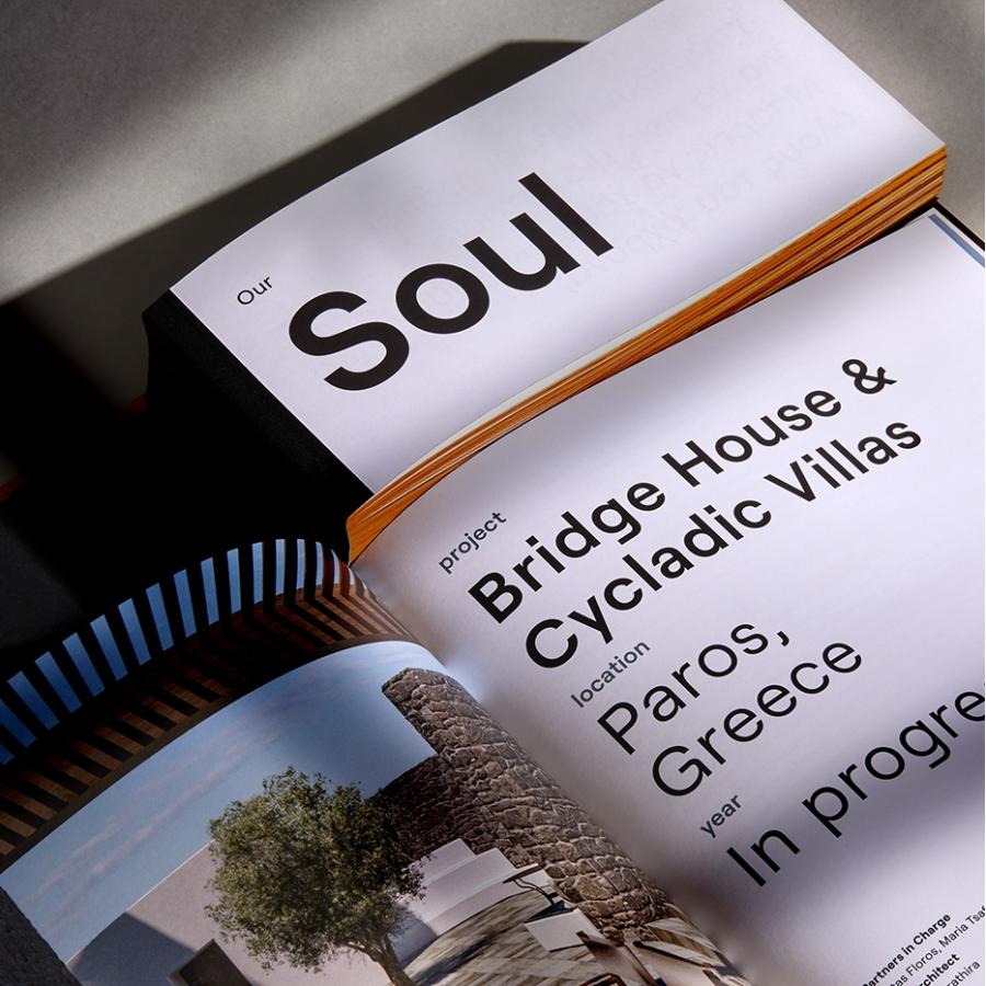
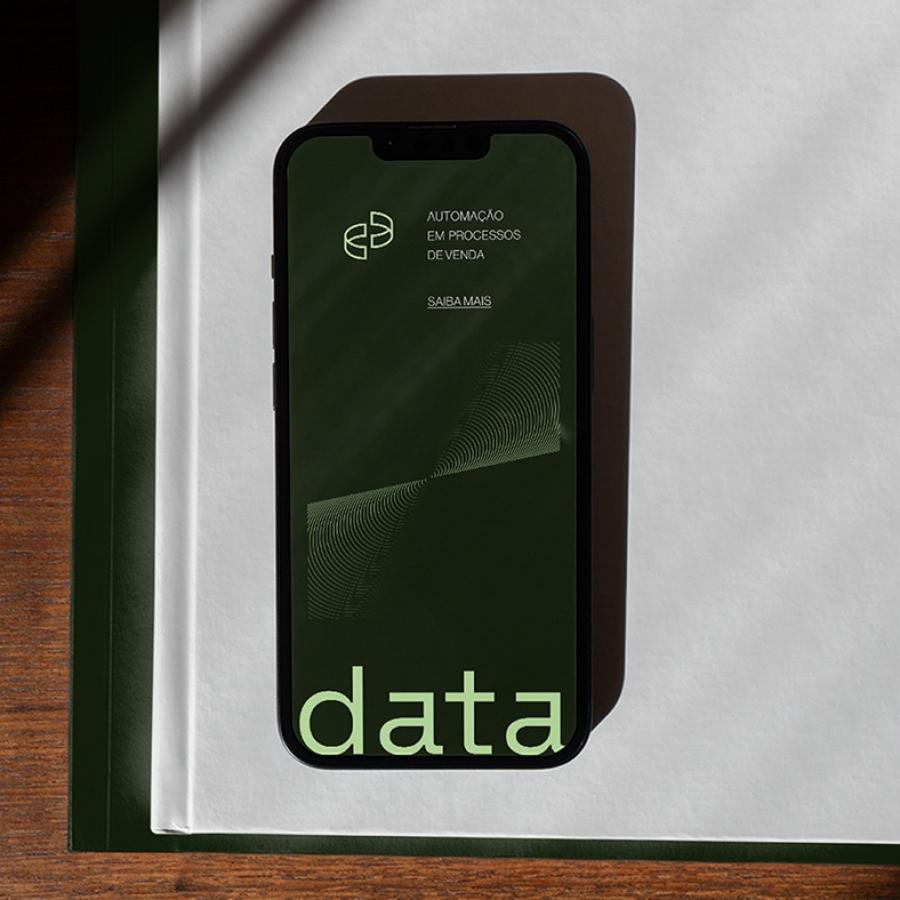
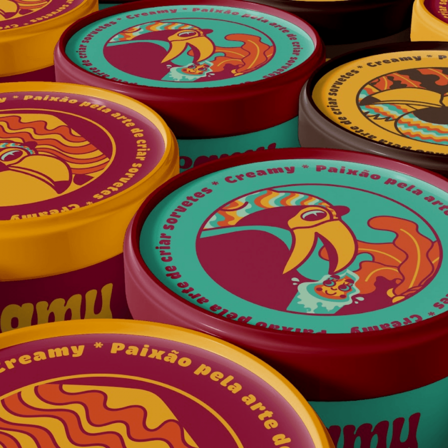
With the new hottopbest design, we always feel compelled to somehow make an effort to mix and match with the grid design. It's quite fun and challenging. To keep this momentum, I wanted to share the work from Sabbath . and the brand direction project they developed for 'Grit' which is a marketing studio that focuses on strategy, content, e-commerce, and ads. It's simple, clean, and I enjoy its modularity? What I mean is that I enjoy how playful is this direction without having to push on a specific primary tone to determine the overall direction of the marketing studio. What do you think?
Sabbath . is a design studio specializing in branding, packaging, editorial, and web design based in Monterrey, Mexico. For more on Sabbath . , check out their site at sabbath.mx/


