Ethem Cem shared a really awesome case study on 3D and motion where he had the opportunity to work with Creative Director Duncan Elms and Elastic to pitch frames for the Amazon Original's new opener.
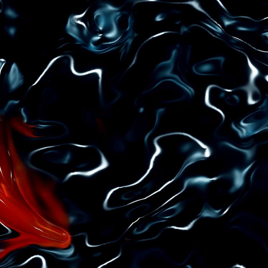
The first approach was to create a sequence in which the camera moves over changing landscapes. hills, tunnels, curved walls. The landscape is made up of light streaks. It begins with just light dots on the surface, then as light increases and grows in intensity it becomes light streaks. We travel over it and find the logo.
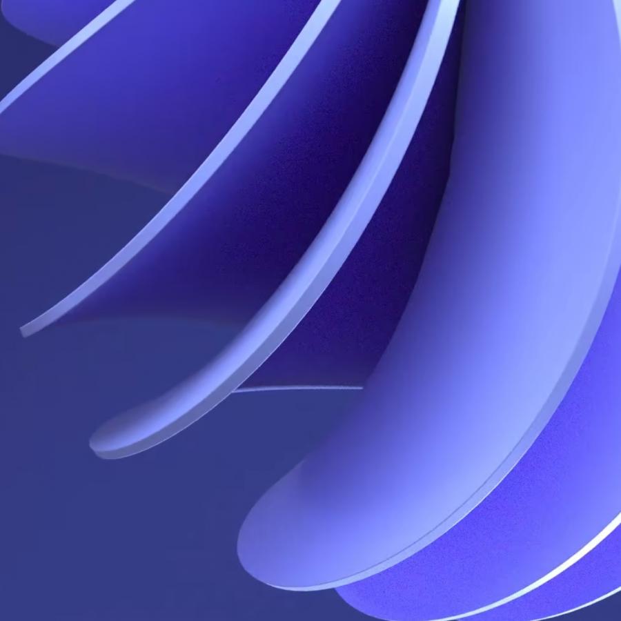
The second approach is to create and feel abstract gradients. Seeing the light traveling over the close crops of the letters making different patterns over different shots. In some shots, we tried to get the feeling that a light source is shining into the object to create the effect. The camera begins to pull out and we see the parts of letters with a prism effect. The camera keeps pulling out from a different angle, we see a light source shinned into it and realize this has a bit of a film projector feel.
For the third approach, the idea was to create a place where everything should feel like a warm place we want to visit or be in. We tried to create a sequence that includes all stages of daylight. It starts with sunrise and we see close-ups from within letters looking around the environment. The camera pulls off and we see a wide letter in the environment at magic hour with two people in it. Then we see the letters are flying up into position in sunset lighting. And final lock-up on a blue gradient, lighter feeling in the late evening.
For the fourth approach, they tried to project different kinds of lights through the letters. Laser, projector, and more organic daylight. The idea was to set up huge interiors and use them as inside of the letters. They had projected the light to different kinds of surfaces like concrete, metallic, and glass.
Our main goal was to emphasize the diversity of contents in Amazon by using different kinds of light sources.
The idea behind the fifth approach was to hide letters into architectural structures. Ethem and team tried to create hints in these structures by using the daylight and shadows. The sequence starts with geometric details from structures and slowly reveals the typography.
Our main inspiration for this concept was James Turrel's installations
For more information make sure to check out Ethem on
