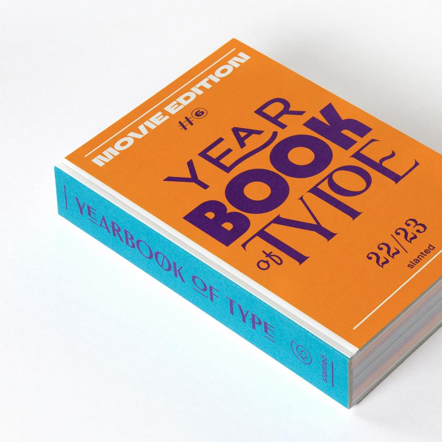
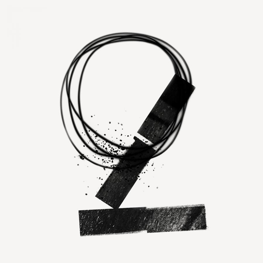
Accept & Proceed Principal Designer Nigel Cottier announces the launch of Letterform Variations, a personal project comprising a book published by Slanted, a font collection, and a series of artworks that look at letterform construction using basic grid and shape based systems, and its potential to generate vast amounts of varying alphabetical outcomes.
Letterform Variations, a Playful Study into Letterform Construction
Letterform Variations is the product of Nigel Cottier’s methodology for developing letterforms that are based partly on visual transformations generated by algorithmic functions, such as constraints, rules, grids, and modules, and partly on designerly judgments about composition, balance and visual dynamics. Cottier’s modular systems are built within expansive design spaces that facilitate the production of an almost infinite range of outputs, but what distinguishes them is the considered choices he makes subsequently, categorizing, and editing his results as competent and handsome representations of alphabetic forms. This connection between impartial geometric shapes and the alphabetic code brings to mind Paul Elliman’s contention that the boundaries between typography, typology and topography are never distinct.
Design
Letterform Variations Book / Image by Alistair Ramage
692 pages containing 19,840 letters, all derived from one simple framework. The book explains the scope and structure of the project and contains a large selection of the possible outcomes. Section A (Letterform Variations 00) contains a series of alternative characters or stylistic sets for each basic Roman symbol (a—z, A—Z and 0—9), all drawn using the same simple and primitive line grid for construction. With 16 stylistic sets for each character and additional punctuation, this counts over 1,000 symbols.
“I have always gotten a kick out of system-based design and art, and using formulae and data as tools for creation. Gerstner, Morellet, Molnar, Mohr are all big influences. I love the idea that you can create something by building a system and then pressing go, and whether the system creates beauty or ugliness, there is still beauty in the system itself. You just might have to tweak the system slightly to create beautiful outcomes.” Nigel Cottier, Principal Designer, Accept & Proceed.
Letterform Variations Book / Image by Alistair Ramage
Section B of the book contains 9 variations of the original complete set. These character sets (Letterform Variations 01—09) are adapted versions of the original system replacing the line grid structure with more nuanced forms, geometric forms and combinations of geometric forms. By replacing stems and terminals with alternative forms the language of the typography shifts. These characters have varying levels of legibility but express a secondary form of creation and graphic language; the geometric components within the characters visually interact with adjacent characters to create a kind of coded gridded patterning.
Letterform Variations Book / Image by Alistair Ramage
The Further Grids section displays example sketches of other potential grids for creation, the intention being to show the vast possibilities within grid based letterform development.
Letterform Variations Font Collection / Images by Nigel Cottier
The font collection consists of all 10 variable fonts all containing 16 alternatives for each roman symbol. Each font contains a contextual alternate script to make the letterform selection feel random when typed. In total there are over 19,000 alternative characters within two weights, but with each font being variable, it creates an almost infinite number of varying forms.
Letterform Variations Artwork / Image by Nigel Cottier
297x420mm artworks are mechanically drawn onto archival paper using Posca paint markers. Each letterform is produced only once, and all artworks are individual and unique, signed and numbered.
Details
- Publisher: Slanted Publishers
- Concept & Design: Nigel Cottier
- Foreword: Paul McNeil
- Publishing Direction: Lars Harmsen, Julia Kahl
- Release: November 2021
- Volume: 692 pages
- Format: 15.5 × 20 cm
- Language: English
- Workmanship: Softcover, matt soft touch finish
- Printing: KOPA
- ISBN: 978-3-948440-35-0
- Price: € 35.–
For more information make sure to check out letterformvariations.com or


