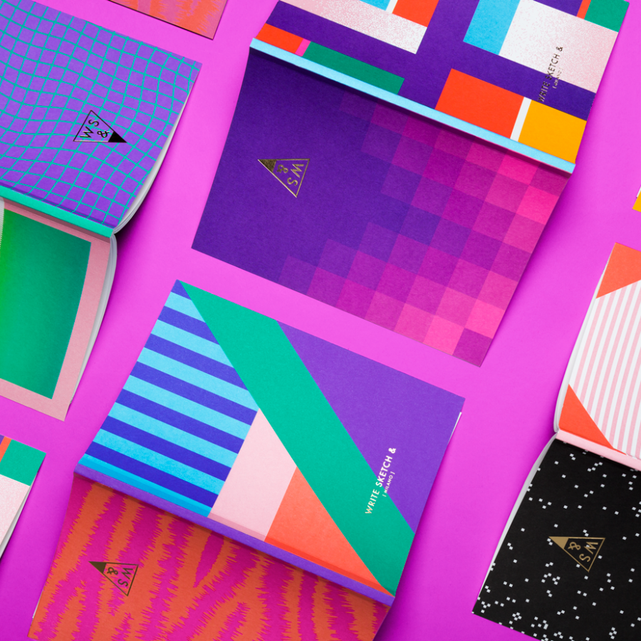
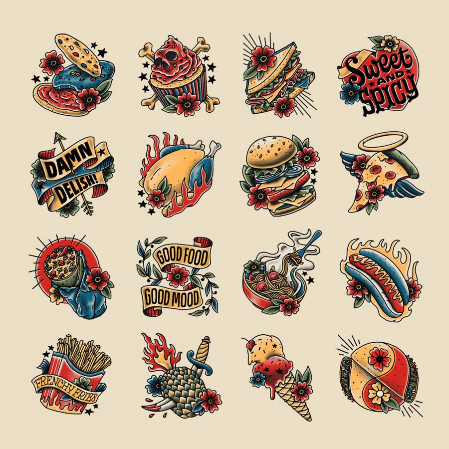
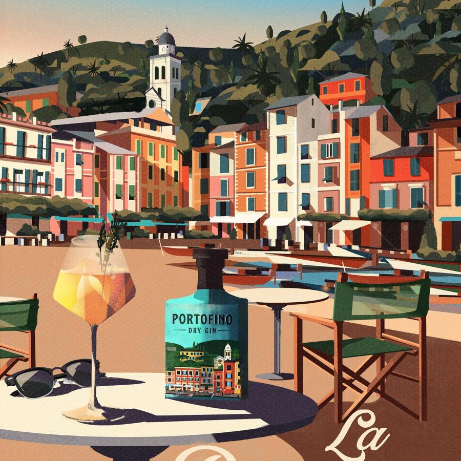
Ahoy Matej is a designer and illustrator based in Croatia with a distinct style that is both playful and minimalist. His illustrations are instantly recognizable, featuring bold lines, geometric shapes, and bright colors. In this article, we will explore his unique style and approach to illustration.
His style is heavily influenced by his love of geometry and the use of basic shapes to create complex designs. His illustrations often feature triangles, circles, and squares arranged in a way that creates a sense of movement and depth. The use of bright, bold colors also adds to the overall energy of his work.
You will realize that his illustrations are not only visually appealing but also convey a sense of fun and playfulness. Many of his designs feature animals or other whimsical characters, and his use of bold colors and geometric shapes gives them a unique personality.
Illustration of Dipsea Sleepovers Case Study
The Dipsea Sleepover is a project a series of illustrations created for Dipsea, a female-founded startup and story studio that focuses on women's sexual wellness. They also aid restful sleep through a series of short stories and soundscape programs.
The illustrations are a series of scenes depicting couples in intimate moments, set against dreamy, pastel-colored backgrounds. The scenes are carefully crafted to convey a sense of intimacy and connection, while also leaving plenty of room for the viewer's imagination.
The use of color and composition is particularly noteworthy. The soft, muted colors create a dreamlike quality that enhances the sensual nature of the illustrations. The use of negative space also adds to the overall aesthetic, allowing the viewer to focus on the essential elements of the scene.
You can check more of the Nick Matej's work at ahoymatej.com and Instagram.


