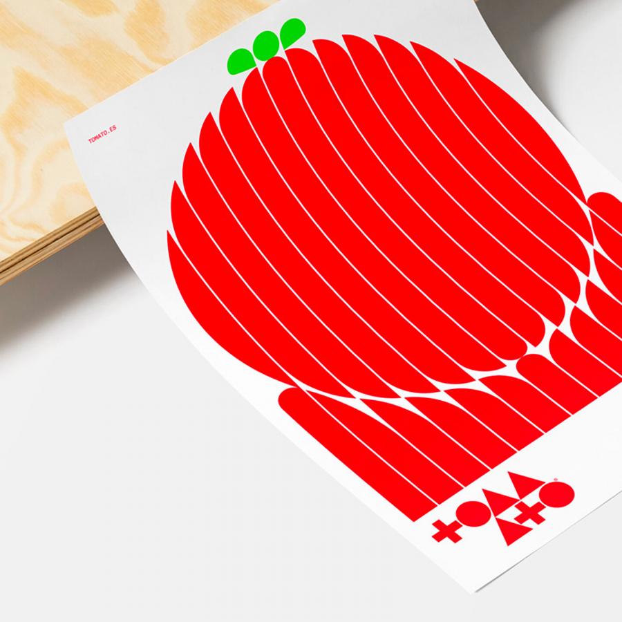
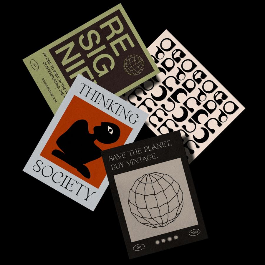
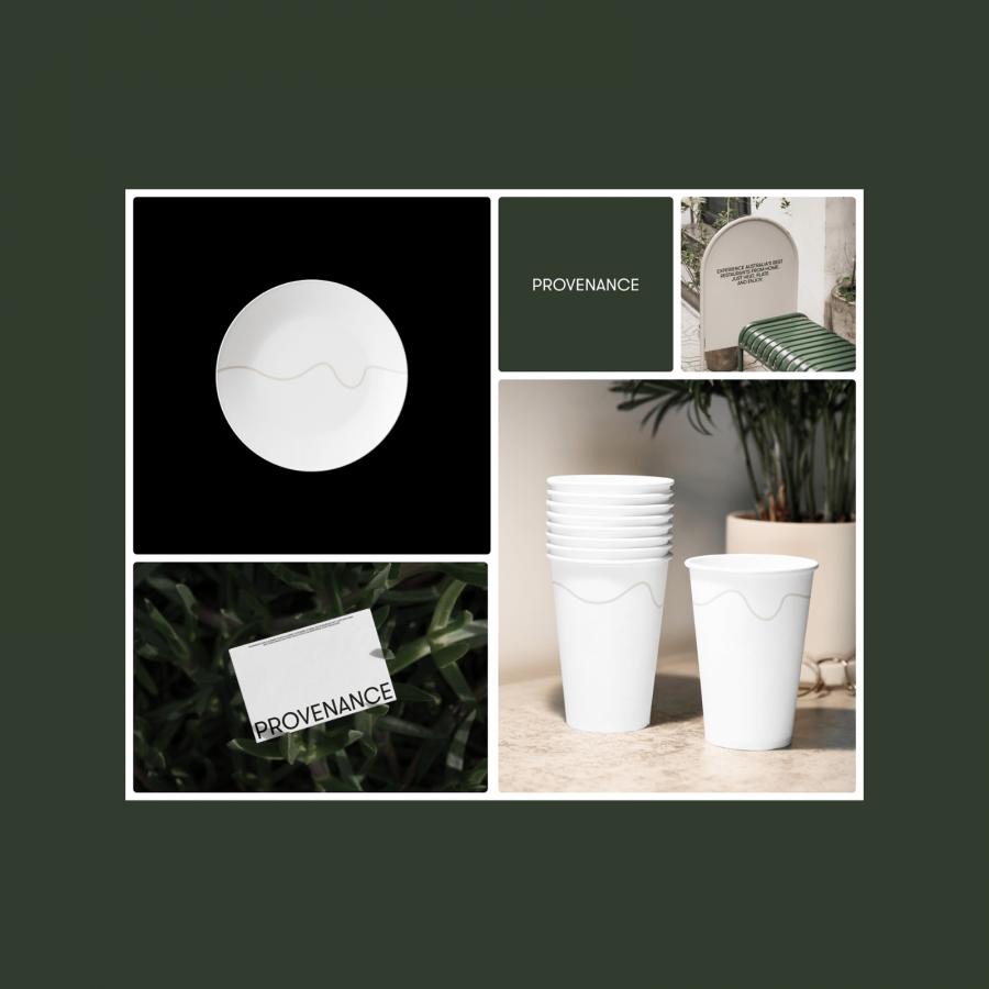
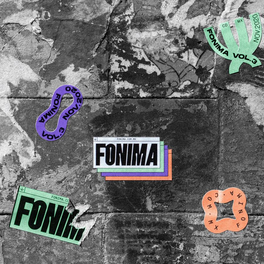
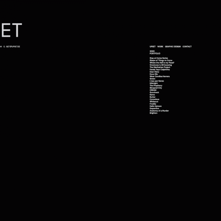
Explore HR/STUDIO's minimalist branding and visual identity designed by Henrique Regonato, featuring Swiss style elements, a cohesive color palette, and elegant typography.
Henrique Regonato, a distinguished designer, unveils the visual identity for HR/STUDIO, his commercial brand name. The project, showcased on Behance, embodies a minimalist approach with a striking blend of Swiss style design elements, enhancing the studio’s unique identity.
The color palette is anchored in black and white, complemented by shades of grey and an orange accent. This combination creates a visually cohesive and modern look. The simplicity of the colors allows the orange accents to stand out, highlighting key elements and adding a vibrant touch to the overall design.
Typography plays a crucial role in HR/STUDIO’s branding. Regonato uses sans-serif fonts that are both simple and elegant. The bold contrast between font sizes emphasizes hierarchy and readability, making the content easily digestible. This choice of typography aligns with the minimalist aesthetic, ensuring that the visual identity remains clean and uncluttered.
The design style leans heavily on Swiss style principles, characterized by clarity, order, and functionality. The minimalist approach reduces visual noise, focusing on essential elements. This style is evident in the balanced layout, precise alignment, and ample white space, which collectively enhance the visual impact of the branding.
Regonato’s work on HR/STUDIO’s identity demonstrates a deep understanding of branding and visual identity principles. The minimalist design not only reflects modern aesthetics but also ensures versatility across various media and platforms. This adaptability is crucial for maintaining brand consistency, a key aspect of effective branding.
The HR/STUDIO project is a testament to Henrique Regonato’s design prowess. His ability to merge simplicity with bold design choices results in a branding that is both timeless and contemporary. For designers and branding enthusiasts, HR/STUDIO’s visual identity serves as an inspiring example of how minimalism can be effectively employed to create a strong and memorable brand presence.
Branding and visual identity artifacts
For more information make sure to check out Henrique Regonato on Behance and website at hrstudio.com.br
