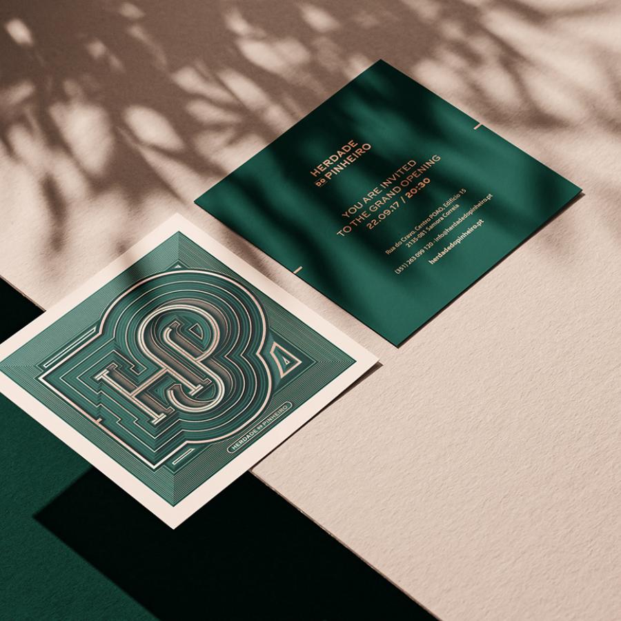
Donuts, oh donuts! It’s hard to resist the temptation of those little fried pieces of dough. To make things even harder Mariana Font and César Romero created a colorful and fun visual identity for House of Donuts. By playing with typography, colors and pattern they created a beautiful system that is playful but super modern and elegant. I personally love the packaging and printed materials. The website is awesome great, especially the hamburger menu.
Visual Identity
Marina is a graphic designer from Venezuela, currently based in Buenos Aires, Argentina. Cesar Romero is a graphic designer based in Santiago, Chile. For more information make sure to follow them Marina on Instagram


