We used to run the Friday Free Fonts series of posts in the past but finding free fonts are not that easy. We understand the level of work necessary to design a font and good work is not always free. So today I want to feature the Frontage Condensed Typeface designed by Juri Zaech, a Swiss Art Director, currently living and working in Paris, France.
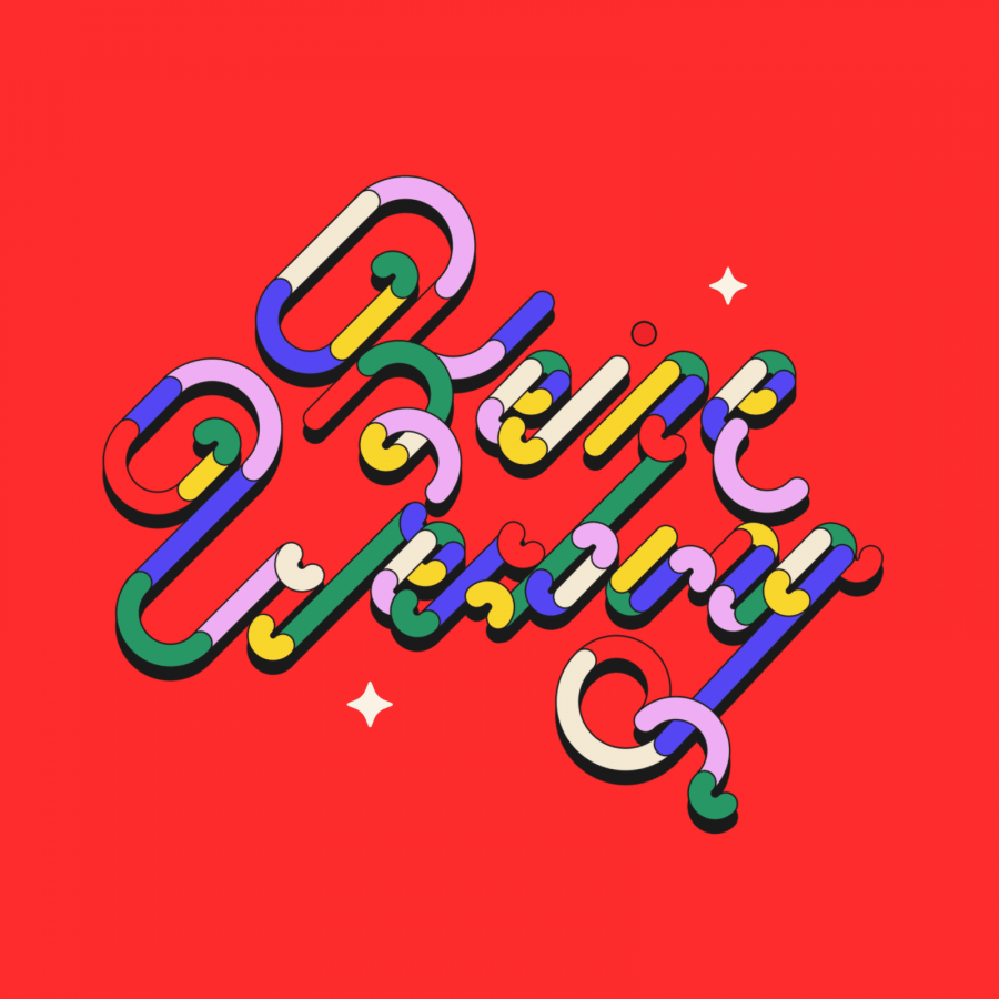
Frontage Condensed is a layered type system inspired by eye-catching and colorful facade signage. Its main aspect is — like many typographic installations on storefronts — three dimensional. The narrow, generously spaced letterforms lend the typeface a bold and eminent voice. The more ornamental layers like Bulb or Neon bring nostalgia to the family, while the Shadow layer maximizes the spacial impression.
The system’s ten layers can be used alone or combined making the family a versatile toolkit. The use of color reveals Frontage Condensed’s full potential, yet for stark applications it works great in black and white too. Check the specimen PDF for examples.
Frontage Condensed features 52 catchwords. They can be simply activated through OpenType’s Discretionary Ligatures and are an easy way to enrich the typographic texture. Other features include fractions, numerators and denominators. Frontage Condensed’s 339-character set covers over 190 latin languages.
Available from youworkforthem.com and myfonts.com
Typeface Design
For more information and to check out Juri's work check out his website at http://www.juri-zaech.com/


