Dive into Typefool's branding and visual identity. Discover how minimalistic design and typography create compelling brand stories for diverse audiences.
In the ever-evolving landscape of branding and visual identity, Typefool stands out as a beacon of minimalistic design and impactful storytelling. Founded by the visionary Jen Ditters, Typefool is more than just a design studio; it's a narrative of simplicity and elegance woven into the fabric of brand identities.
At the core of Typefool's philosophy is a commitment to distilling creativity into its simplest form. This approach is vividly reflected in their latest project, which showcases a unique blend of minimalistic design elements and powerful visual storytelling. The project, a testament to Typefool's prowess, aligns perfectly with the modern trend where less is indeed more.
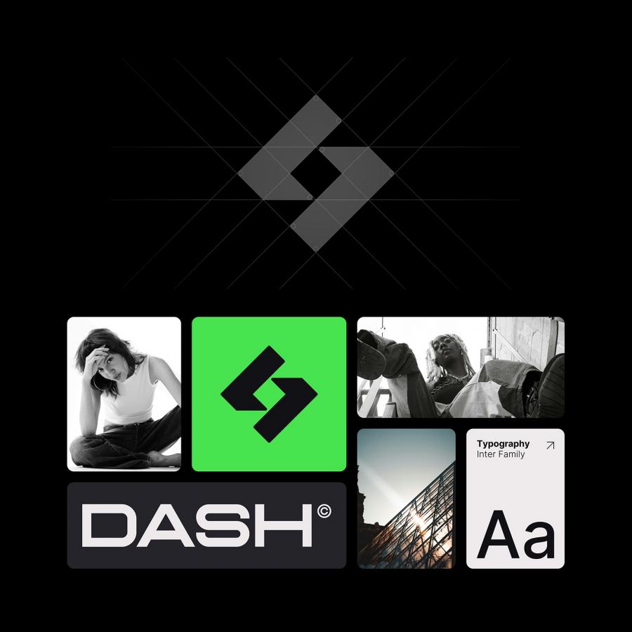
Typefool's visual identity is anchored by its distinctive logo. The logo, a harmonious blend of the Roobert font and soulful lettering, narrates a story of innovation and simplicity. It's not just a symbol but a narrative element that encapsulates the brand's essence. This fusion of design and storytelling is what sets Typefool apart in the branding realm.
Another striking aspect of Typefool's identity is the use of Roobert Pro. This font, characterized by its sleek and modern aesthetic, embodies the brand's ethos of authenticity and sophistication. It adapts effortlessly, from bold to light, mirroring the versatility and dynamism of Typefool's design philosophy.
Photography plays a crucial role in bringing Typefool's brand to life. Each image captures the vibrant energy and collaborative spirit of the studio, offering glimpses into the creative process that fuels their innovative designs. This visual storytelling not only highlights the brand's personality but also connects with the audience on a more intimate level.
In summary, Typefool's brand identity is a masterclass in minimalist design and effective branding. It's a perfect blend of visual simplicity and narrative depth, making each element a critical part of the larger brand story. This project by Jen Ditters is a shining example of how brands can communicate powerfully and succinctly in a cluttered world, leaving a lasting impact on their audience.
Branding and visual identity case study
Designed by Jen Ditters All rights served ® For more information make sure to check out Typefool website, Behance and Instagram.
