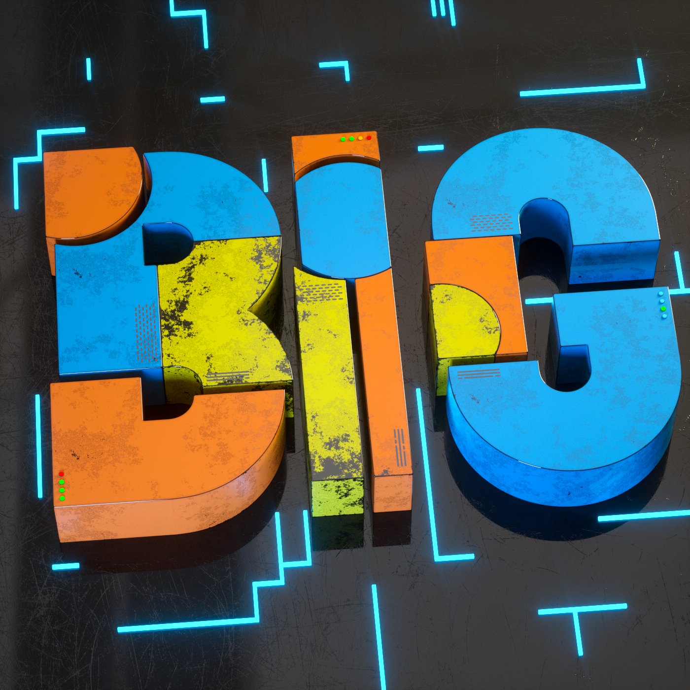
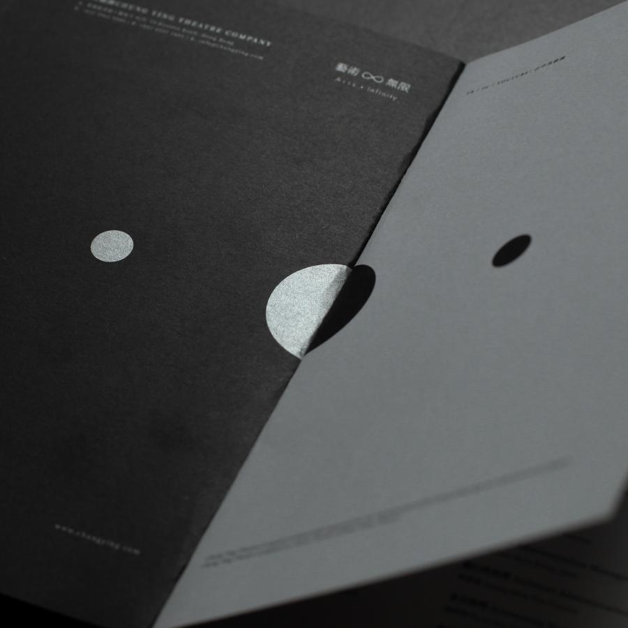
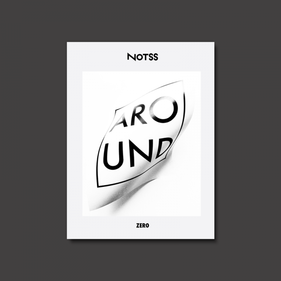
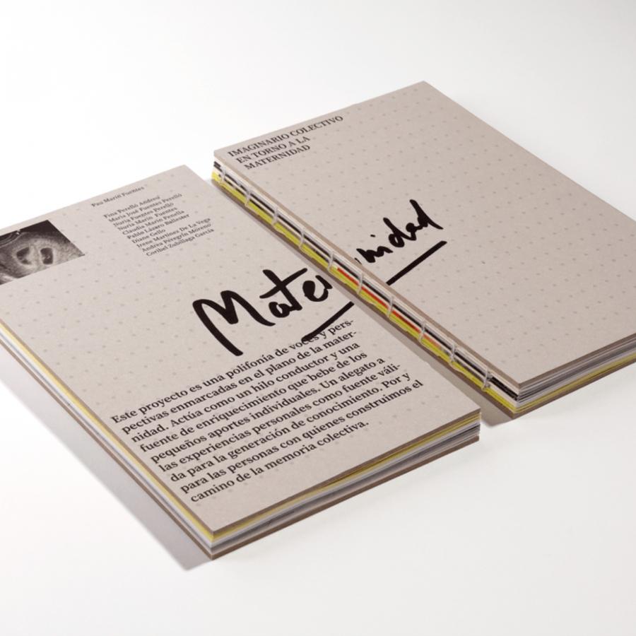
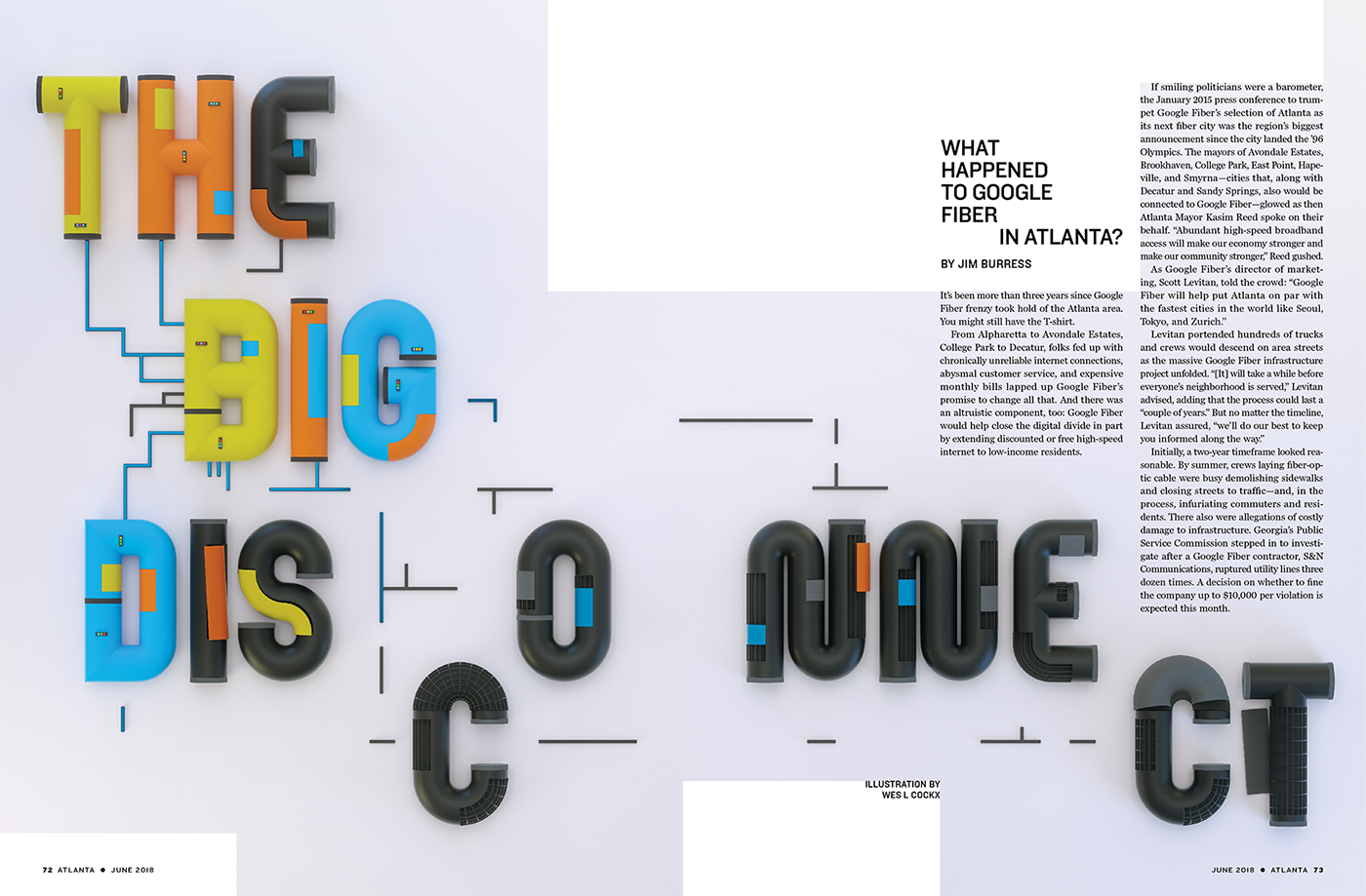
Wes L Cockx shared a beautiful editorial design project on his Behance profile. It was for The Big Disconnect article for the Atlanta publication. The article talks about, or asks what happened to Google Fiber in Atlanta. But we are not featuring it here because of the content per se, but how the content was laid out on the pages as well as the beautiful and bold 3D text.
Below you can see some details of the final piece. In addition Wes, shared a couple "work in progress" examples of alternative designs that were tried. I always love to see those, especially because it gives a bit more perspective that people try a lot of things before landing on what they consider final.
Editorial design

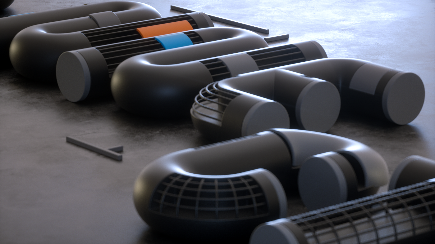


Work in progress

