by abduzeedo
When people ask why we run Abduzeedo, our answer is always, we are always looking for things that inspire us. We are also trying to find new projects before they get featured on other publications. There are some projects that we have to share even after they get featured because they are too good. That's the case of the brand identity project created by the awesome people at atipo ®.
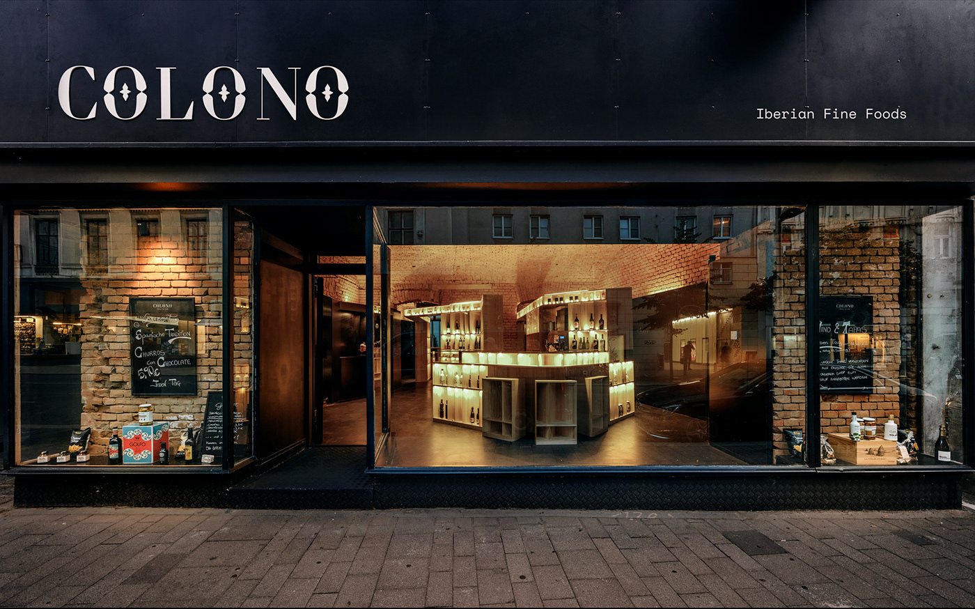
Colono is a culinary project based in Vienna that is mainly dedicated to the import of food from the Iberian peninsula to Austria. Through a direct collaboration with the producer from "colono" they are responsible for getting the best product to the main restaurants, catering services and delicatessen. in addition, in order to publicize its own line of groceries the firm has opened, in 2018, its first physical store in the center of Vienna under the concept “groceries-bar-gourmet”.
For the project, Colono (‘settler’ in english) was our name proposal; direct reference to the person who is established in another territory and the grocery stores, commercial establishments that sell various food products (and that take their name from the set of imports brought from the former spanish colonies).
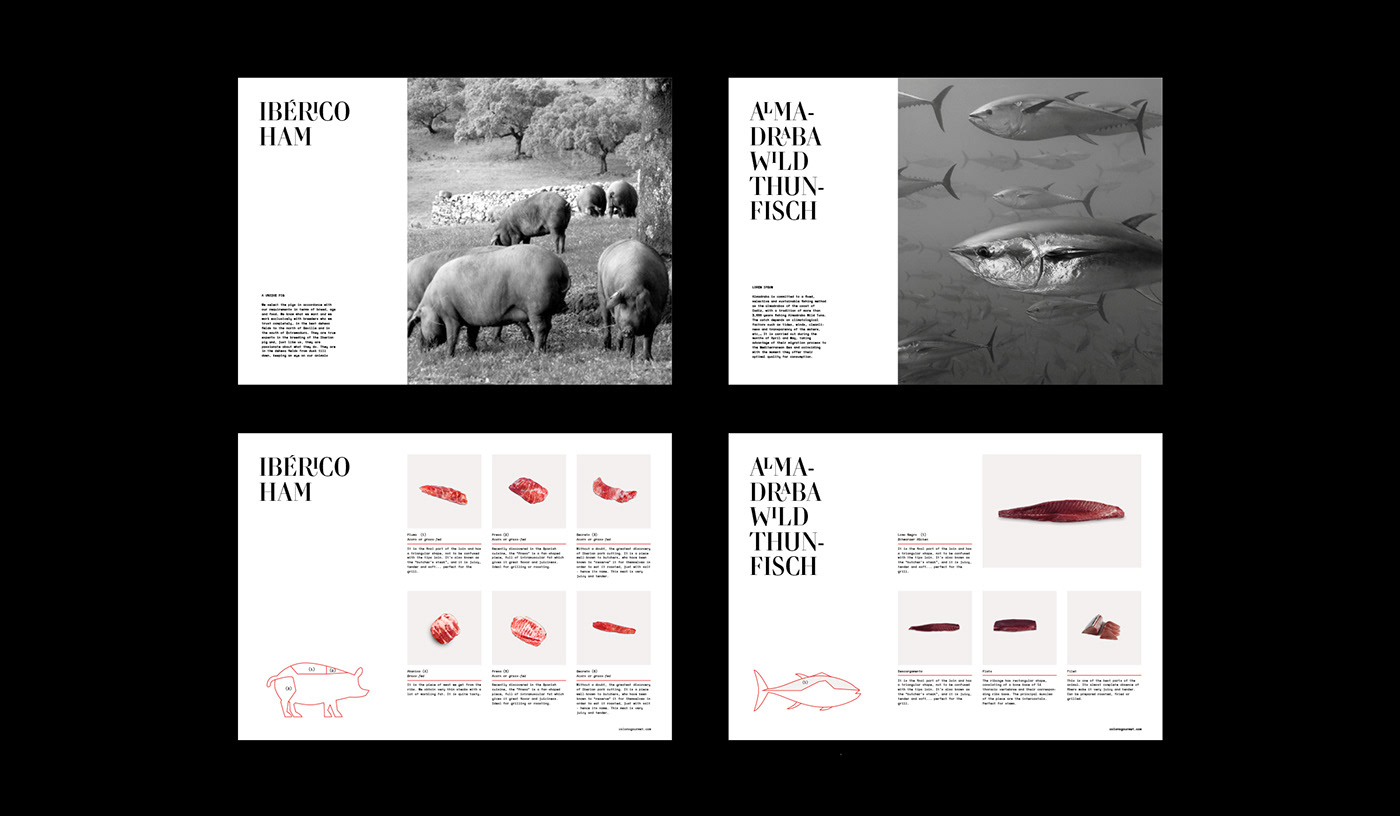
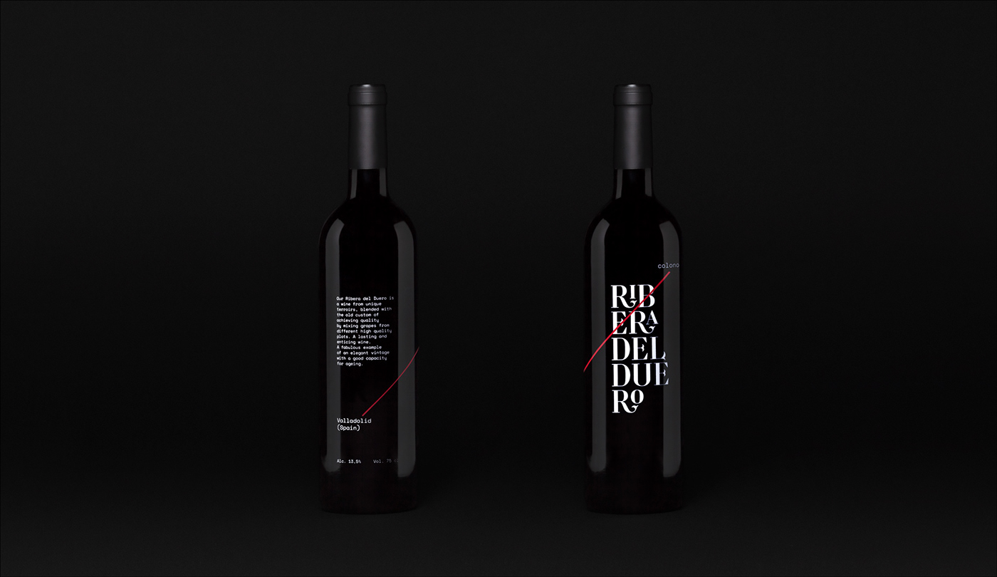
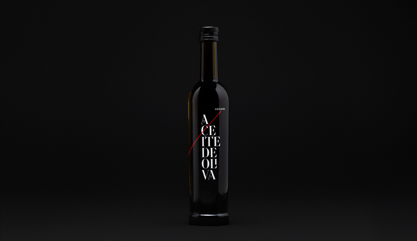
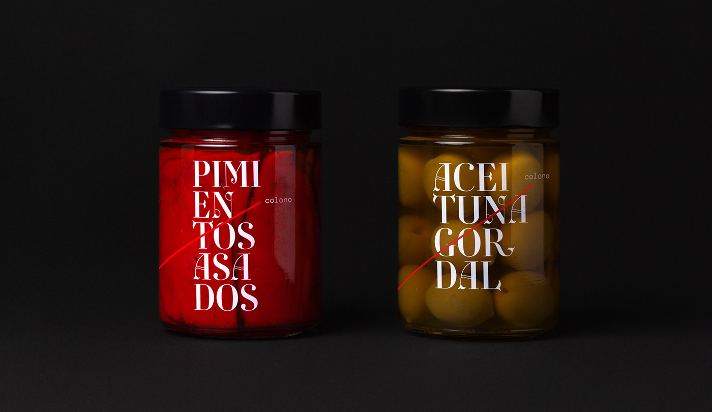
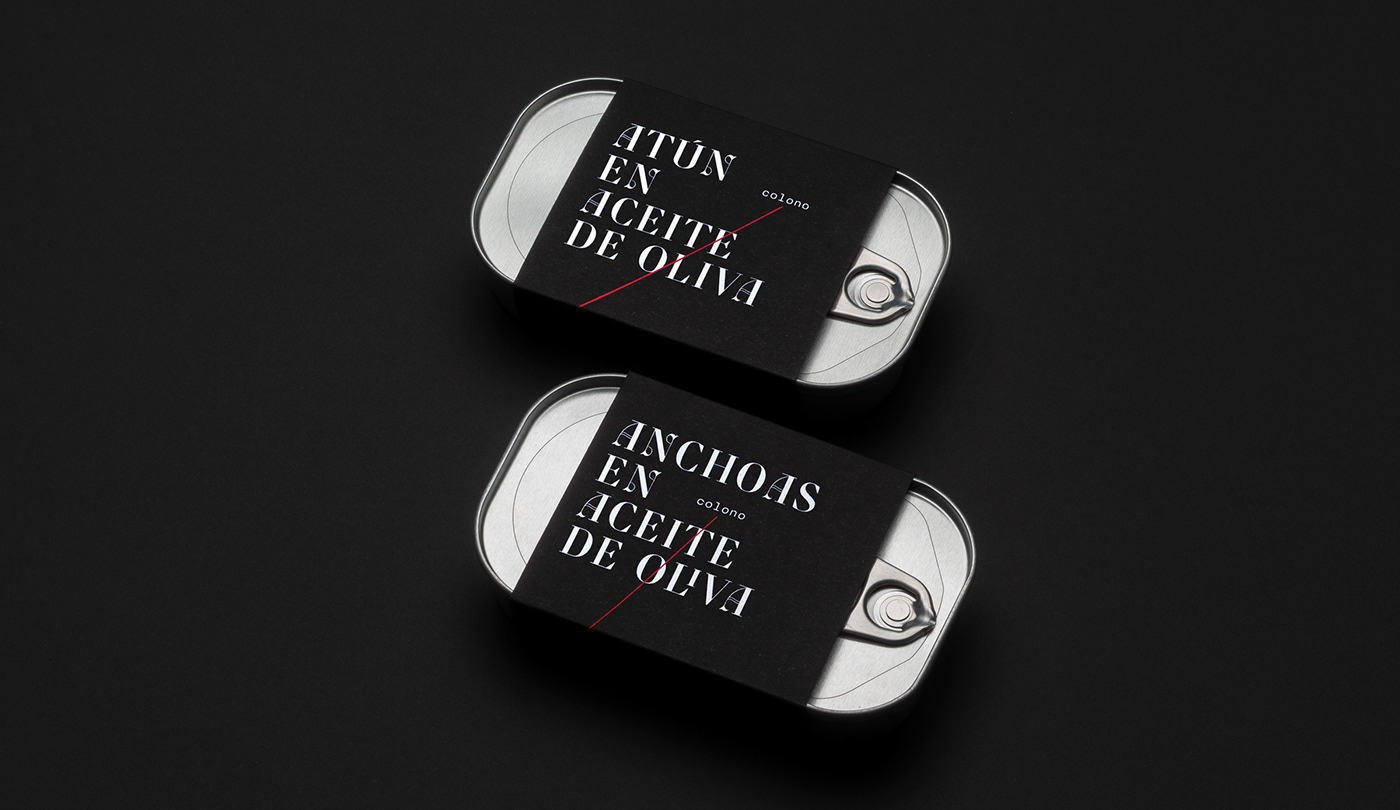
The journey made by the products is the guiding thread of the whole identity and it is represented in the different pieces and packaging through a red line that connects two imaginary points.
Brand Identity
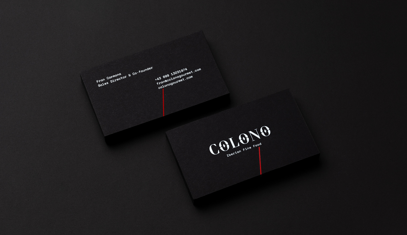
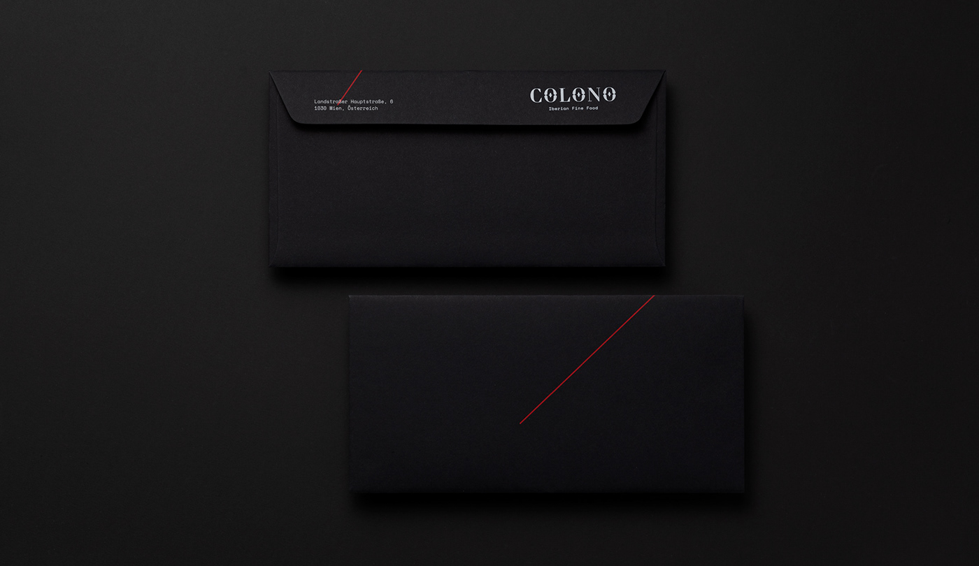
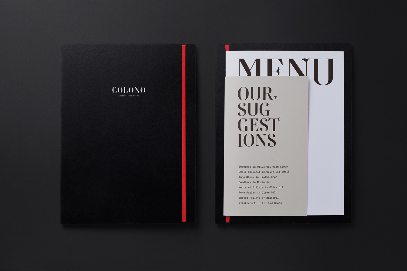
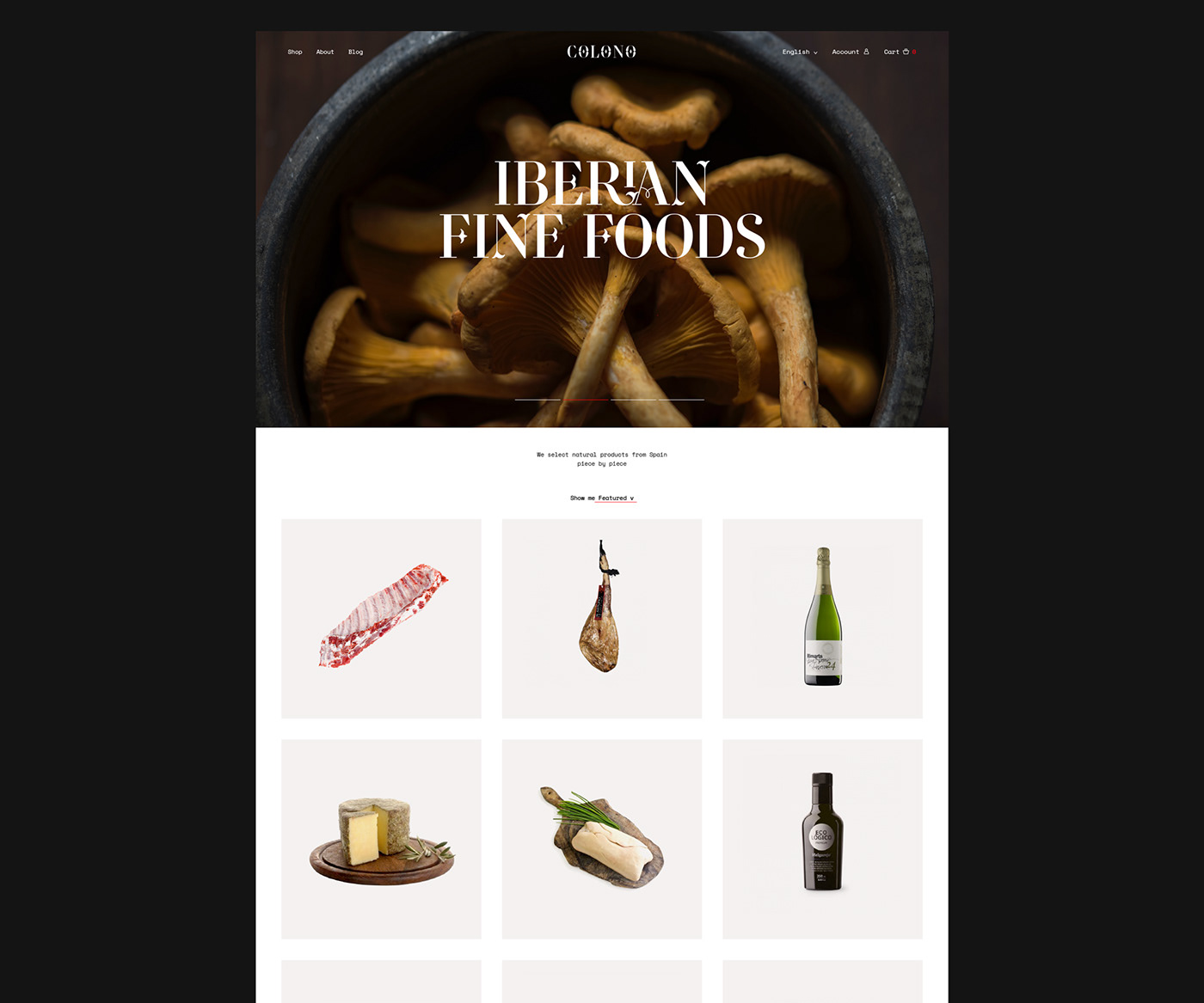
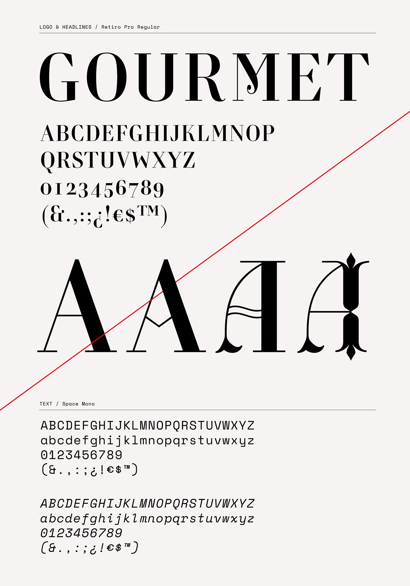
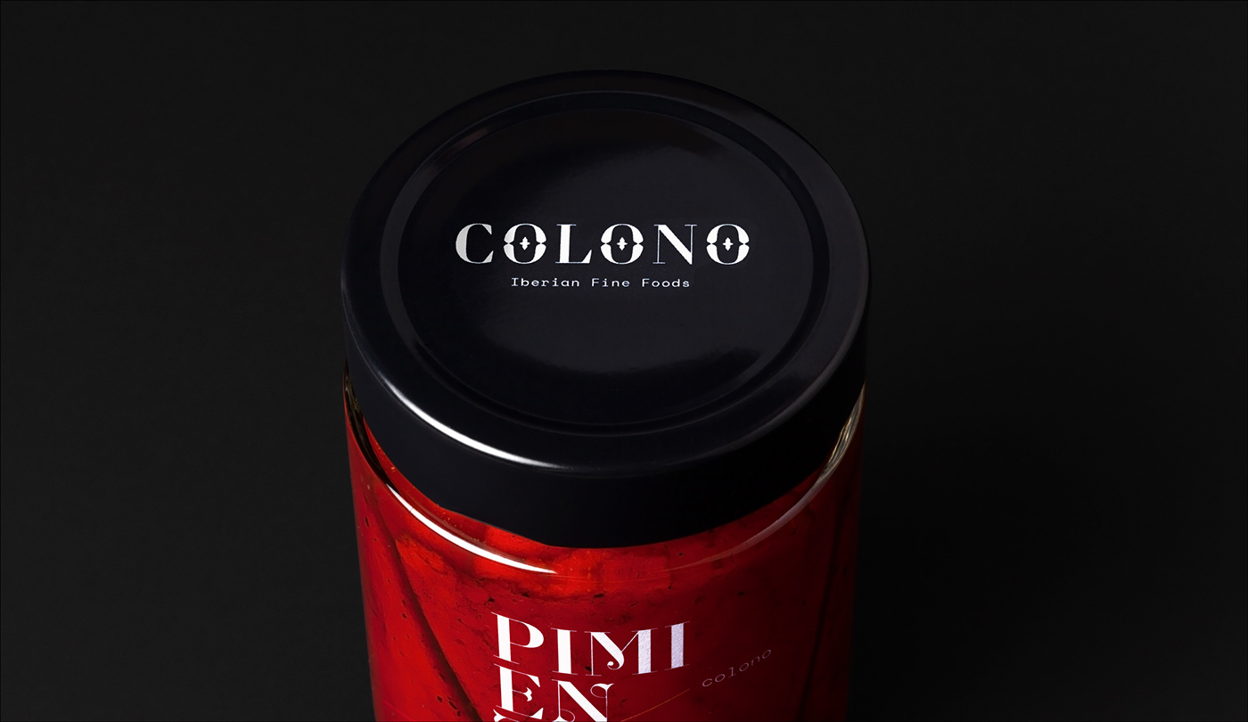
The logo is composed with the Retiro font, elegant didona of spanish airs that perfectly communicates the origin and the select character of the products. in contrast, as a secondary font it is used a monospaced that brings freshness and a contemporary air.
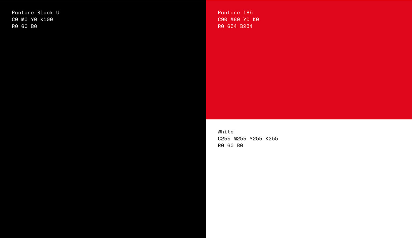
The palette of colors is sober and elegant and seeks to convey the gourmet nature of the project and, in turn, enhance the prominence of the typography where only the red color present in the lines of the graphics stands out above all else.
The set forms a distinctive and faithful identity to a project proud of its origin, but that flees from the clichés and declares itself in love with the product that selects and commercializes.
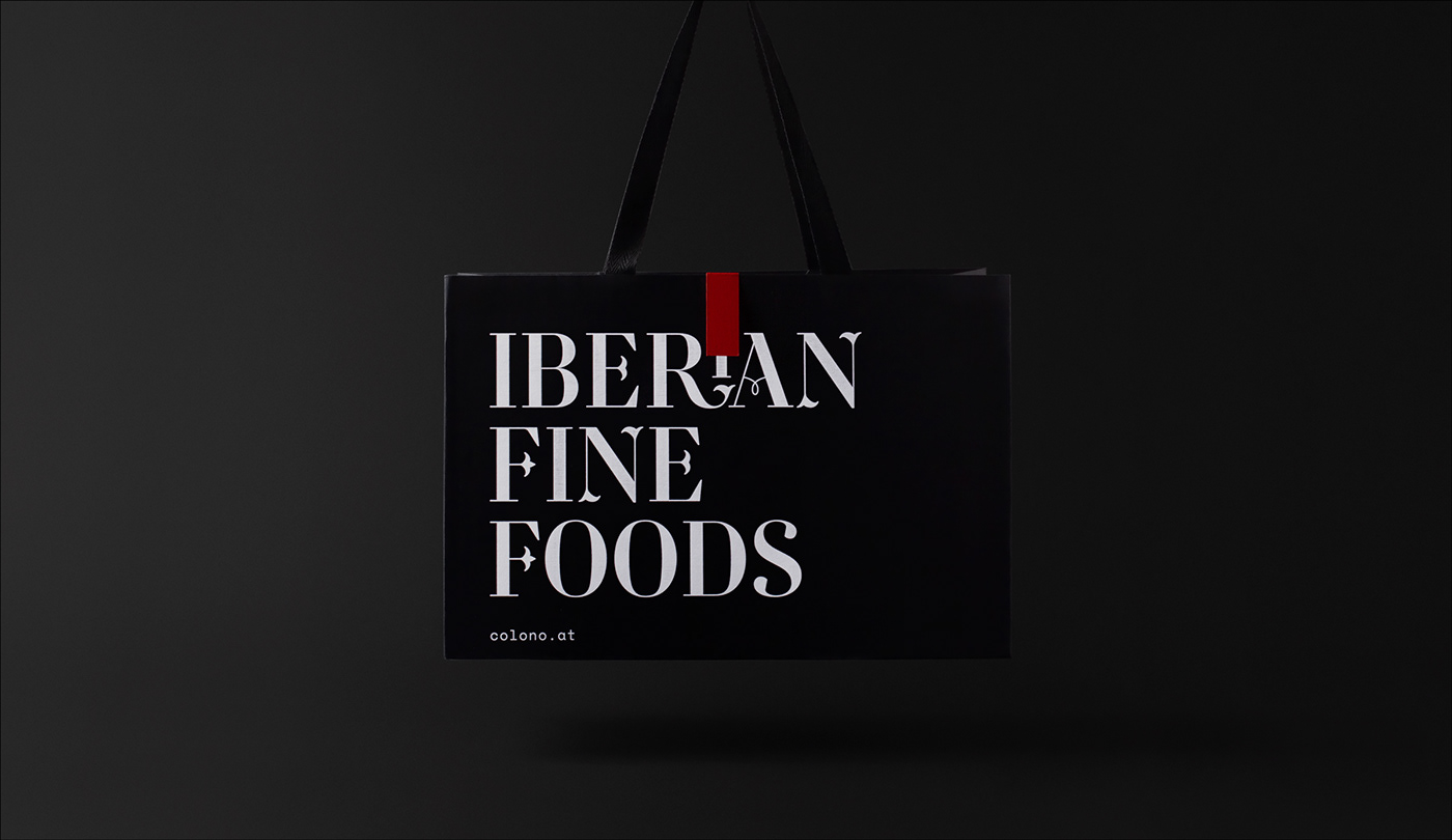
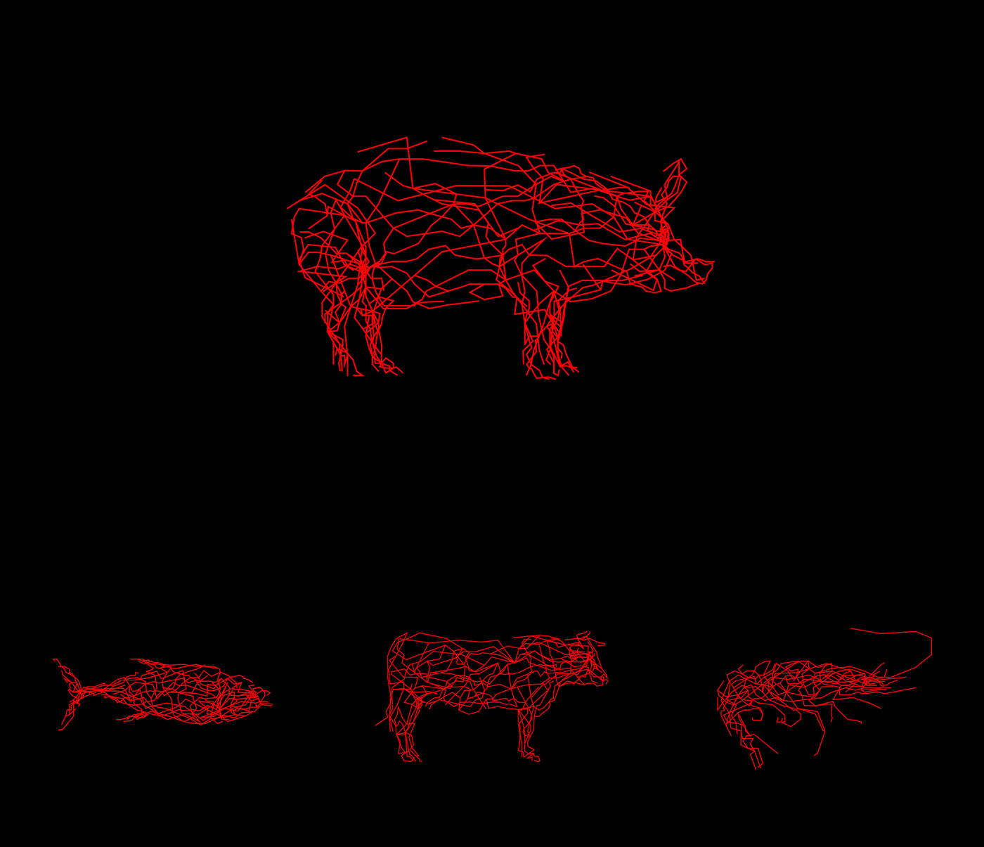
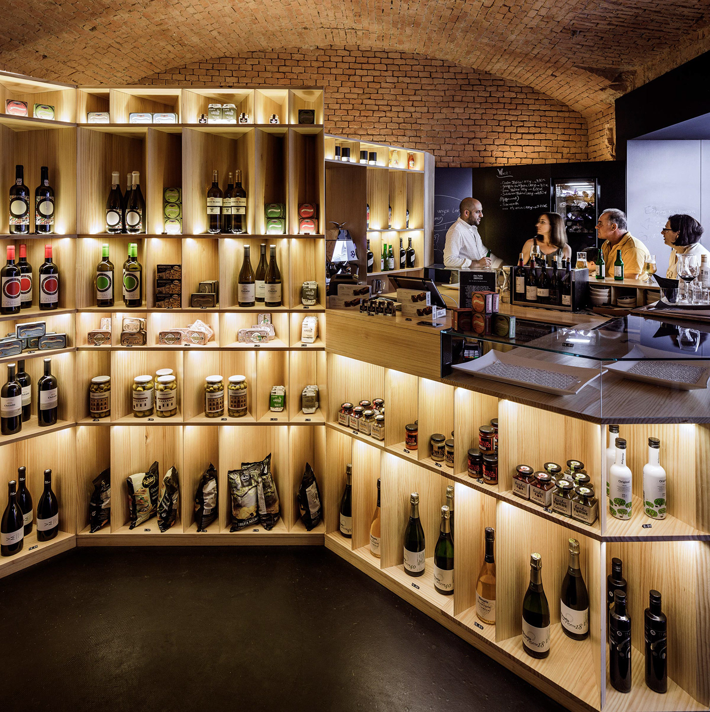
In addition to selected products from different origins, Colono wants to enhance their own range of groceries. the same as the identity, the design of the packaging is eminently typographic and is marked by the red line that invites the consumer to discover the origin of each product.
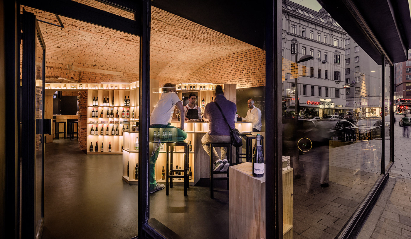
The premises, an update of the grocery stores, developed by Serrano + Barquero, is a place where you can buy and also “tapear” –basically dishes made with preserves, salted fish and pickles– the products in their bar-gourmet. Cozy atmosphere, noble materials and dark tones for a place that pays homage to the product.
